How will I explain? Well I'll explain it like this "They had no performance left", but than again nobody on console has done RT GI so its excusable. I said frame rate was bad(first part of the game that is), but I expect that to be fixed.How will you explain no realtime GI and avg framerate of 25 FPS (PS3) and drops up to 10 FPS while (auto)saving game.
edit: i forgot the aggressive LOD on consoles and bad bugs with decals on PS3
You are using an out of date browser. It may not display this or other websites correctly.
You should upgrade or use an alternative browser.
You should upgrade or use an alternative browser.
*Confirmed* Original Crysis Bound for *PS360
- Thread starter fellix
- Start date
Blame RSX for being a dog?
here is original description from crytek "how easy its running on consoles with few fixes/optimalisations and super fast"
http://www.crytek.com/cryengine/presentations/CryENGINE3-reaching-the-speed-of-light
after all it was a lie
Why some of you guys get so emotionally atached to those things? They had it running pretty fast, but given the fact that game ran shaky even without it its understandable they havent implanted it.here is original description from crytek "how easy its running on consoles with few fixes/optimalisations and super fast"
http://www.crytek.com/cryengine/presentations/CryENGINE3-reaching-the-speed-of-light
after all it was a lie
BTW, they really seemed out of time with Crysis 2.They added motion blur and AA in console versions two months before game was released, they seemed kind of in hurry. BUT, they do have what seems to be nice performances for those things so I guess it could translate in Crysis 1 being more optimized. Especially since now they are doing occlusion culling too.
Why some of you guys get so emotionally atached to those things? They had it running pretty fast, but given the fact that game ran shaky even without it its understandable they havent implanted it.
BTW, they really seemed out of time with Crysis 2.They added motion blur and AA in console versions two months before game was released, they seemed kind of in hurry. BUT, they do have what seems to be nice performances for those things so I guess it could translate in Crysis 1 being more optimized. Especially since now they are doing occlusion culling too.
broken promises...
whats eating the performance?
subHD,aggressive LOD,stupid/buggy AI,infinity respawn of AI or blurry/bad AA ?? you must look at the game from customer view not from developer view ...
Crytek promised diamonds (like Dice now) and we saw copper ....
Which PS3 game do you think is clearly superior?subHD,aggressive LOD,stupid/buggy AI,infinity respawn of AI or blurry/bad AA ?? you must look at the game from customer view not from developer view ...
Crytek promised diamonds (like Dice now) and we saw copper ....
The lesson here is to ignore pre-release game hype because it is 50% exaggerated half truths every time.
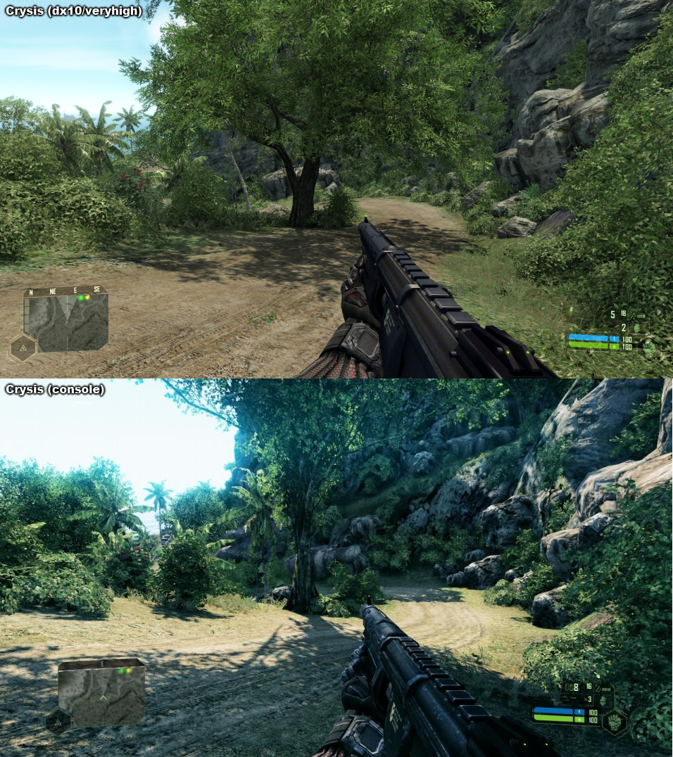
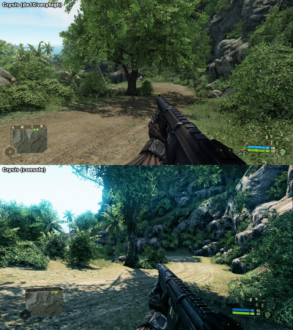
Foliage looks to be around 80 maybe as much as 90% intact. Shadow detail seems to be reduced but not devistatingly. The biggest issue for me is still the oversaturated lighting. It's lost the photorealistic look which is what made Crysis look so incredible in the first place.
POM is missing from the PC shot though which I mentioned earlier. Likely because AF is turned on instead (you can't have both at the same time on PC).
POM is missing from the PC shot though which I mentioned earlier. Likely because AF is turned on instead (you can't have both at the same time on PC).
The lack of AF when using POM made the game look pretty bad at times IMO. Particularly whenever you could look at a lot of road. That was an ugly sacrifice.
The lighting in the 360 shot may be a bit exaggerated, but overall I think it looks a lot better than the PC shot it's alongside. Stock PC Crysis has a dull/muted look to its daylight lighting that is not realistic either. This is a way in which Crysis 2 PC looks a lot better than Crysis1/Warhead.
The lighting in the 360 shot may be a bit exaggerated, but overall I think it looks a lot better than the PC shot it's alongside. Stock PC Crysis has a dull/muted look to its daylight lighting that is not realistic either. This is a way in which Crysis 2 PC looks a lot better than Crysis1/Warhead.
djskribbles
Legend
The framerate is bad in the beginning, but gets significantly better later on.How will you explain no realtime GI and avg framerate of 25 FPS (PS3) and drops up to 10 FPS while (auto)saving game.
edit: i forgot the aggressive LOD on consoles and bad bugs with decals on PS3
The only time I've had the framerate drop below 15-20 was on my first playthrough and I was in the middle of a huge gun fight.
dragonelite said:Sarcasm right?
No. Crysis 1 max everything looks almost photorealistic. Less foliage is also sad
I wanted a crysis 2 build in the same way as crysis 1. To run at max everything smoothly you need a gaming rig from the future! Sadly, crysis 2 pc feels somewhat limited by it's console origin.
Last edited by a moderator:
The lack of AF when using POM made the game look pretty bad at times IMO. Particularly whenever you could look at a lot of road. That was an ugly sacrifice.
Good job you can now run both with a MOD
Stock textures BTW..
Last edited by a moderator:
Quick and nasty, Using the Reli TOD with a custom config, Not the best TOD and config but I don't play the single player anymore so not removed it.
Shot is with 4xMSAA+4xTRSAA
Frame rate is around ~45fps during that shot but that's down to the config file.
Every single screenshot here fails to get the contrast / tonemapping right.
Yea that's the problem, TOD's only really look right at certain times of the day, I did have the perfect balance ages ago before I stopped playing.
The only thing that always annoyed me about Crysis was that no matter how much I played with the shadow distance and jitter settings I was never happy with the way they looked.
The shadows in CryEngine 3 are much much better.
Last edited by a moderator:
How is it "wrong" if it's the default in game setting? Or am I missing something here?Every single screenshot here fails to get the contrast / tonemapping right.
The PC shot in this vs. pic uses default VeryHigh settings.

There should be a higher amount of contrast between lit and shaded areas. The camera lens or your eyes can either adjust to the intensity of the light reflected from the directly illuminated area, in which case the shadows should be much darker; or to the shadowed area in which case the lit surfaces should be a lot brighter, probably even overexposed.
The console screenshot tries to remedy this, by using the new linear lighting, but something's still off. The sky shouldn't be this saturated, just as the rest of the image actually, and the lit areas are still not bright enough.
There are basically two approaches to solve this issue.
One is to manually tweak every variable until it looks right, which is complicated even if you have a linear lighting pipeline; it usually requires different settings for different lighting conditions to look realistic, so if you can't change them on the fly then something's probably going to end up looking wrong.
The other approach is to make everything physically correct, from light sources and their intensities through energy conserving shaders to realistic exposure/tone mapping.
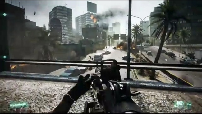
Just compare the above images with practically any Battlefield 3 screenshot.


This one is particularly good, the general intensity of the shaded and lit areas is much much more correct.
The console screenshot tries to remedy this, by using the new linear lighting, but something's still off. The sky shouldn't be this saturated, just as the rest of the image actually, and the lit areas are still not bright enough.
There are basically two approaches to solve this issue.
One is to manually tweak every variable until it looks right, which is complicated even if you have a linear lighting pipeline; it usually requires different settings for different lighting conditions to look realistic, so if you can't change them on the fly then something's probably going to end up looking wrong.
The other approach is to make everything physically correct, from light sources and their intensities through energy conserving shaders to realistic exposure/tone mapping.
Just compare the above images with practically any Battlefield 3 screenshot.


This one is particularly good, the general intensity of the shaded and lit areas is much much more correct.
The lighting in the 360 shot may be a bit exaggerated, but overall I think it looks a lot better than the PC shot it's alongside. Stock PC Crysis has a dull/muted look to its daylight lighting that is not realistic either. This is a way in which Crysis 2 PC looks a lot better than Crysis1/Warhead.
No way, the colour is just stupid in the console shots.
The console shot is exaggerated but overall it is much closer to reality. It's the same with Crysis 2.No way, the colour is just stupid in the console shots.
The brightness of the sunlight/shadows on the ground is almost true-to-life, but the sky is still far too bright. That's really the only issue I have with the new ToD, and it seems to be a common problem in many CE3 games, unfortunately.The console shot is exaggerated but overall it is much closer to reality. It's the same with Crysis 2.
Similar threads
- Replies
- 15
- Views
- 3K
- Replies
- 1
- Views
- 1K

