You are using an out of date browser. It may not display this or other websites correctly.
You should upgrade or use an alternative browser.
You should upgrade or use an alternative browser.
Archive Thread of Screenshots of Ridunkulous Quality and Size [2007-2015]
- Thread starter Neb
- Start date
- Status
- Not open for further replies.
Kyyla
Veteran
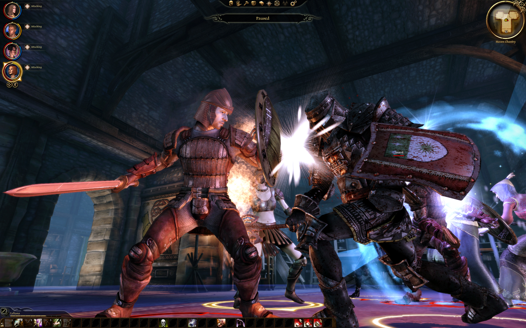
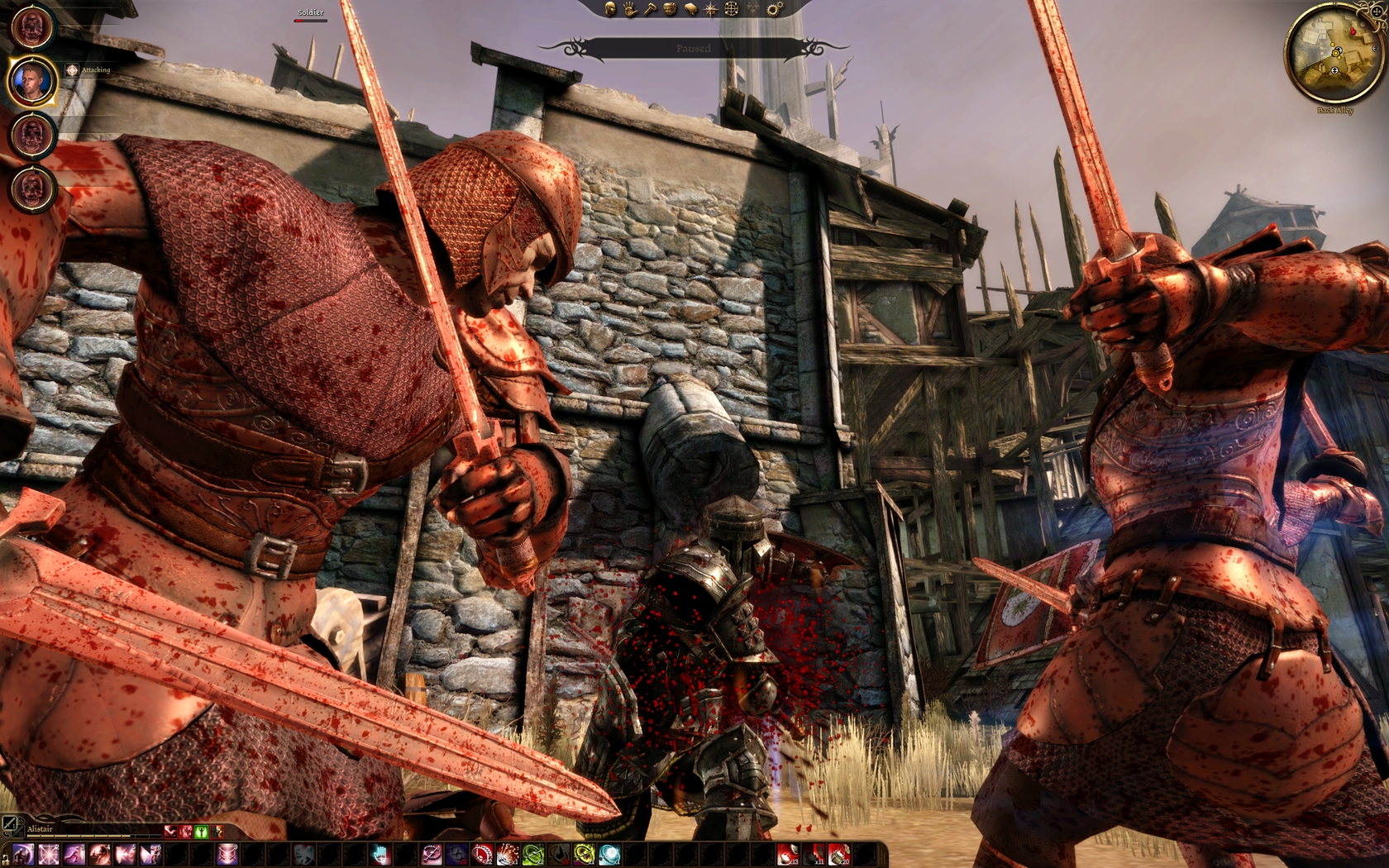
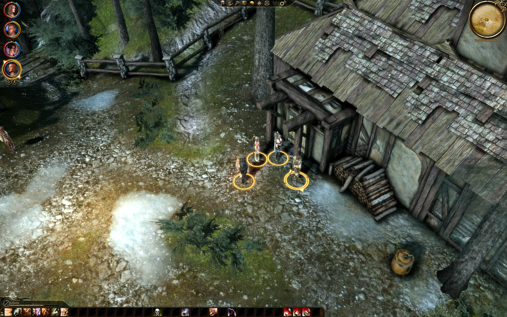
I can't get over how out-of-place the shiny dog (a nice breed of Mastif?) looks in every screenshot.
Especially in that second shot with no shadows cast.
Battlefield 2142 ,installed it after a long time to see if I can do any good, but no use...I still suck ass in this game. Also the this is concerning me for the first time, the draw distance is pretty awful in this game :|


brain_stew
Regular
Bad Comany 2, Bolivia mission shots -- maximum settings, 4xAA:
http://img413.imageshack.us/img413/5310/bfbc2game20100228134544.jpg
http://img20.imageshack.us/img20/6744/bfbc2game20100228134608.jpg
http://img20.imageshack.us/img20/3531/bfbc2game20100228134621.jpg
http://img20.imageshack.us/img20/8259/bfbc2game20100228134639.jpg
http://img20.imageshack.us/img20/9998/bfbc2game20100228134711.jpg
http://img20.imageshack.us/img20/24/bfbc2game20100228134737.jpg
http://img20.imageshack.us/img20/4547/bfbc2game20100228134747.jpg
http://img20.imageshack.us/img20/4339/bfbc2game20100228135036.jpg
http://img136.imageshack.us/img136/1950/26467863.jpg
http://img136.imageshack.us/img136/231/81591272.jpg
http://img136.imageshack.us/img136/9594/19195067.jpg
http://img136.imageshack.us/img136/4184/27602370.jpg
Last edited by a moderator:
Bad Comany 2, Bolivia mission shots -- maximum settings, 4xAA:
http://img413.imageshack.us/img413/5310/bfbc2game20100228134544.jpg
Sure it's not the CryEngine3 Demo?
Looks nice though AA seems not working.
The tech behind teh game isn't even scratching the "paint" of Crysis. Excellent artwork and design but technically if Crysis would keep it at that level you would be running it at 120fps at 1080p, 8xAA with a 4870.
Sure it's not the CryEngine3 Demo?
The tech behind teh game isn't even scratching the "paint" of Crysis. Excellent artwork and design but technically if Crysis would keep it at that level you would be running it at 120fps at 1080p, 8xAA with a 4870.
Last edited by a moderator:
And it doesn't...the surfaces its applied on is quite minimal.
Refreshment
Regular


Last edited by a moderator:
Refreshment
Regular
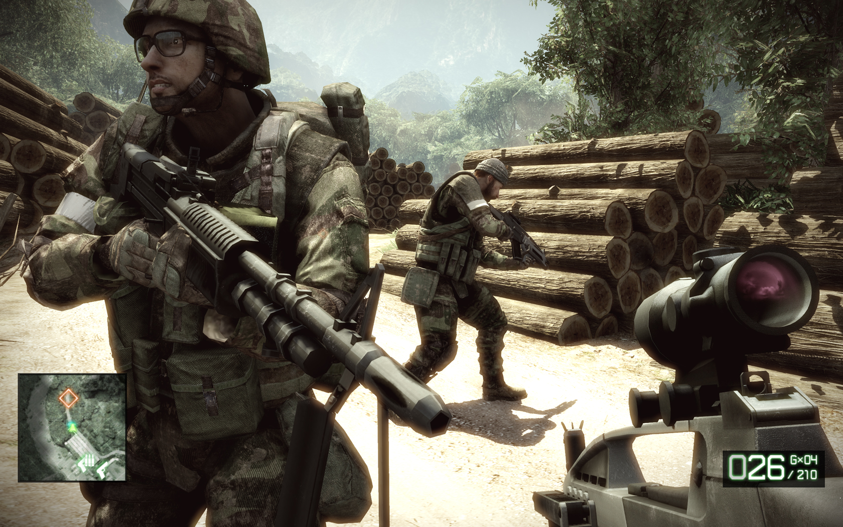
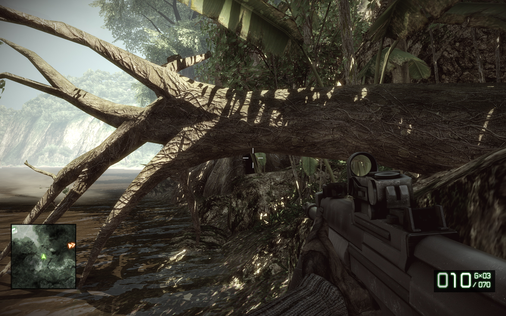
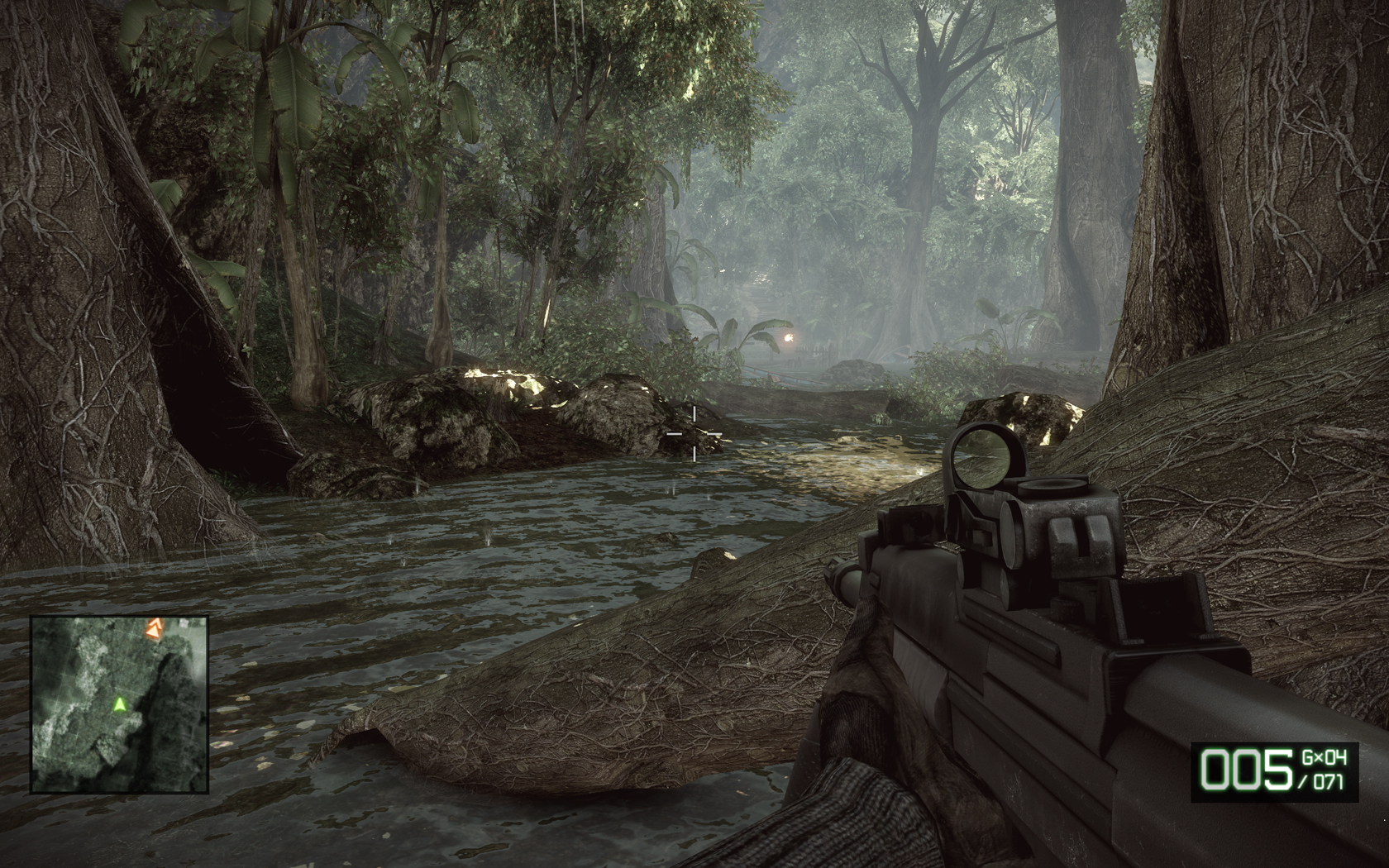
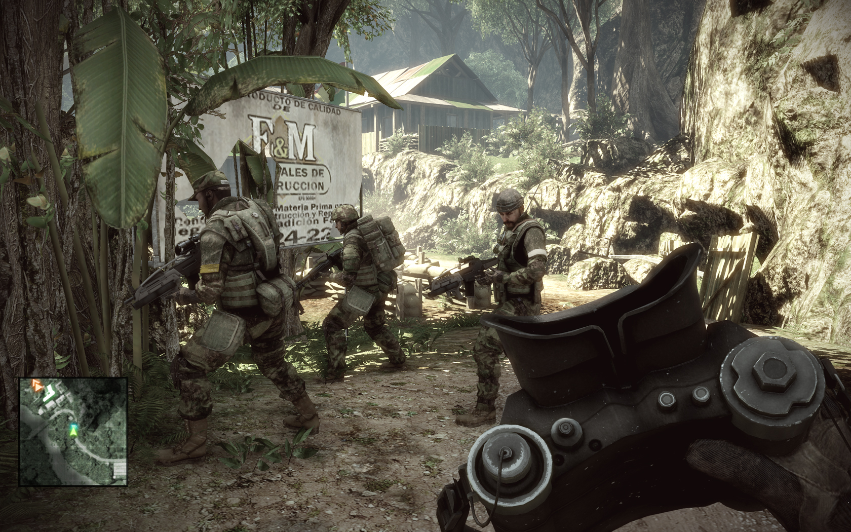
Battlefield: Bad Company 2
All settings at maximum, 8xAA, 16xAF, HBAO is on.
Performance: 30-35 fps most of the time with 8xAA. If lowered to 4xAA I get about 45-60. Turning HBAO off also increases fps greatly and removes mouse lag.
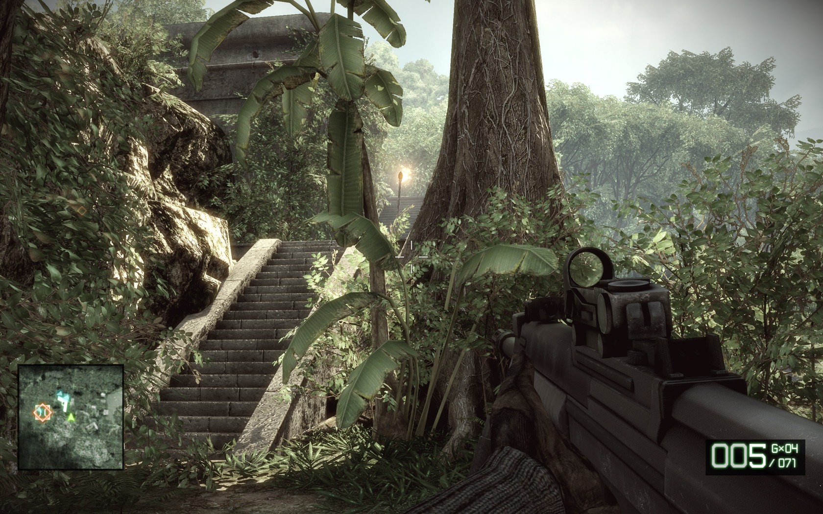
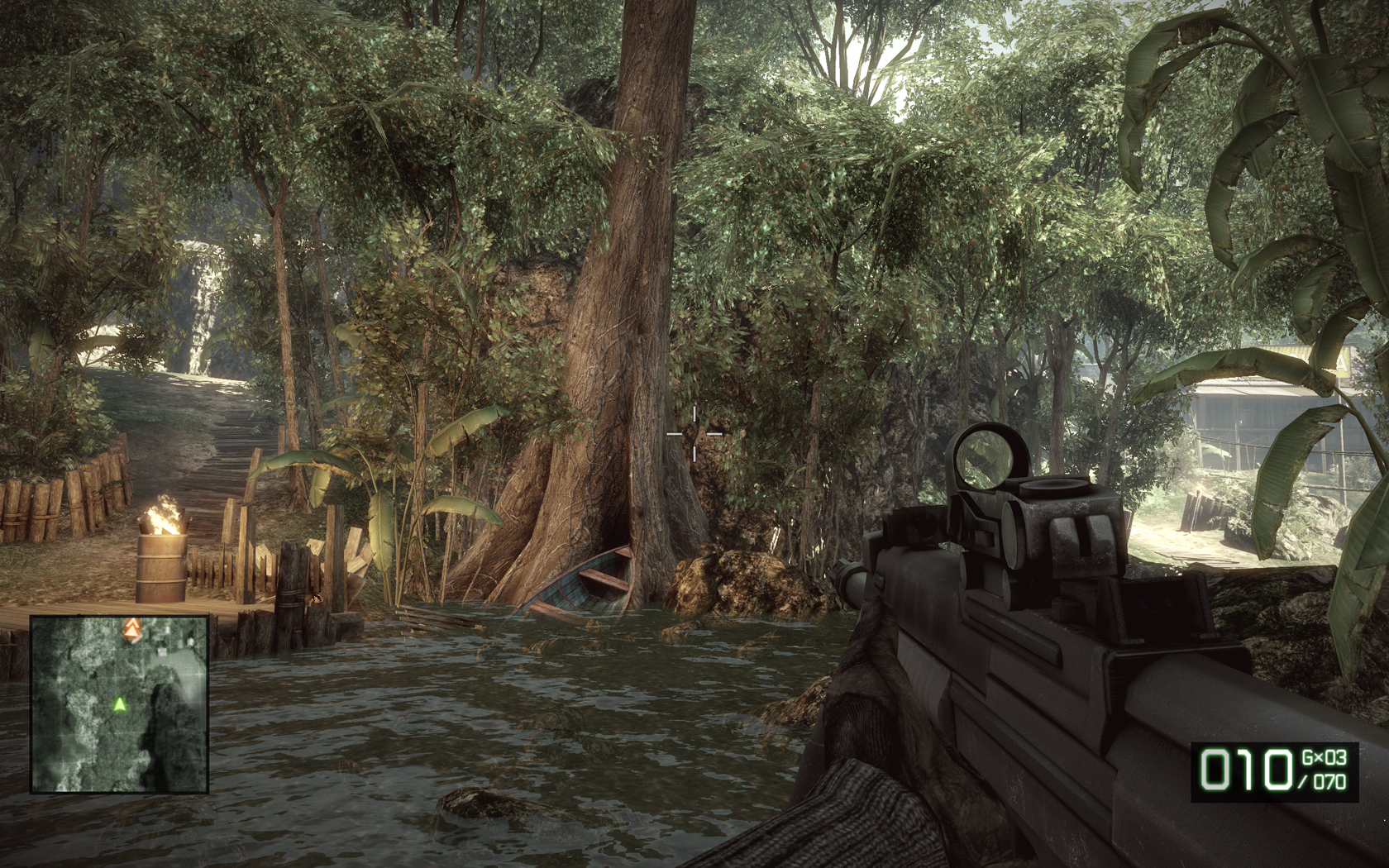
http://www.abload.de/image.php?img=bfbc2game2010-03-0123-va21.jpg
http://www.abload.de/image.php?img=bfbc2game2010-02-2823-1ac0.jpg
All settings at maximum, 8xAA, 16xAF, HBAO is on.
Performance: 30-35 fps most of the time with 8xAA. If lowered to 4xAA I get about 45-60. Turning HBAO off also increases fps greatly and removes mouse lag.


http://www.abload.de/image.php?img=bfbc2game2010-03-0123-va21.jpg
http://www.abload.de/image.php?img=bfbc2game2010-02-2823-1ac0.jpg
- Status
- Not open for further replies.
Similar threads
- Replies
- 104
- Views
- 12K
- Replies
- 14
- Views
- 2K


