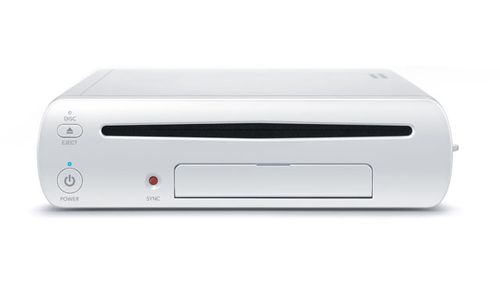
New PS4 industrial design concept

what the hell?

that's like saying this

reminds you of this

:D

I don't like the look horizontally but as a vertical machine it is pretty cool IMO


It's curious that you wouldn't say the same about Rudecurve's comparison between a Wii U controller and an etch-a-sketch, since it was an anecdotal reaction to the equally-anecdotal original comparison.
 
It's nice to see that a mythical PS4 reminds you of a machine that was incredibly popular, spawned an entire generation of gamers, and is still, fondly, remembered as one of the milestones in bringing the arcade to the home!!
 
The current trends are converging to unibody and rounder designs, as you'll see by looking at the Wii U, the X360 and both the PS3 designs.

Actually there is no "trend". Both the PS3 and X360 have round curves in them while ironcally the Wii had flat angular dimensions. Also symmetry and asymmetry are not design "trends"...they are just design elements that have no time association. A circle can be trendy or timeless as can a square just depends on the overall design.

That "PS4" just looks like an appliance made during the late 90s, with angled protrusions everywhere.

Yes it looks like this CD playing "appliance"...

http://www.bang-olufsen.com/beosound9000
 
Last edited by a moderator:
Erm.. yeah, sure..
:LOL:

Feel free to post a picture of your angular 90s appliances and we'll decide if it's timeless or "trendy".;)

Or just continue to troll when your argument doesn't hold water. :LOL:

Yes, compared to that too.

So this....

326048_I2YG4pDKqndVPyihfxhALuFcx.jpg


looks cheap..compared to this....

wiiu.jpeg


erm...yeah, sure..:LOL:
 
Last edited by a moderator:
Rudecurve calling someone else a troll, thats pretty funny.

Basically, it's just a more elaborate fan vision of what they hope the PS4 will be.

Pretty much this, wet dreams of fanboys. At least they got it right that they'll probably ripoff nintendos new controller in some way.
 
I really like the direction in the design, but I don't like the "bottom" part, though it looks much better when view vertical. Such a thin system I would think would only be achievable on an expanded PS3 type spec, as opposed to a whole new system with current generation GPU, lots of RAM, and with heat and wattage that is still manageable in that form factor. T'would be pricey.
 
I like the "industrial design"...looks modern...;)

The design asthetic is similar to SONY PSVita which uses hard lines. WiiU controller is like blob of pizza dough.

326048_FEfDChZuEdsunZYXyyqYfznxr.jpg


ps-vita.jpg


Last edited by a moderator:
Reminds me of a Dalek for some reason. I half expect vacuum tubes on top. ^_^

If they are going after the mass market, probably need a little something to appeal to women (or drop the excessive styling).

.. secretly I hope for a robot stand with holographic display. :runaway:

EDIT:
Remember that Move + Stand/Dock + portable device patent ?
It would make sense if that Stand is mobile like Aibo. Waving the silly looking Move controllers in front of a robo-doggie is much more appealing than a motionless stand. That is if Sony is interested to expand their offerings instead of doing piecemeal systems all the time. :devilish:
 
This concept has good aspects and some really bad ones. Overall the design is way, way too busy. Simple always works better than lots of lines and details. It's funny Rudecurve posts pictures of those speakers and that bigass amp for example - they're anything BUT like that theoretical PS4. ;)

The stand is atrocious, it doesn't harmonize with the design itself, makes the whole thing top-heavy by being way too tall and narrow. You'd knock the console over trying to insert a disc a bit carelessly into it for chrissakes. Plus it blocks off the vents too.

Then there's all the hard angles coupled with the curved prow or whatever to call that thing sticking out beneath the drive, and the swish on top. They don't mesh stylistically. Either go angles OR curves - not both at once in this haphazard fashion.

Look at an Apple Airport Extreme for example if you want angles meshed with curves. That's a design that works, this bizarre hodgepodge does not.

Lose the swish and the prow, then it looks a lot better. Still too busy though with the multiple surface textures, colors and so on.
 
This concept has good aspects and some really bad ones. Overall the design is way, way too busy. Simple always works better than lots of lines and details. It's funny Rudecurve posts pictures of those speakers and that bigass amp for example - they're anything BUT like that theoretical PS4. ;)

Actually it was posted to show that anglular designs done right don't look old...;)

Look at an Apple Airport Extreme for example if you want angles meshed with curves. That's a design that works, this bizarre hodgepodge does not.

The design of the PS4 concept isn't trying to be an Apple product...it's trying to be a SONY product. The Airport Extreme is BORING just like the Mac Mini...
The concept is actually borrowing from the PSTWO...

As far as being top heavy well yeah if you're stupid then you'd put all the heavy stuff where the slim drive is. Don't know about you but I don't see anything where the optical drive is.

As much as I like my iPhone 4 I don't have any problem admitting that even Apple releases crappy designs once in awhile. :LOL:

apple_imac_g3.jpeg
apple-powermac-g4.jpg

B001F7AHY6-1.jpg


I hate Apple fanboys as much as Nintendo fanboys....
 
Last edited by a moderator:
Back
Top