You are using an out of date browser. It may not display this or other websites correctly.
You should upgrade or use an alternative browser.
You should upgrade or use an alternative browser.
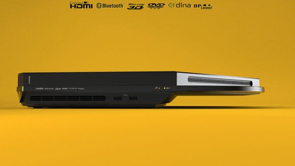
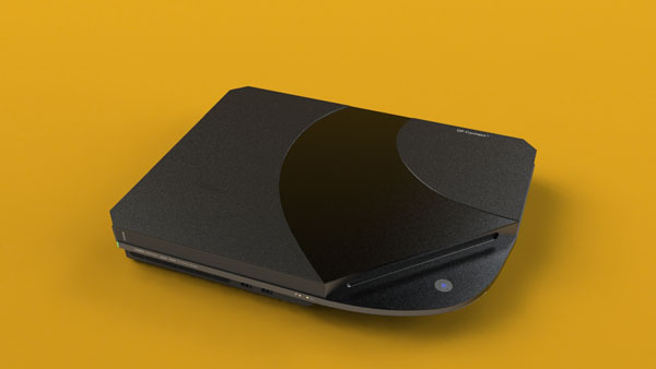
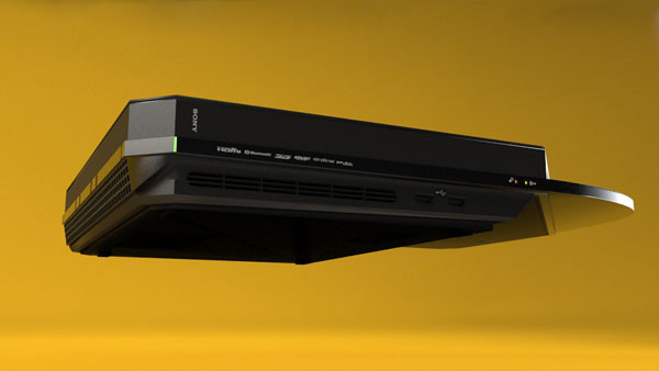
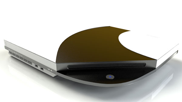
New PS4 industrial design concept
- Thread starter RudeCurve
- Start date
Silent_Buddha
Legend
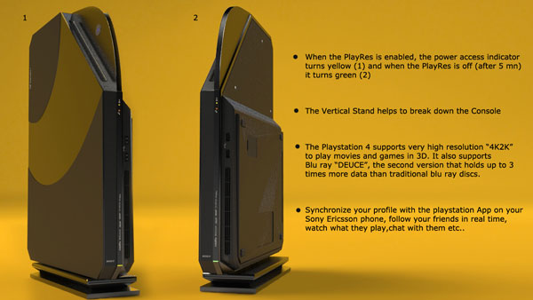
A lot of that seems like wishful thinking. 4Kx2K is going to require greater than 15 Gbit/sec which makes transmission over this wireless DPconnect entirely unrealistic.
And upon further investigation it is just that. Wishful thinking. It's a concept by Joseph Dumary of what he thinks the PS4 should look like and what he thinks the PS4 should be capable of. But without providing any way to achieve his lofty goals.
Basically, it's just a more elaborate fan vision of what they hope the PS4 will be.
Regards,
SB
Looks novel. Love-it-or-hate-it response I think, which may be a bad call. Clearly Sony want to draw people's attention to their box, which is good advertising. From a pure design POV I think it works, and I like the swish from the disk drive. Vertical stand looks ghastly IMO. The drive at an angle really limits space inside though, so I can't see that happening in the final product. I think this is just playing with ideas and the final will be pretty different.
Not big enough. ( for all teh powa we're gonna need  )
)
Pretty cool design beyond that. I'm guessing real consoles never look this cool for cost reasons. I was never a big fan of either design of the PS3 but they took all the shiny bits out to save a few bucks in the new version, and I guess a few bucks is always going to be key in consoles.
Maybe not. I remember reading a fascinating account of the redesign of the Dodge Ram truck in the USA a few years back. Which has a big "controversial" at the time semi looking front end like this. The prior Dodge Ram was just a regular looking truck and longtime not very popular. Anyways they focus tested two designs, one a continuation of the old "normal" model, and the new one. They found when asked to give a 1-10 score people either gave the new design 9's or 10's, or 1's or 2's. They loved it or hated it but they had a strong reaction. The continuation of the old design almost always would get rated 7's. People approved but nobody had strong feelings.
They went with the controversial love it or hate it design, and it went from obscurity to being one of the best selling trucks from then on...
That's always been one of my favorite "marketing/focus group" stories...
Pretty cool design beyond that. I'm guessing real consoles never look this cool for cost reasons. I was never a big fan of either design of the PS3 but they took all the shiny bits out to save a few bucks in the new version, and I guess a few bucks is always going to be key in consoles.
Love-it-or-hate-it response I think, which may be a bad call
Maybe not. I remember reading a fascinating account of the redesign of the Dodge Ram truck in the USA a few years back. Which has a big "controversial" at the time semi looking front end like this. The prior Dodge Ram was just a regular looking truck and longtime not very popular. Anyways they focus tested two designs, one a continuation of the old "normal" model, and the new one. They found when asked to give a 1-10 score people either gave the new design 9's or 10's, or 1's or 2's. They loved it or hated it but they had a strong reaction. The continuation of the old design almost always would get rated 7's. People approved but nobody had strong feelings.
They went with the controversial love it or hate it design, and it went from obscurity to being one of the best selling trucks from then on...
That's always been one of my favorite "marketing/focus group" stories...
Last edited by a moderator:
Cars are in a sea of competing products though, and the best you can do is generate strong feelings from your tiny niche. Consoles are all aiming for the same mass market. Where a car can get away with targeting the goth/emo's, or urban mum's, or whatever, and design specifically for a demographic, a console needs mass appeal. A design that turns people off is going to lose you sales. A design that no-one feels strongly about can be pleasantly ignored as they play the games and services. If Sony go artsy to get heads turned and generate interest, they need to do it in a way that's not going to polarise the market and have some not wanting to buy PS4 on account of it being ugly.
PS2 slim was extremely cool. It wasn't beautiful, but it was good to look at and marvel at how titchy it was. the PS3 fits away okay, but is a bit foreboding. I'd rather that one was invisible. 360 similarly doesn't have any visual appeal for me, and Wii didn't have the cool factor of PS2S because it never started out big in the first place.
Perhaps the best design is to release an enormous console full of empty space, and then produce a tiny one a year later and impress everyone with how you've managed to shrink it!
Perhaps the best design is to release an enormous console full of empty space, and then produce a tiny one a year later and impress everyone with how you've managed to shrink it!
D
Deleted member 13524
Guest
Looks cheap and outdated.
2001 outdated.
2001 outdated.
Looks really good to me. Far to small though have high end hardware in there on the level of PS3 for the time. If that's the size they're targetting then I'd expect it to be powered by something along the lines of a high end fusion chip.
Looks cheap
Looks cheap compared to what? This?
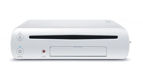
outdated.
2001 outdated.
80s outdated...


Last edited by a moderator:
Look PSenterprise
ha!
D
Deleted member 13524
Guest
Looks cheap compared to what? This?

Yes, compared to that too.
The current trends are converging to unibody and rounder designs, as you'll see by looking at the Wii U, the X360 and both the PS3 designs.
That "PS4" just looks like an appliance made during the late 90s, with angled protrusions everywhere.
80s outdated...
Now that you mentioned it, this:
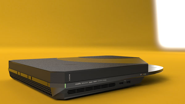
reminds me of this:

It's just in a different color, shorter and without the unnecessary protrusions that go along the optical drive.
Yes, compared to that too.
The current trends are converging to unibody and rounder designs, as you'll see by looking at the Wii U, the X360 and both the PS3 designs.
That "PS4" just looks like an appliance made during the late 90s, with angled protrusions everywhere.
Now that you mentioned it, this:
reminds me of this:
It's just in a different color, shorter and without the unnecessary protrusions that go along the optical drive.
what the hell?
that's like saying this

reminds you of this

I don't like the look horizontally but as a vertical machine it is pretty cool IMO
Similar threads
- Locked
- Replies
- 260
- Views
- 21K
- Replies
- 34
- Views
- 4K
- Replies
- 1
- Views
- 15K

