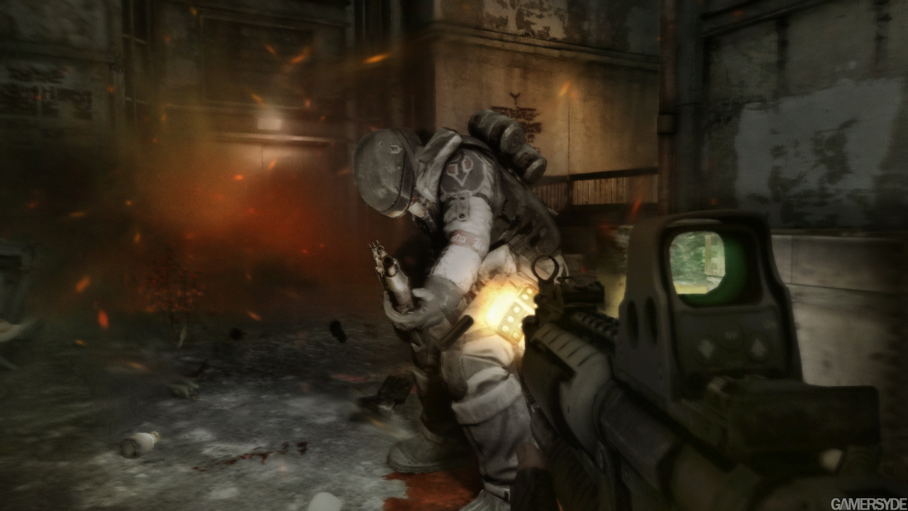
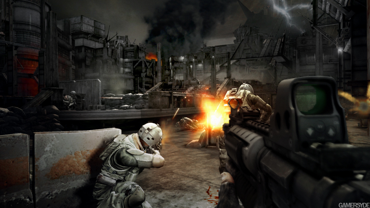
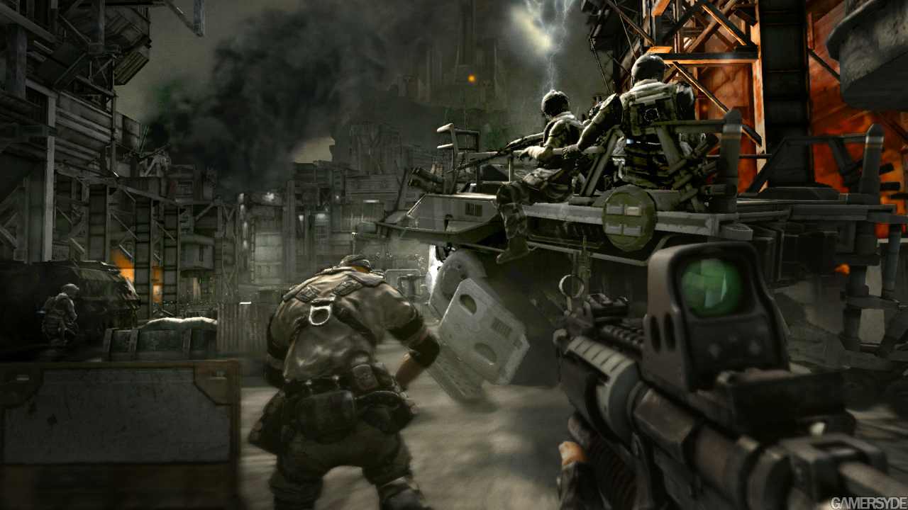
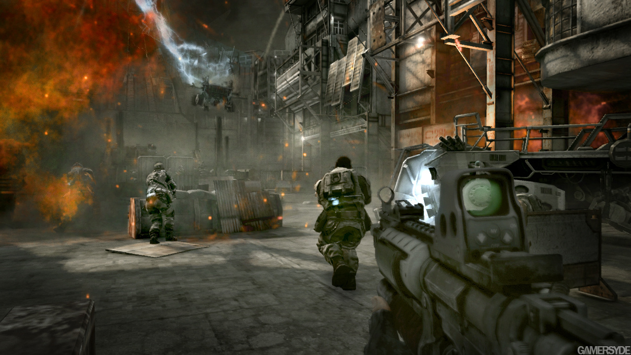
If other games looked like The Order 1886

Status
Not open for further replies.
Don't you think the boosted saturation is a bit destructive to the mood of the game?

Personally, yes. I think the colour palette of the game really fits the atmosphere. I could personally do away with some of the blurring, but I'm not particularly sensitive to it. I was a big fan of Alan Wake's visuals on the 360, and we all know that was very low res. They're maybe a bit comparable, in terms of having the shadows and lighting as the stars of the show, and similar tone. The one thing the order has on it is essentially a non-scaled image that should resolve more texture detail despite the various things that add some blur to the image.

We could carry the same argument about Instagram and films though. I think it's good for people not to confuse "best looking" with "best tech" or "worst looking" with "worst tech." The art/graphic teams have a huge influence on the overall look of the game, the same way a film is coloured. It's important to understand the way a game, film or photo looks is carefully manipulated by artists. What we find appealing is subjective.


It would be interesting to see a very large poll of gamers, asking them to compare images to see what they like.
 
Last edited:
I don't like the heavy AA blurring either (I love the motion blur though), but I guess there were compromises.

The film Tinker Tailor Soldier Spy comes to mind, the grading was done with a similar desaturated film look.
 
Here's the original:

i4qfCqhYhXFNS.png

So there's actually an option grain filter = ON / OFF in the game!

WE HAVE PROOF NOW! :yep2:
 
Don't you think the boosted saturation is a bit destructive to the mood of the game?
Seems like the No.1 enemy of RAD is color :LOL:

http://www.neogaf.com/forum/showpost.php?p=151780103&postcount=2257

Personally, yes. I think the colour palette of the game really fits the atmosphere. I could personally do away with some of the blurring, but I'm not particularly sensitive to it. I was a big fan of Alan Wake's visuals on the 360, and we all know that was very low res. They're maybe a bit comparable, in terms of having the shadows and lighting as the stars of the show, and similar tone. The one thing the order has on it is essentially a non-scaled image that should resolve more texture detail despite the various things that add some blur to the image.

We could carry the same argument about Instagram and films though. I think it's good for people not to confuse "best looking" with "best tech" or "worst looking" with "worst tech." The art/graphic teams have a huge influence on the overall look of the game, the same way a film is coloured. It's important to understand the way a game, film or photo looks is carefully manipulated by artists. What we find appealing is subjective.


It would be interesting to see a very large poll of gamers, asking them to compare images to see what they like.

The monocromatic color palette in games is the equivalent of the orange and teal color grading in movies, and recently, TV.

http://hamcj.com/2014/07/25/why-is-...teal-and-orange-is-spreading-into-television/

Yuck.

So there's actually an option grain filter = ON / OFF in the game!

WE HAVE PROOF NOW! :yep2:
Well of course, the grain is a post-processing effect. Doubt there will be an option to disable it in the retail game though.
 
Seems like the No.1 enemy of RAD is color :LOL:

The monocromatic color palette in games is the equivalent of the orange and teal color grading in movies, and recently, TV.

Yuck.
This is a desaturated film look. Tell me how it makes you feel.


tinkertailor1.jpg
 
Seems like the No.1 enemy of RAD is color :LOL:

http://www.neogaf.com/forum/showpost.php?p=151780103&postcount=2257


The monocromatic color palette in games is the equivalent of the orange and teal color grading in movies, and recently, TV.

http://hamcj.com/2014/07/25/why-is-...teal-and-orange-is-spreading-into-television/

Yuck.


Well of course, the grain is a post-processing effect. Doubt there will be an option to disable it in the retail game though.


Wow, I definitely prefer the old build to the new one, when seen side-by-side.

As for orange and teal ... colour combinations go in and out of style. I think it's common in the media world to copy colour combinations, styles. It's like shaky cam. For a while it's new, so everyone does it, then suddenly it's out of fashion again.
 
A problem I see is that many people like the effects these filters produce but won't acknowledge them as important. I don't understand why.
Because it's bollocks. People recognise the additional benefit post-effects can have on some games, but those effects alone don't make a game look like it could have been rendered offline for the purposes of a computer animation. There's a LOT more to it. The lighting and shading model needs to work. I'll point to DriveClub being a game that can produce CGI-like visuals without any blur or grain or desaturation.

Case in point, your link http://www.neogaf.com/forum/showpost.php?p=151780103&postcount=2257. The old, saturated, less blurry clip looks every but like CGI as the latest build.

What I don't understand is your fascination with constantly belittling the hard work of developers who produce some stellar visuals by crafting well-executed rendering with artistically applied post effects as appropriate to capture a particular style by calling their work the result of a cheap trick, and why saying your piece the once or twice isn't enough, but you have to keep regurgitating the point ad nauseum including laughably biased 'investigations'. That's the real mystery here.
 
This is a desaturated film look. Tell me how it makes you feel.


tinkertailor1.jpg
You sound like a psychiatrist :LOL: And to answer your question: sad because of the cheap cinematography of today.

Wow, I definitely prefer the old build to the new one, when seen side-by-side.

As for orange and teal ... colour combinations go in and out of style. I think it's common in the media world to copy colour combinations, styles. It's like shaky cam. For a while it's new, so everyone does it, then suddenly it's out of fashion again.

I'm not as optimistic as you. Even in the teaser already Star Wars has been infected by this, thanks in no small part I'm sure to J.J. Abrams involvement.

Because it's bollocks. People recognise the additional benefit post-effects can have on some games, but those effects alone don't make a game look like it could have been rendered offline for the purposes of a computer animation. There's a LOT more to it. The lighting and shading model needs to work. I'll point to DriveClub being a game that can produce CGI-like visuals without any blur or grain or desaturation.

Case in point, your link http://www.neogaf.com/forum/showpost.php?p=151780103&postcount=2257. The old, saturated, less blurry clip looks every but like CGI as the latest build.

What I don't understand is your fascination with constantly belittling the hard work of developers who produce some stellar visuals by crafting well-executed rendering with artistically applied post effects as appropriate to capture a particular style by calling their work the result of a cheap trick, and why saying your piece the once or twice isn't enough, but you have to keep regurgitating the point ad nauseum including laughably biased 'investigations'. That's the real mystery here.
Seems like another person couldn't be bothered to read this thread. Also, downsampled GIFs aren't a good way to measure how blurry a game is. The direct-feed screenshots we have have been far more useful.

EDIT: Oh and, does this look every bit like CGI as the blurry, grainy, unsaturated footage?

ibjKvc8slZctbK.png
 
You should pick up the phone and let J. J. know you can give him some advice on film making.
 
You sound like a psychiatrist :LOL: And to answer your question: sad because of the cheap cinematography of today.
It's a film that came out in 2012. Are you saying it's cheap cinematography?
Does the desaturated film look help accentuate the mood or not?
Also, downsampled GIFs aren't a good way to measure how blurry a game is. The direct-feed screenshots we have have been far more useful.
Motion blur and grain are temporal effects, a screenshot with those is a moronic way to judge the quality of those effects.

(I will preemptively reassert that grain, while random, is temporal)
 
Last edited:
It's a film that came out in 2012. Are you saying it's cheap cinematography?
Does the desaturated film look help accentuate the mood or not?
What mood?

Motion blur and grain are temporal effects, a screenshot with those is a moronic way to judge the quality of those effects.

(I will preemptively reassert that grain, while random, is temporal)
It's not moronic. It tells us the extent of the effects on a per-frame basis. Also grain is in every frame, motion or not so a screenshot is perfectly valid.

---------------------------------------------------

Looking back, Even the early Killzone 2 had more saturated colors than The Order :p

image_killzone_2-7119-1306_0006.jpg

image_killzone_2-7119-1306_0005.jpg

image_killzone_2-7119-1306_0004.jpg

image_killzone_2-7119-1306_0001.jpg
 
What mood?
That film has an old film stock look, correctly taking us back to the cold war era. Desaturation in general, even a little, tends to provides a historical feel.

My impression of 1886 film look is more of a cold, desolate, and historical. A bit depressing. For the night screenshots, it feels like cold biting humidity.

The colorful images you modified are completely neutral and they make me feel nothing.

The high saturation of children's animated films, however, make me feel all happy happy joy joy. I have a hunch this wouldn't fit well for 1886.
It's not moronic. It tells us the extent of the effects on a per-frame basis. Also grain is in every frame, motion or not so a screenshot is perfectly valid.
Yes, it's moronic.

A grain plate is animated, and you don't see the individual grain when it's running, you only see clear grain when you pause the frame.

Also a motion blurred screenshot doesn't tell us shit. If you don't have the motion vectors, you have no idea what the simulated shutter angle was. You have no idea how it looks in motion. Motion blur address motion artifacts, there's no such thing in a static image.
 
A grain plate is animated, and you don't see the individual grain when it's running, you only see clear grain when you pause the frame.
Grain is an animated effect in that it will vary from one frame to the next, but for a single frame it's a spatial phenomenon; it's at most minimally dependent on the motion in the scene being recorded.

In still frame we can get a pretty good sense for what the developer's choice of grain pattern and intensity is like. We don't really need motion for that.

Also a motion blurred screenshot doesn't tell us shit.
Motion blurred screenshots can tell us a fair amount; you might identify artifacts in the techniques used, count how many MB samples were used, etc.

Although it's true that you have to be very careful when comparing amount of motion blur.
 
Wow, I definitely prefer the old build to the new one, when seen side-by-side.

As for orange and teal ... colour combinations go in and out of style. I think it's common in the media world to copy colour combinations, styles. It's like shaky cam. For a while it's new, so everyone does it, then suddenly it's out of fashion again.

I like the old build, but for the feeling of the era I like the final build.

As for the film shot, I got cold and depressing from it.
 
LEAVE TINKER TAILOR SOLDIER SPY OUT OF THIS! IT'S A MODERN MASTERPIECE!

Ha ha ha, things are getting heated. Anyone that believes there is one correct style for shooting a film, or making a game, is crazy.
 
That film has an old film stock look, correctly taking us back to the cold war era. Desaturation in general, even a little, tends to provides a historical feel.

My impression of 1886 film look is more of a cold, desolate, and historical. A bit depressing. For the night screenshots, it feels like cold biting humidity.

The colorful images you modified are completely neutral and they make me feel nothing.

The high saturation of children's animated films, however, make me feel all happy happy joy joy. I have a hunch this wouldn't fit well for 1886.
That shot you posted looks to clean to be from an old film. I don't remember old film looking that green either. Suffice to say that the rest is dependent on your personal aesthetic idiosyncrasies.

Yes, it's moronic.

A grain plate is animated, and you don't see the individual grain when it's running, you only see clear grain when you pause the frame.
You're right about one thing, it's more annoying in motion.

Also a motion blurred screenshot doesn't tell us shit. If you don't have the motion vectors, you have no idea what the simulated shutter angle was. You have no idea how it looks in motion. Motion blur address motion artifacts, there's no such thing in a static image.
The way I added the effect it simply emulates the look of rotating the camera horizontally with the player as the pivot.
 
The point of having a standard well-calibrated material library is to be able to use those materials under different lighting conditions without having to tweak them everytime. That's why they look consistent under different color grading schemes.

Also, without the filters they don't look as realistic to be honest. They look more plasticky.
And the reason why those materials work well under different lighting conditions is because they retain their properties including correct colors.
The assets do look realistic. The extra realism you get is thanks to the fact that with the filters it conveys a feeling that the game is shot from a real camera

I think you are alittle confused here. The game retains a CGI look whether it has the filters or not. But you mix your preference against such post processing effects with whether the game has a CGI'ish look
I managed to find an almost clean image of The Order 1886 (no brown or noise filters). Got rid of the chromatic aberration and blur with photoshop plus made the color saturation more realistic:

ibjKvc8slZctbK.png


Here's the original:

i4qfCqhYhXFNS.png


You still need the artists to make the correct materials and lighting setups.
And yet although there is a difference, none looks better or more CGI'ish than the other. If the right assets and conditions are not there it just doesnt impress.
 
Status
Not open for further replies.
Back
Top