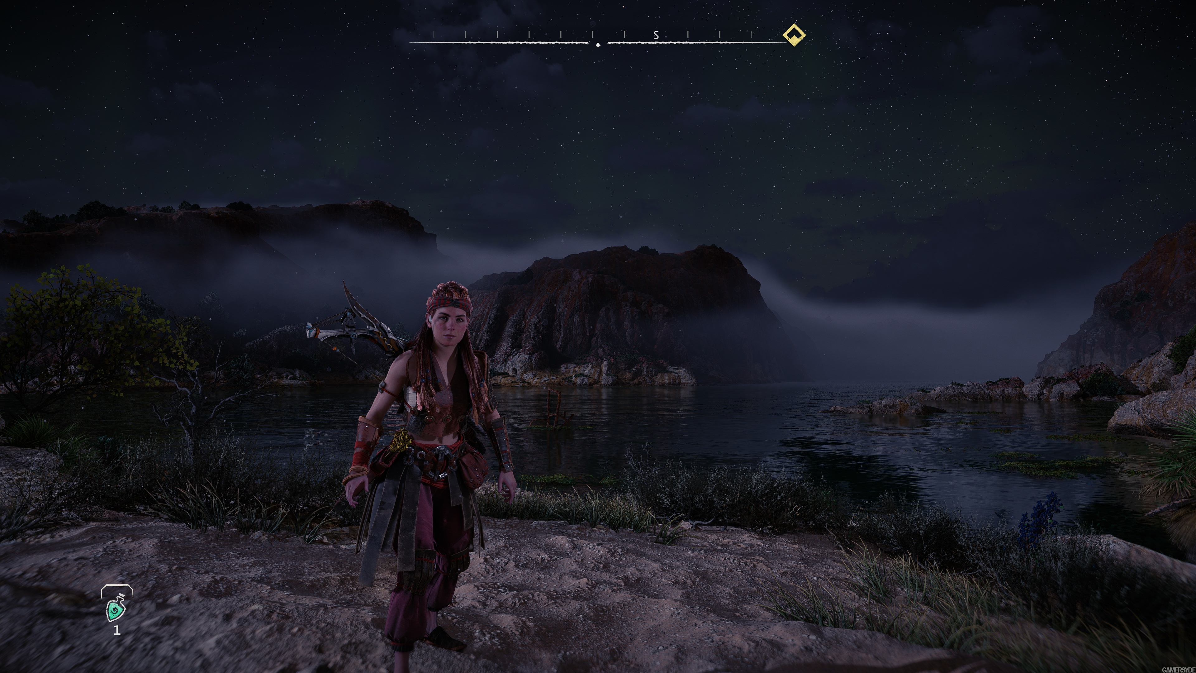
Watching Cohh play and a few things bother me. Enemy corpses that are just environmental decoration have arrows sticking out of them from past combats. Enemy corpses that you kill, don't show arrows sticking out of them. It's really weird seeing enemies you kill next to dead enemies that are part of the environment. Like, why aren't Aloy's arrows sticking out of the corpse like the ones in the environment?
Aaaaaah. It's minor, but it bugs me.
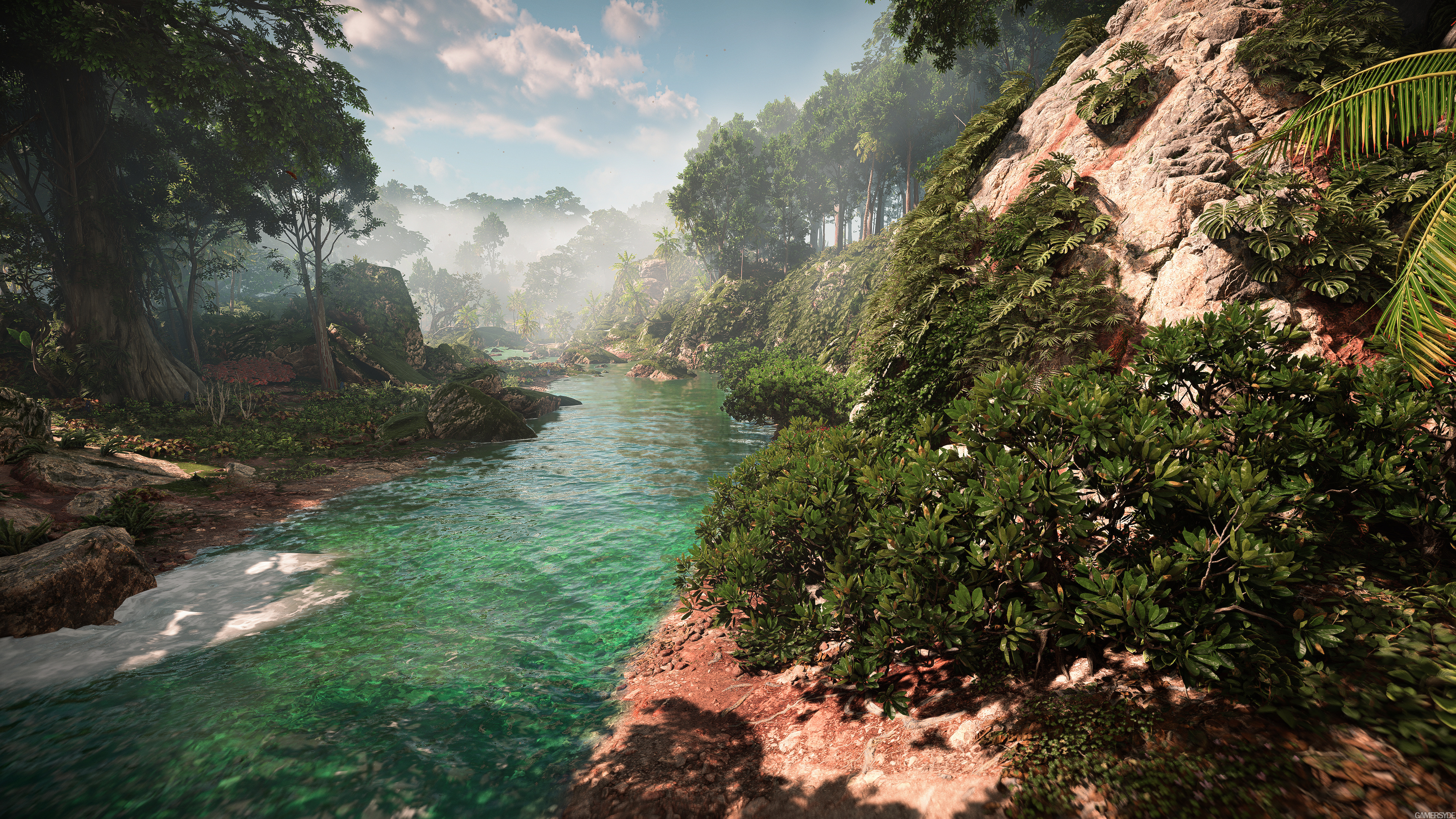
Also, underwater rendering isn't quite right when you look up at the surface of the water from underwater.
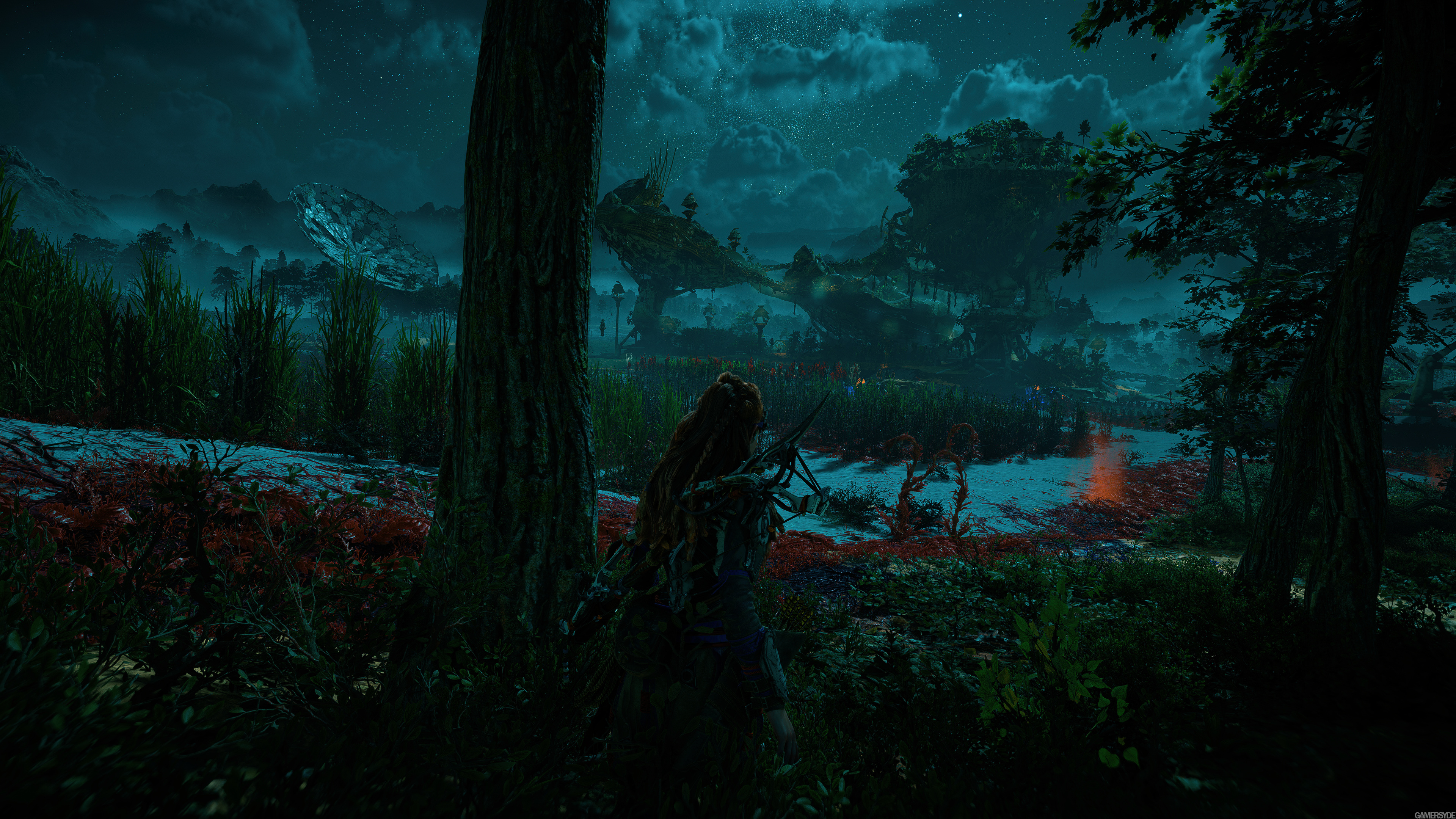
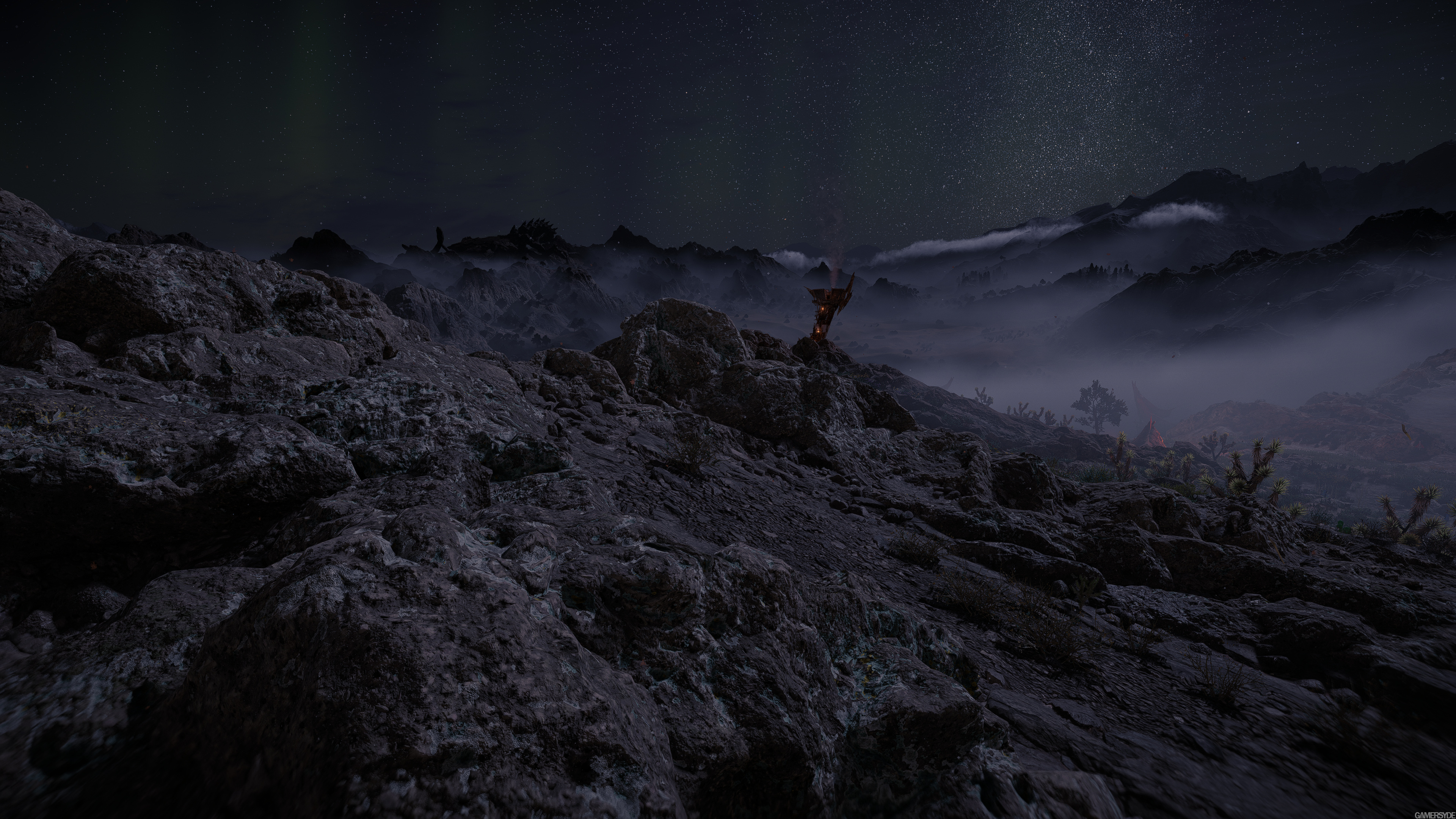
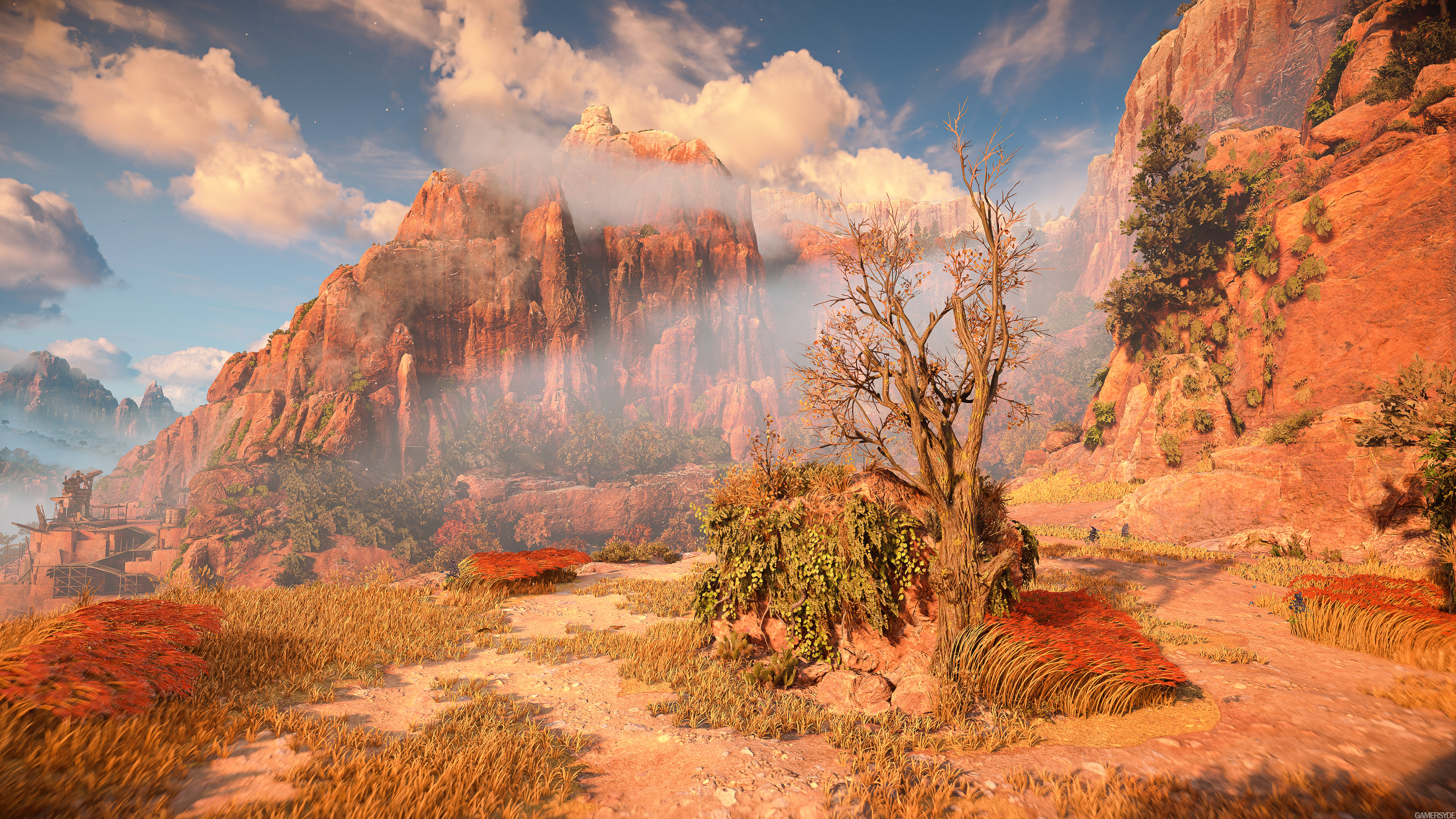
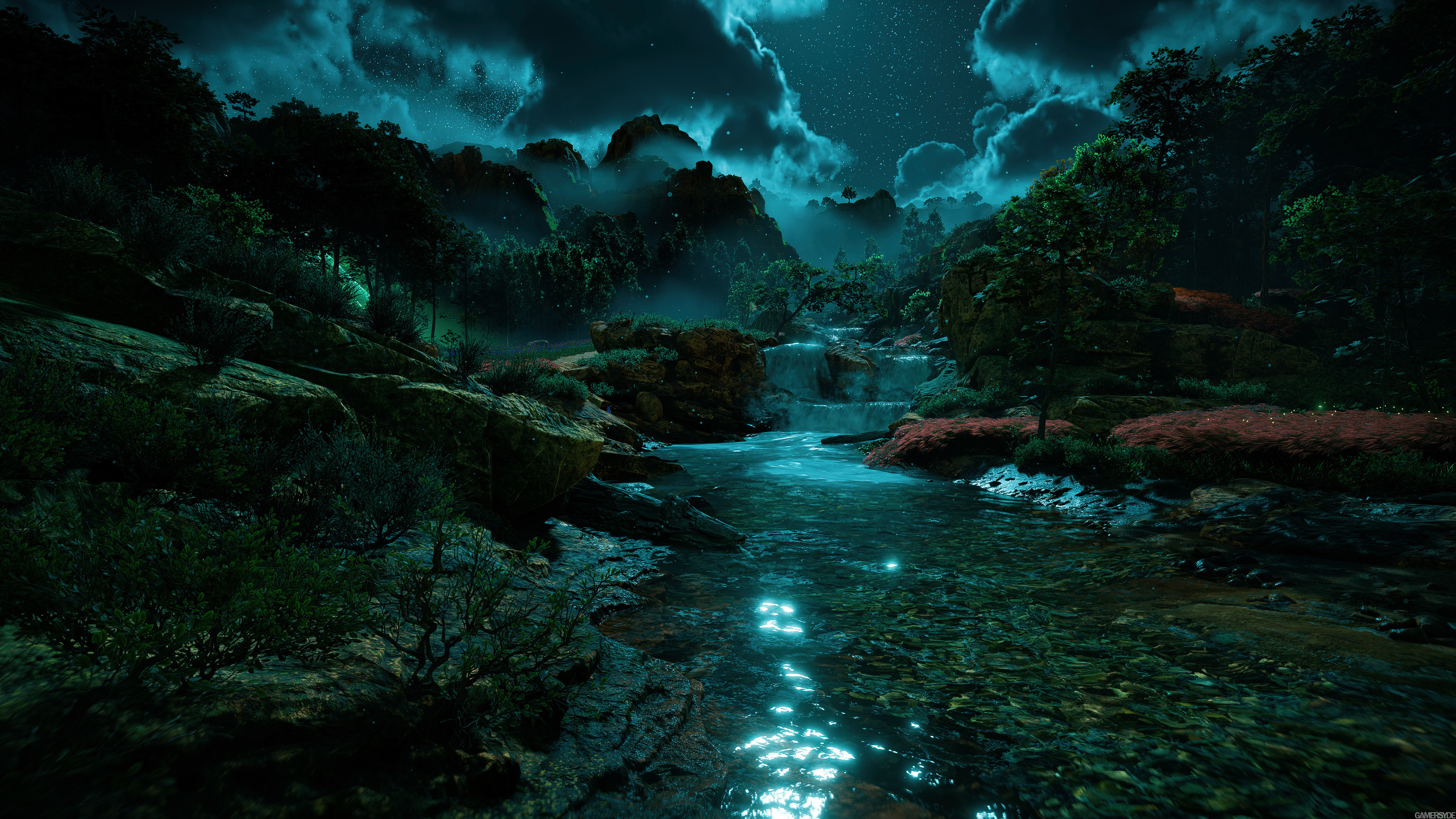
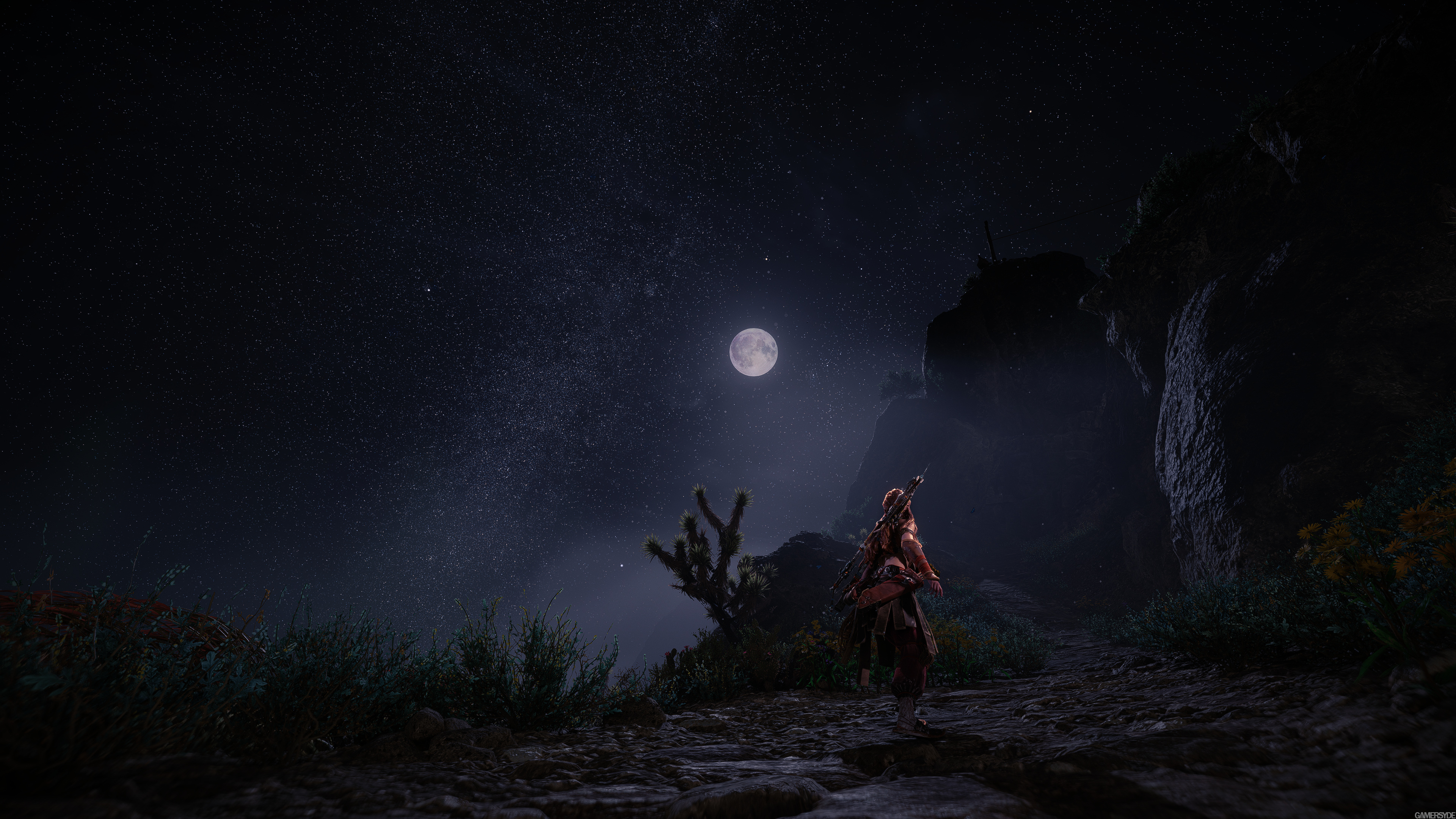
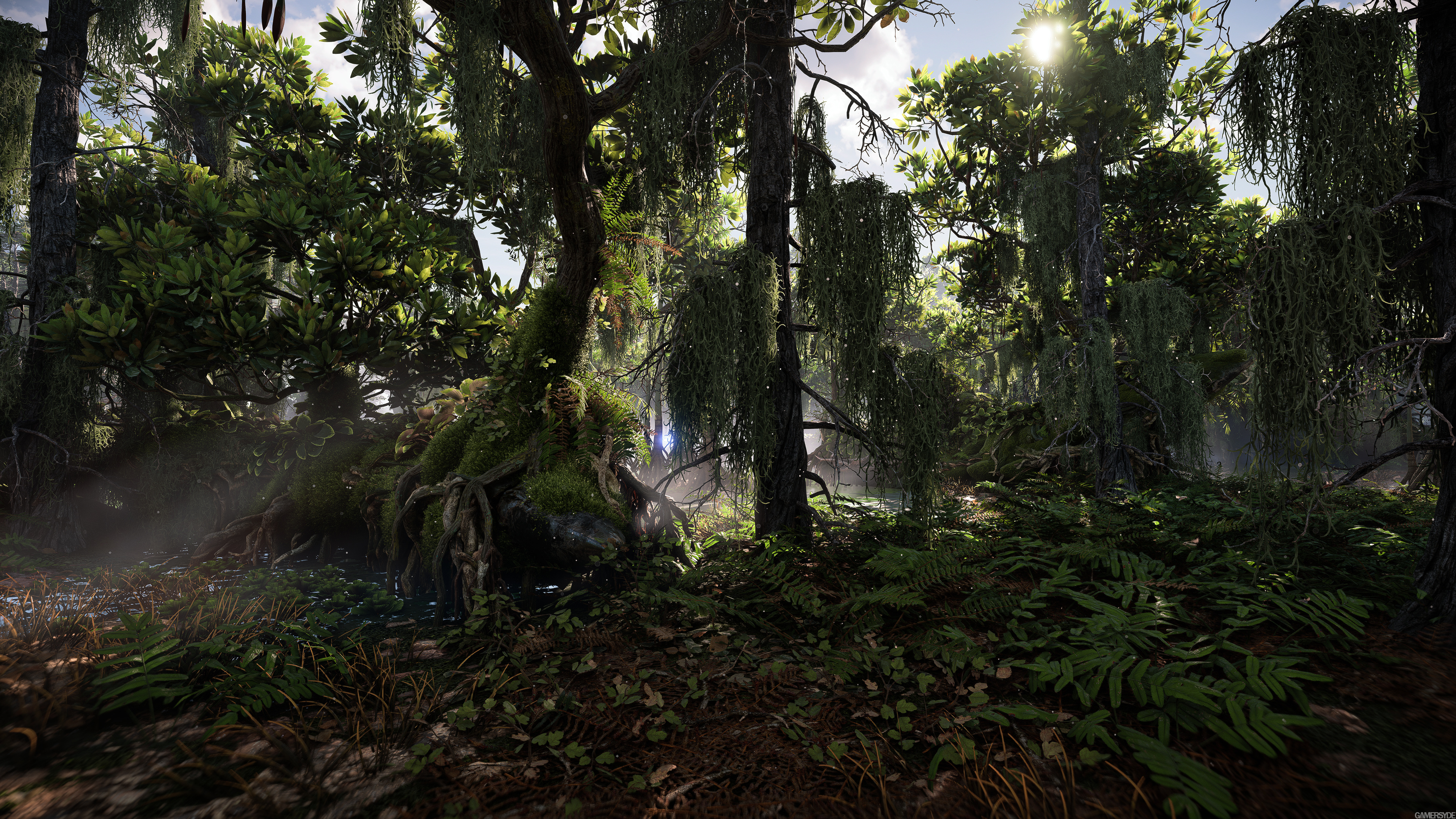
That said the game is gorgeous. But it's the fact that it looks so good that makes things really stick out when it's not done as well as the other excellent parts of the presentation. So the poison gas bubbling looks strangely disconnected. They'd look fine in a game which isn't generally so excellent looking, but considering how great everything in the game looks, it really sticks out as not being on the same level.
Which reminds me of something I've been thinking about. The better a game looks, the more critical I am of things not being correct or not being of a consistently good quality. Something that I'm far more forgiving of when a game isn't really good looking. Imperfections just generally really stick out a lot more when the overall presentation is excellent versus not so great or just good.
That paradoxically means that the more realistic graphics rendering gets, games that aim for a realistic look end up looking worse because everything that isn't realistic looking stands out like a festering diseased sore thumb. Which, IMO, is a good thing that HFW didn't go for realistic looking graphics but a more stylized look that borders on realisitc.
Regards,
SB

