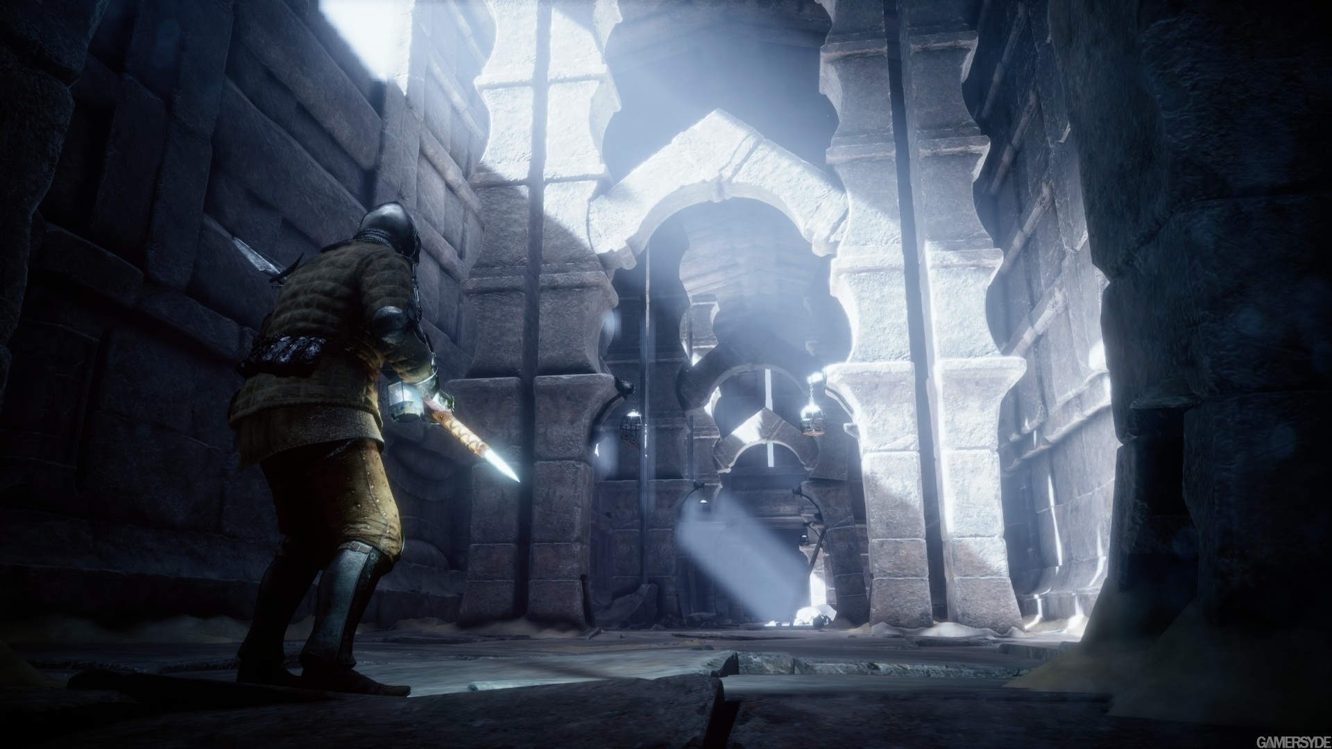
Capcom's Deep Down

it's more like talking about a game they'll never play, developed by a company they don't trust, on a console they'll never own, made by a company they feel threatened by. But still voicing an opinion about it.

I will use this as my... I don't know how you call but the thing that is underneath my posts :p
(I don't even know how to do this tbh)

I think the game is shaping up to be really great. I think the tech demo used maximum effects in controlled environments without AI and (possibly) without realtime physics calculations. As a launch (window) title (? ) they won't be able to reach that tech demo for a 100%, but I am pretty shure that "Deeper Down: the next Ascend" will reach it with ease. Although I predict at 720P framebuffer at 60pfs, which doesn't matter that much because of all the screen space effects I doubt there will be 1 pixel-sized particles at 1920*1080
 
This game looks awesome.

I really hope X1 fans (like myself) can stop entering PS4 game threads and trashing games for no reason, much like some PS4 fans are doing the same to X1 games (see Ryse thread for details). This board should be more mature than that. Some of us have been here for over 10 years and are tired of it.

Agreed - much like Moores Law can predict number of component on chips, Fanboy's Law can predict the reception of a new IP or piece of hardware. I first postulated Fanboys Law back in June and once the Royal Academy of Computing and Mathematics finished reviewing my data we can create a wikipage.

On a serious note I thought the lighting was ok I think someone mentioned earlier they thought it was poor. The fire and wind was really good IMO as was noted, if anyone has a link to how they are doing the fire effects I'd love to see some additional info.
 
Could someone explain the pixelized light shafts?
image_deep_down-23241-2664_0009.jpg
 
I hope the rooms where you fight in get a bit bigger. I'm assuming it will change for the better in the end, but fighting a seemingly endless number of Manpigs one on one everywhere you go could get a little boring :)

If they can make the enemies as varied as in Diablo (or Wizardry or what have you) they'd be onto something here.
 
It's nice to the fluid simulation back during the press conference. That time stop power seems weird though. Are they really going to make the other players wait until it runs out. What if everyone starts using that?

Too bad the playable demo is so limited. Only one player fighting one type of monster. Those narrow corridors seem rather cramped for 4 players.
 
Could someone explain the pixelized light shafts?

I'd assume the light shafts are dynamically generated and so are usually in motion. The problem with none doctored screen shots is that they, potentially, show flaws that wouldn't be apparent in real time.
 
To be fair, I felt the same about Airon's post, but he did say he'd wait to see TGS gameplay to see if it changes his opinion. He's seen the latest stuff, is bitterly disappointed, and said as much, which is fair enough. Now, if he feels the need to repeat this disappointment any more, having come to a conclusion, then he really does need therapy. It may be that odd behaviour of people where they find themselves watching something truly horrible, that they can't take their eyes away despite it being so offensive, and rather than spend his time, oh, I dunno, playing a game he does like, or reading about a game he does like, he's trapped watching this game he hates. If that's the case we really ought to pity the poor fellow, but hopefully it's not as extreme a situation as that. :yep2:

This is why Beyond3D should have a 'like' or 'recommend', or just 'i love you' buttons for posts. Should have had for many years.
 
Could someone explain the pixelized light shafts? [/IMG]

They are probably not 2D light shafts like in gears of war 3 other unreal engine games, or halo4, but rather volumetric lights, like Uncharted 3, the last of us or other PS3 exclusives.
 
People can complain about the downgrade based on poorly compressed or off screen footage all they want, but a lot of the impressions I'm hearing from people actually at TGS is that the game looks gorgeous. On the CAGcast tonight they were saying it's the only thing at TGS that actually looks "next gen".
 
This video shows the Light Armor class, played with a bit more magic than the previous one. And of course, still 1080p 60 fps but no sound like the previous video.

http://www.gamersyde.com/news_tgs_more_deep_down-14648_en.html

Not watched yet, but this one has the soldier with the quilt like armour.

Edit: watched it. Apparently these are different classes with different abilities.
This video shows there a re multiple skills to select from and a Casual mode which can be turned on and off. Also, the Ogre looks very different in this video. and the Ogre has the ability to throw fireballs too. :) Randomnly generated FTW !
God mode is enabled at TGS. Also shows some clipping and camera issues. I will say this is the best video of the game we have till now.
 
Last edited by a moderator:
Could someone explain the pixelized light shafts?

That pixellation doesn't seem to be in the light shafts but in the "glow/bloom" they are using for those windows. Maybe they are using some box method for blurring and it doesn't have enough samples. Maybe. I can't be sure cos the bloom/glow on the edge of the spear doesn't have those boxes but we can see more of that pixellation ahead n the left of the image, where more windows exist. Could be a bug.
 
That pixellation doesn't seem to be in the light shafts but in the "glow/bloom" they are using for those windows. Maybe they are using some box method for blurring and it doesn't have enough samples. Maybe. I can't be sure cos the bloom/glow on the edge of the spear doesn't have those boxes but we can see more of that pixellation ahead n the left of the image, where more windows exist. Could be a bug.

I can't even see the pixellation (pixelisation? who knows). I'll be a very happy bunny this next gen as clearly I got to the point where I'm no longer able to see the little niggles and errors I used to notice all the time.
 
I can't even see the pixellation (pixelisation? who knows). I'll be a very happy bunny this next gen as clearly I got to the point where I'm no longer able to see the little niggles and errors I used to notice all the time.

It took me quite some time myself :p . Its on the edge of the glow around the window above the knight, on th eleft.


By the way, heres some impressions from IGN:
Playing through the same demo twice, the two dungeons that the game laid out for me were very different, though they looked broadly the same. First time through, the ground gave out beneath my feet within a few steps, plunging me down into a pit with an ogre. The second time, there was a twisting corridor leading to a hidden door, with traps that spat fireballs. First time through, a childlike voice in the background kept going on about the wonders of alchemy as I crept through corridors; second time, it was a female voice asking for help. The monsters seemed to be randomly placed too, though there was only one in this build - an ogre-like creature that swung with a blunt club.

That is very encouraging.

Also, we still don't know what this was when they demoed it :
http://farm4.staticflickr.com/3749/9815831963_238ccd12ae_o.gif

The time stopping spell? Can someone who understnds japanese translate what they said while demoing this?
 
This is why Beyond3D should have a 'like' or 'recommend', or just 'i love you' buttons for posts. Should have had for many years.

We used to have it for posters.

What we realized was the 2 factions would give "likes" to people in their camp, e.g., for saying something they didn't dare to. If someone got voted down, he will get voted back up by his clique. It became mechanical.

The mods decided to just let people focus on the contents.

I missed that feature sometimes though. :)
 
I can't even see the pixellation (pixelisation? who knows). I'll be a very happy bunny this next gen as clearly I got to the point where I'm no longer able to see the little niggles and errors I used to notice all the time.

Same here.

The only improvement I want to see is to reduce shader alias in GT7.
 
It took me quite some time myself :p . Its on the edge of the glow around the window above the knight, on th eleft.


By the way, heres some impressions from IGN:


That is very encouraging.

Also, we still don't know what this was when they demoed it :
http://farm4.staticflickr.com/3749/9815831963_238ccd12ae_o.gif

The time stopping spell? Can someone who understnds japanese translate what they said while demoing this?

Looks like it but my Kindergarten level Japanese is not good enough to help. :oops:
 
People can complain about the downgrade based on poorly compressed or off screen footage all they want, but a lot of the impressions I'm hearing from people actually at TGS is that the game looks gorgeous. On the CAGcast tonight they were saying it's the only thing at TGS that actually looks "next gen".

They said exactly the same thing in the 8-4Play Podcast. Everybody seemed very impressed.
 
I can't even see the pixellation (pixelisation? who knows).
That's because it doesn't exist. Or rather, the description of pixelisalation in light shafts is incorrect. There's a clear chunkiness around the window when one goes looking. Look at the window and you can count 6 steps at the bottom in the glow. As a decidedly non-final build, I wouldn't give it a moment's attention myself.
 
Back
Top