Capcom's Deep Down

This is a good one:
Deep-Down_2013_09-12-13_006.jpg
Yup, indirect lighting looks quite nice.
Shadow maps are going to be the bane of this generation. They are just so damn hard to get right, the bias and resolution and other parameters, especially when you want to cover great distances with the same light.
Indeed, I really hope we would see some alternative solutions during coming generation. (Some form of raytracing would be nice. ;))
 
Translation of the video doc.

The game is set in New York, year 2094. The members of a group called “Ravens” (the players) have the special ability to travel back in time by reading the memory of items and listening to the voice of the past. They can travel to the past by using the information they read from the items.

The game is called a “Reading RPG” for two reasons: first because of the idea of “reading memories” mentioned above, and then because of the theme of “reading emotions” The emotional theme comes from the fact that various dungeons correspond to different emotions. For instance by touching a statue and reading its emotions one can feel the grudges of a vicious mind that will then characterize the resulting dungeon.

The theme of “knowing the truth of the past” is also present, and that’s the Ravens’ purpose.

Capcom wanted to make an online only game to do something different from the past experiences of Monster Hunter and Dragon’s Dogma, in order to enjoy the online gameplay without restriction, on a platform (the PS4) that has an inseparable relationship with online gaming.

By playing with friends one can exchange the information gathered from dungeons and further the investigation of the mystery behind Deep Down.

It’s still possible to play solo, and gamers should begin like that in order to get familiar with the game, then they should challenge the dungeons alongside other Ravens.

Ono-san wants to reduce the barriers between players and online gameplay, in order to reassure those that are hostile to the idea of always online games.

Since players are supposed to play the game for a long time, like most online games, large updates have already been scheduled, and they will happen on a regular basis. Capcom will continue to develop the game after release in order to let players feel the changes regularly.

There will be a beta after the release of the PS4, and Ono-san wants it to begin as soon as possible.

Sony has created an easy development environment for the PS4, and that’s a welcome change.

The quality showcased in the PlayStation Meeting in February was reached considerably quickly, and things like 60 frames per seconds are relatively easy to achieve.

The automatic generation of dungeons is achieved thanks to the power of the PS4. It’s not completely random, but automatically generated according to certain parameters. Since the PS4 has specs similar to a PC, dungeons can be generated like this thanks to its memory capacity and computing speed.

The representation of environments is close to photo realistic, and elements like degradation of weapon and armor will also be displayed graphically. The PS4 is able to calculate the accumulation of mold, dirt and rust on equipment and display it on the textures, giving you the sensation that those items really exist in the world.

The light bar on the DualShock 4 will represent the emotions of the dungeon being played. When a Raven listens to the voice of the past, it will come from the speaker on the controller, in order to increase immersion. The touchpad will also be used for tactile features.

Remote play with PS Vita will be fully supported in order to play the game more comfortably. The team is also thinking on how to use smartphone and tablets.
http://www.dualshockers.com/2013/09...bout-60-fps-vita-remote-play-and-dualshock-4/
Would be dumb if the game is 720p/60fps for a slow dungeon crawler like this.
 
Reasonable art direction.

Monsters could be more grotesque (a la Demon's Souls and Berserk). Wondering about animation. That's the department that makes Demon's Souls monsters come alive, especially the skeleton warriors.

The environment should be more aggressive or despair. The face here is not angry or sad enough:
http://gematsu.com/gallery/albums/deep-down/september-12-2013/Deep-Down_2013_09-12-13_004.jpg
[size=-2]Is he yawning ?[/size]

May need to tune the lighting so that the mood is more oppressed (Think Tower of Latria). Ah, that's why dynamic level generation is tough. Should use warm, flakey light, not white light. Eerie blue light might work better in some scenarios too.

I like the art very much actually. More Lord of the Rings than Darksiders. If you really think about it, the art in the Souls games actually isn't particularly grotesque either. Certainly not the environmental art. Sewers look like sewers, tombs look like tombs, and Anor Londo isn't eerie because it's dark and gritty, but because the quiet and emptiness of its hallways seems so weirdly ad odds with what is actually a splendid and quite majestic location forever drenched in the beautiful hues of the evening sun. Heck, the few environments in DS that really stand out from standard medievil fare are actually quite beautiful (like the Ash lake)

Loving the skin shaders on the creatures. The subtle translucency makes them look properly "next-gen"
 
Last edited by a moderator:
Looks pretty good.

Deep-Down_2013_09-12-13_004.jpg


Any pixel counters want to give it a go? Seems it's 720p native?

I hope they can make the textures higher res by launch. Feel too low res for a machine with 8gb RAM.

Loving the skin shaders on the creatures. The subtle translucency do make them look properly "next-gen"

Exactly ! Lovely skin shaders and beautiful lighting. Good particles and first time ever fluid simulations ! Hoping they make the other aspects crisp too before launch. Me too loves the minimalistic art :smile: ! The environs feel inviting as if they are enchanted, yet these monsters feel like deformed creations. The fear is in ur mind and how underpowered you feel in front of these pig-like men.

This is beauiful:
Deep-Down_2013_09-12-13_002.jpg

Deep-Down_2013_09-12-13_003.jpg

Why didn't anyone post this ?
 
Last edited by a moderator:
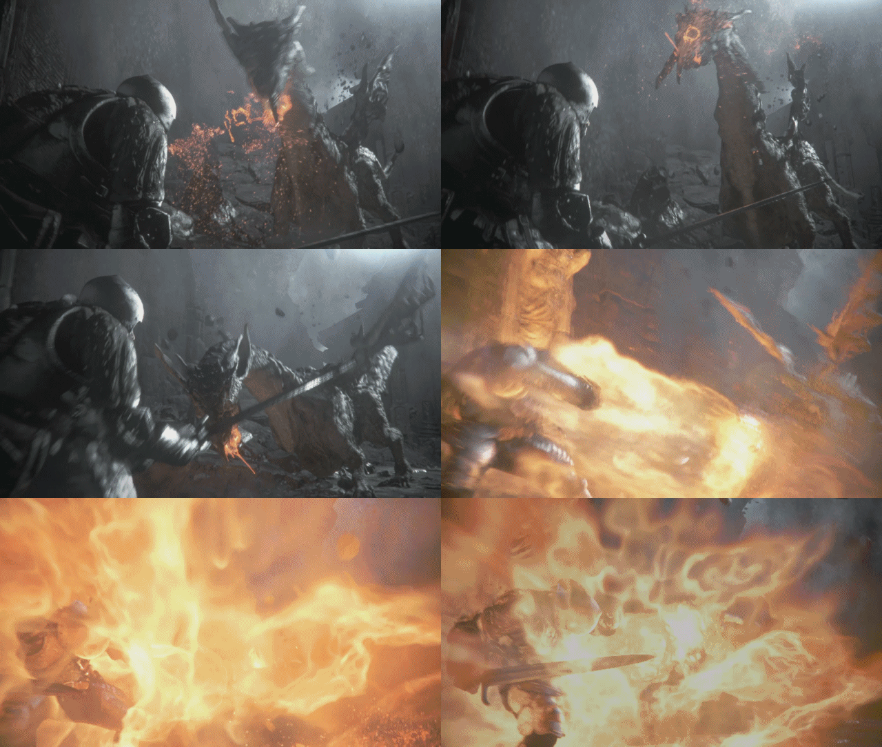
The dragon's flame doesnt look like it has the same volume and definition as it used to. It looks blurry and flat. I think that the dragon's geometry was also somewhat reduced
 
The dragon's flame doesnt look like it has the same volume and definition as it used to. It looks blurry and flat. I think that the dragon's geometry was also somewhat reduced
I think the biggest downgrade is the texture res. If they put those same high res textuers on this Dragon, it might be the same polygon wise.
Let me take a screen grab from the tech demo..

EDit: Here's one from the tech demo:

ultl.jpg


I think the hanging ear gives an idea of the poly edges. Texture res is very high compared to the new screens And lighting seems so much better in tech demo. But then the screen on top of this page has similar lighting.
 
Last edited by a moderator:
Yeah, 720p, post AA given the wild variation of AA across the scene (some edges none whatsoever).

Shame. But I guess if their aim really is 60 fps with all the nice lighting and effects somethings got to give. Maybe the combat will actually have some meat to it if framerate is a priority.
 
Surely 60fps is not something that's exactly necessary for this type of game? It's hardly Devil May Cry or something where speed and accuracy is paramount. I think they should focus on the eye candy.
 
Surely 60fps is not something that's exactly necessary for this type of game? It's hardly Devil May Cry or something where speed and accuracy is paramount. I think they should focus on the eye candy.

Eye candy costs money. Maybe they don't want to spend too much.
 
Last edited by a moderator:
Surely 60fps is not something that's exactly necessary for this type of game? It's hardly Devil May Cry or something where speed and accuracy is paramount. I think they should focus on the eye candy.

Who knows. Ono might get some SF guys working on the fight mechanics with 1-2 frame hit/block accuracy or something.

Contrast that to the Souls games where everyone's rolling around like acrobats trying to get a lucky back stab on some lag..
 
I think the biggest downgrade is the texture res. If they put those same high res textuers on this Dragon, it might be the same polygon wise.
Let me take a screen grab from the tech demo..

EDit: Here's one from the tech demo:

ultl.jpg


I think the hanging ear gives an idea of the poly edges. Texture res is very high compared to the new screens And lighting seems so much better in tech demo. But then the screen on top of this page has similar lighting.

deep_down.jpg

DeepDown.jpg

Deep-Down-capcom.jpg

deep-down-PS4.jpg

Yeah texture res took a hit. It also looks that the downgrades could be much more than that.

First of all the high precision and intense lighting emitted by the fire in the first image was not demonstrated yet in the same quality in any of the new footage

The high quality object based motion blur is gone

Camera focus as demonstrated in the image you posted is gone

Subsurface scattering in my second image (dragon's mouth) could be gone too.

Character model detail has also been reduced.

Also one of the most impressive aspects of the original demo was the smoke when one of the characters have shot an exploding arrow on the pillar. It looked very dense and had volume. I think it also absorbed lighting and shadows and cast its own shadows on the environment.

Framerate and animation were as smooth as butter too. Not so in the latest videos
 
DOF is still there, so is sub surface scattering. I guess we will have to wait for TGS before we can make aNy proper comparisons. Lets hope they show improvements till next E3, like Driveclub, as frankly I don't understand why the texture res is so low.
 
Back
Top