Unreal Engine 5, [UE5 Developer Availability 2022-04-05]

Restir GI is not what Cyberpunk uses, it just brute forces GI bounces and their talk on doing the Cyberpunk "pathtracing" mentions such specifically.

Are you sure?

“Now, we're introducing Reservoir-based Spatiotemporal Importance Resampling Global Illumination (ReSTIR GI) with the launch of Update 2.1 and the Cyberpunk 2077: Ultimate Edition. ReSTIR GI is an advanced sampling technique for indirect lighting available in the NVIDIA RTXDI SDK, which further improves the quality of fully ray traced lighting in Cyberpunk 2077.”

I don’t know where you guys got the idea that Nvidia only slaps RTX on their proprietary stuff. They’ve been riding any game that’s using DXR and/or DLSS in a way that makes their hardware look good. Far Cry 6 for example would not apply but Watch Dogs Legion does.
 
"RTX On" for me always simply meant "this is what you get when using the RTX branded hardware features of Nvidia GPU's starting with Turing" namely the hardware RT capabilities and tensor cores.

Hence why they changed their GPU naming convention from GTX to RTX with Turing. It was denote the significant new hardware capabilities which Nvidia market the usage of as "RTX On"
 
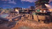
The second area of Wukong is very reminiscent of the Lumen in the Land of Nanite demo. This game is gorgeous, but hopefully some of it's issues can be ironed out. Full disclosure I believe with these pics I had Full RT off and I had mods for removing sharpening and enabling VSMs. Anyway, some of the architecture and environmental design in this game is stunnnnnnning.. and for the record, I'm loving the game itself.

20240825163612-1.jpg


20240825160117-1.jpg


20240825162054-1.jpg


20240825161153-1.jpg
 
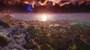
I went back and watched Lumen in the Land of Nanite and I would say it still looks markedly better than any game. I doubt we will see a game come close to that level of geometric fidelity this generation. The lighting, shadows and materials are also of a much higher fidelity.
 
Massive global illumination and indirect lighting difference in this video (timestamped).


It seems RTGI typically bounces more light than Lumen. The result isn’t always better looking though. Was it the artist’s intent for those areas to be so bright and less contrasty? Surely they can tweak irradiance values if they wanted to produce similar results with RT on and off.
 
Massive global illumination and indirect lighting difference in this video (timestamped).
Honestly very weird and unexpected results in both cases. Even more than the last comparison the indirect lighting is "brighter" but looks almost completely flat here. You could probably convince me this was a constant ambient term even though again I'm sure it is not.

This is not what I would expect out of "path tracing" TBH... I guarantee the reference path tracer would produce an image with way more lighting depth than this. Hell even a big area light behind the camera or bent normals with some mid-range AO would. Something funky going on... could be bugs, could be settings.

1724729638604.png

The Lumen result is definitely too dark though - hard to speculate as to why without being able to fix the exposure and look at albedos and such.
 
Last edited:
The Lumen result is definitely too dark though - hard to speculate as to why without being able to fix the exposure and look at albedos and such.

Need more light bounces! (cached worldspace restir paths can add more bounces relatively cheap, just assume the paths are still valid for a few bounces during radiance cache updating and do multiple bounces, yay!)

Regardless, there's a backup non Lumen GI solution that uses a precaptured cubemap and distance field AO. Apparently there's some sort of bug in this game where certain setting might not change correctly, so this might be the result. I.E. this is low GI setting based off cubemap + AO, even though he changed the setting to RT.
 
Last edited:
Honestly very weird and unexpected results in both cases. Even more than the last comparison the indirect lighting is "brighter" but looks almost completely flat here. You could probably convince me this was a constant ambient term even though again I'm sure it is not.

Could it be due to overly aggressive reuse of spatial samples? That could reduce the effective resolution of “per-pixel” GI.
 
Could it be due to overly aggressive reuse of spatial samples? That could reduce the effective resolution of “per-pixel” GI.
🤷‍♂️ it's really hard to speculate with confidence but my gut says there's something significantly broken here. Beyond a little bit of fuzziness around a few objects there's not even any broad-scale indirect shadowing/AI from the giant statue, so I don't think it's just an issue of resolution.
 
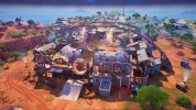
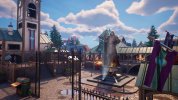
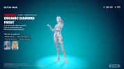
Took some screens in Fortnite. Just some stuff of the current map and the character rendering, if you're interested to see what fortnite looks like lately. 9 images behind the spoiler tag. Settings are maxed out but with hardware ray tracing off.

Fortnite   2024-08-29 2_40_45 AM.jpg

Fortnite   2024-08-29 2_42_24 AM.jpg

Fortnite   2024-08-29 2_44_06 AM.jpg

Fortnite   2024-08-29 2_44_40 AM.jpg

Fortnite   2024-08-29 2_46_51 AM.jpg

Fortnite   2024-08-29 2_50_02 AM.jpg


Fortnite   2024-08-29 3_01_10 AM.jpg

Fortnite   2024-08-29 3_01_33 AM.jpg
 
Fortnite's art style has always been utter and complete shite. The game simply looks... off-putting.

Crazy talk. I really didn't like the old character design style from when the game launched. They had really weird eyes and faces. And the world had this pure cartoon style, where everything was oddly shaped and flat colours. Now it's a hybrid of cartoon and realism. I like it, but I get why other people wouldn't.
 
@davis.anthony I think that guy is full of shit. Video is starting to make the rounds. I've already seen a whole bunch of debunking of that, but it's hard to collect all of it because it's scattered. From what I understand he's not a game developer and never has been. He's trying to crowd fund a company so he can make a game and "fix" geometry with ai.
 
Back
Top