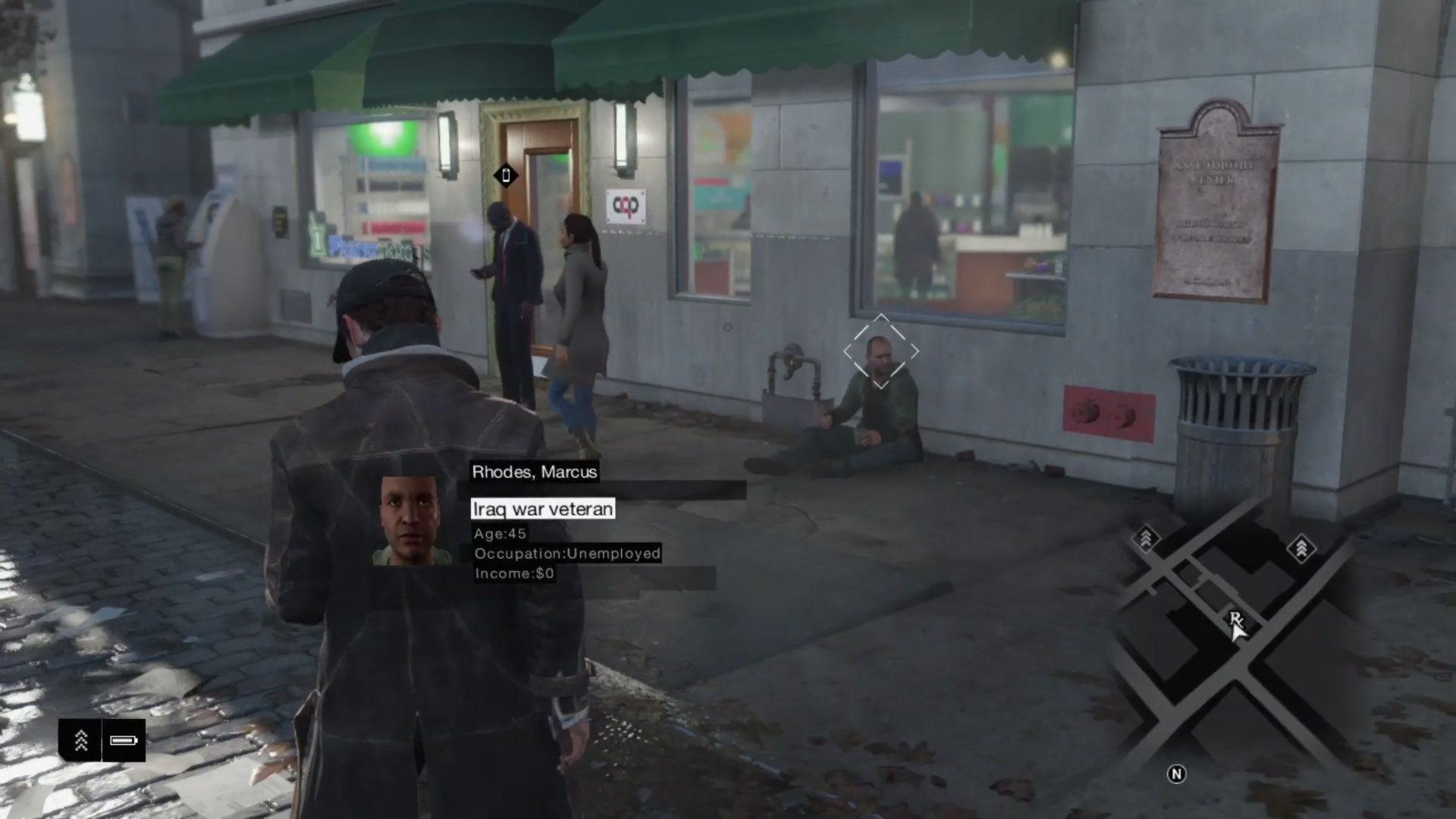
You say light is never too soft to cast shadows but in the pic I posted above, there is very few shadows
There are shadows everywhere, just incredibly subtle. The hydrant has a 'halo' shadow. The girl on the far right has an obvious one. There has to, because her body is occluding light from all directions. It's just that the contrast is low. The man is the only place where a contact shadow isn't visible and that's likely because the surface he's standing on has camouflaged it.
You mention the porch at the back but is that a shadow from a light source or darkening caused by the absence of directed or reflected light - subtleties of of lighting probably beyond a console open world game engine.
It's darkening due to an absence of light from the overcast, hemispherical sky light. Light is coming at the door from all angles, but some of that light is stopped by the porch, reducing the amount of light reaching the door and causing shadowing. Regards expecting GI/AO in games - 1) It's been baked in games for years. 2) Modern engines are incorporating it in realtime, although maybe not for an open world game. 3) It's present in some cases in WD images but not others; its inconsistent. 4) Early WD demo's had gorgeous visuals showcasing great lighting, so people were expecting it, and the similarity to older, simply-lit games is made with the final build.
But there game is certainly lighting and shadowing during the day.
Sure, but it's inconsistent, and really broken in some cases. eg. The deli screenshot with zero shadowing on the guy serving. Your first screenshot shows both direct and indirect shadowing and doesn't look too bad. Your second pic is lacking soft shadowing somewhat (under porch).
I'm not denying visuals vary in terms of general appeal but I don't think it's because of the lack of lighting, I think the lighting and shadowing is there but the effect is similar to the real picture I posted before. Simply too subtle to discern
I disagree. It's not too subtle - it's missing. It's like good audio - it's good when you don't notice it. Lighting is good when it looks real, not when it's analysed and features ticked off. The numerous independent opinions saying people find the visuals of this game flat is good indication that the lighting is off. It's like the Uncanny Valley with faces. You don't need to be a trained 3D artist to recognise a face that's wrong. You don't need to have experience in game design or CGI to spot when a scene doesn't look correct. It feels wrong at first, and then you can analyse it to find what's causing that feeling. Sometimes of cause something can look right, like fudged reflections, but be found wrong on analysis, but you can't render a game according to real life principles and end up with something that looks far removed from reality!
 You mention the porch at the back but is that a shadow from a light source or darkening caused by the absence of directed or reflected light - subtleties of of lighting probably beyond a console open world game engine.


