The Order: 1886

Congrats to RAD...even with all those obvious and right into your face fundamental 'flaws' they put into this game because they are dumb ass devs and don't know better....somehow, every single review and every single hands-on report in forums noted that this is without a doubt the best looking game they ever saw up to date and the closest to offline CGI yet.

Oh RAD you stupid lucky bastards...
Those "flaws" are a major factor for all the praise.

To be fair P.T. looked great because of it's great lighting in a very very limited scope and the noise/distortion gave it a hand held camera like effect. But yes I see what you mean, without the handheld camera like effect it would look quite gamey. But that's is what the "cinematic immersion" is about I guess.
Exactly.
 
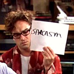
The_Sarcasm_Misunderstanding_by_ThePlotThinnens_zpsa65f7933.jpg
 
Everyone has different tastes, but I think the game looks incredibly good. They're obviously a top notch studio, with a talented art department. Any perceived "flaws" are not for lack of effort or know how, but compromises based on artistic direction. I still like to see the discussion about what those tradeoffs are, and what their upsides and downsides are. I think anyone that complains the game is too blurry because of x, or any other complaint, is fair to say so. All interesting.
 
RAD uses these post effects as an element of the visual style of the game, and quite honestly it's unique enough IMHO. You could list any number of games using each individual feature, more or less successfully, but the overall package is what matters and what seems to impress a lot of people. A razor sharp look would of course expose a lot of the realtime trade-offs like more aliasing and such, but it'd also deprive the game of its unique look.

I personally think that the "flawed" quality works very well with the steampunk setting too, it wouldn't be right in a modern COD game or racer or such. Also explains why they would've liked to use 24fps if it was possible.
 
Everyone has different tastes, but I think the game looks incredibly good. They're obviously a top notch studio, with a talented art department. Any perceived "flaws" are not for lack of effort or know how, but compromises based on artistic direction. I still like to see the discussion about what those tradeoffs are, and what their upsides and downsides are. I think anyone that complains the game is too blurry because of x, or any other complaint, is fair to say so. All interesting.

I agree with everything you wrote, first sentence included. The technical and artistic aspects of the game (minus the cinematic optical effects but I really hope that art in a videogame is (should be) more than just a few easy post processing filters) are top notch and the game itself looks promising. But everybody could win in the end, there is an ridiculously easy solution: what they've eventually done with lords of the fallen (CA disable option).

They could implement options to disable some effects: CA, grain filter, High-degree myopic DOF. When was the last time you really watched a movie with such heavy grainy filter? Who would want to watch such a movie? I have never watched one personally, not completely.

And I can perfectly tolerate reasonable options like a very light grainy filter (used in TLOU and only noticeable in situations of low contrasts) and DOF only for very far away backgrounds (used in Infamous SS to really hide low resolution assets).

The era of totally fixed settings in console games is over, people want more options, console gamers are PC gamers too and they want more choice and customization options as seen in many games in the last few years, from only the games I've played:

- Motion blur disable option in Warframe (god send), reduction in KZSF MP (after many complaints)
- 30fps cap in Bioshock infinite, TLOU, KZSF and Infamous SS (also after many complaints for the last 2 games)
- CA disable option in Lords of the fallen (many complaints....again).

Win/win situation for everybody.
 
I agree that the Order looks to be the best looking game this gen but I have to remind myself that it is the photoreal color palette, excellent use of the toolset, and stellar art direction that makes it stand out.
 
What impressed me the most about The Order are the convincing cloth physics, lighting, superb character models, SSS, particles and of course one of the most realistic or complex PBR system I've seen. All the post processing effects are just icing on the cake really. Plus one of the major unique point is the seamless blending of in game and cutscene graphics, this is why I put it above the other big boys.
It's just got that really natural and realistic look on all the materials, could be the lighting or something.
http://static1.gamespot.com/uploads/ignore_jpg_scale_super/349/3494045/2772271-untitled-1.gif
 
Last edited:
The whole "game would look quite shit if it wasn't for its effects fakery" argument is so unbelievably asinine. I mean, so what? Did anyone ever complain to Ridley Scott about the fact that his Blade Runner sets would have looked fake as hell if he hadn't filmed them during dark, wet and foggy conditions?

+1

Good point.
 
The whole "game would look quite shit if it wasn't for its effects fakery" argument is so unbelievably asinine. I mean, so what? Did anyone ever complain to Ridley Scott about the fact that his Blade Runner sets would have looked fake as hell if he hadn't filmed them during dark, wet and foggy conditions?

Not to mention, everything in games is fakery. If RAD wanted a cleaner look, they'd make different choices. They're not hiding anything. They just chose to do things a particular way. They seem to have put together a highly polished package. I've no reason to doubt their developers or artists. Some people will like it, some won't, and that's normal.
 
What impressed me the most about The Order are the convincing cloth physics, lighting, superb character models, SSS, particles and of course one of the most realistic or complex PBR system I've seen. All the post processing effects are just icing on the cake really. Plus one of the major unique point is the seamless blending of in game and cutscene graphics, this is why I put it above the other big boys.
It's just got that really natural and realistic look on all the materials, could be the lighting or something.
http://static1.gamespot.com/uploads/ignore_jpg_scale_super/349/3494045/2772271-untitled-1.gif
90% of that GIF is blur :p
 
Back
Top