Phalanx, the mysterious reason of its weird western cover uncovered.

Cyan

orange
Legend
Supporter
2364533-snes_phalanx.jpg


https://www.destructoid.com/discovering-the-mystery-behind-the-phalanx-cover-art-471030.phtml (original article here)

Although the origins of the legendary cover of Phalanx (a Super Nintendo matamarcianos -martianskiller, a genre which is called that way in Spanish, it is your typical shoot em' up in English- 1992) in the western markets are not unknown (the makers of the cover decided to find a way to draw attention to the game and that was the best happened to them), one of the creatives of the advertising agency that worked for Kemco in those years has now given a detailed explanation of the whole process.

In statements given to Destructoid , Matt Guss, one of the two responsible for that cover, has explained the creative process that followed.


"We knew that the game did not have much to offer, but we wanted an impressive cover"
"My advertising company had Kemco's account and our job was to create covers and advertising materials for more than 40 games, Kemco typically bought their games from Japanese external studios, some were good and some were not." Loose games needed more help to get attention in stores, "explains Guss.

"What you wanted was for people to pick up the box, be attracted to the story and buy the damn game ." The box also had to be used by Kemco to sell the games to stores, like Walmart. similar to each other : same gender, same graphics, nothing differentiated them from each other ".

Guss explains that the idea for the cover was from his partner, Keith, whom he describes as "a brilliant guy". " We knew that the game did not have much to offer, but we wanted an impressive cover ."


"Phalanx is a very mediocre game with an unexpected cover"
"Since there was nothing more we could do, we had to try to keep the potential consumer looking at the box and trying to understand what he was seeing, what we would call a moment now" but what the fuck " [" WTF moment "], says Guss .

"So Keith could make a cover with the predictable spacecraft shooting at anything like any other game or he could create a story that would make people think about it, and I guess the proof that it was a good idea is that the people are still thinking about it . "

For Guss, " Phalanx is a very mediocre game with an unexpected cover, I needed a big and weird idea to stand out from everything else ".

Phalanx was launched in 1991 originally in Sharp X68000, but the following year Kemco published an adaptation for Super Nintendo , which was the version that reached the western markets. It is a horizontally developed matamarcianos -martianskiller- that was programmed by ZOOM Inc.
 
and now we have games with generic pose of the main character from head to buttock, a bit looking back, for shooters (3rd/1st). also have generic pose of angry person as game icon in android games
 
I remember this game from a great many department store bargain bins. I also remember how much I'd been put off by that weird ass cover. Are they honestly implying that a well crafted, generic artwork of a space ship would have worked worse than a photograph of a geezer with a banjo? For an audience of pretty much male kids and male teenagers exclusively? (not that it would've done anything for girls) Sure, every once in a while Phalanx gets a mention in another top-10-weirdest-covers article. I doubt it helped them sell the game, though.
 
Last edited:
I remember this game from a great many department store bargain bins. I also remember how much I'd been put off by that weird ass cover. Are they honestly implying that a well crafted, generic artwork of a space ship would have worked worse than a photograph of a geezer with a banjo? For an audience of pretty much male kids and male teenagers exclusively? (not that it would've done anything for girls) Sure, every once in a while Phalanx gets a mention in another top-10-weirdest-covers article. I doubt it helped them sell the game, though.
It' be nice to know the sales of the game by region, that would really be quite explanatory on how effective or ineffective the cover was.

To me, that Phalanx cover makes me think that meanwhile we are here ' doing or own stuff ', in space can happen thousands of things. :)

And that idea seems pretty, but the way they translate it into the video game cover might not be well executed.

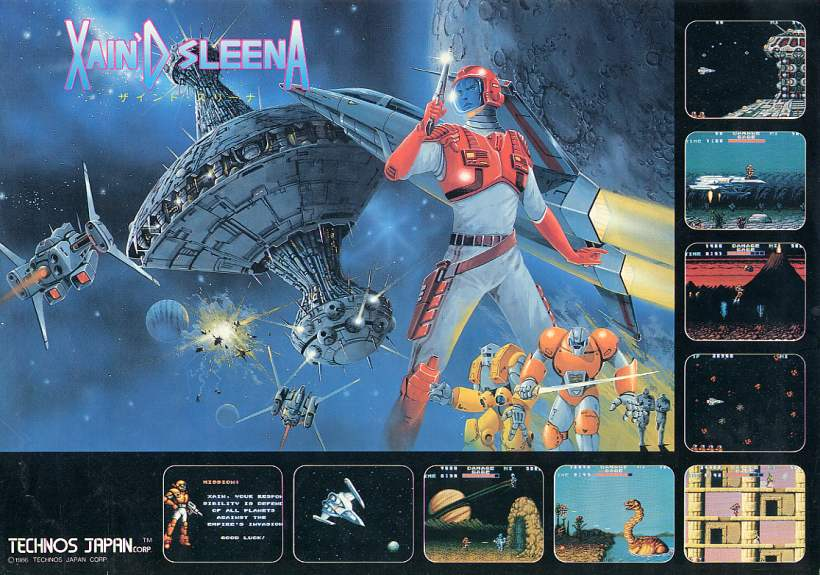
Xain'd Sleena (or Solar Warrior, whatever it's called) got that idea kinda right, imho.

xsleena.png
 
I think the cover may have worked. In the pre-internet games, it wasnt rare to buy a title out of shear curiosity. The old dude with the bajo sure is intreeguing to me. What kind of game has that as a cover? Must be something very different. It certainly has a creative story. And an original universe. Buy it. Take it home. Get disapointed... hahah.
Also, the final consuner is just part of the sale. Convincing store owners and big-chains representatives your product is worth shelf space is a VERY important part of the process, typically underapreciated by the general consumer. They'd see in that cover something different than the other sci-fi space games, and never actually bother to see the thing running to catch the borderline-hoax.
 
Also, the final consuner is just part of the sale. Convincing store owners and big-chains representatives your product is worth shelf space is a VERY important part of the process, typically underapreciated by the general consumer. They'd see in that cover something different than the other sci-fi space games, and never actually bother to see the thing running to catch the borderline-hoax.

This was very important. Back around that timeframe I had a friend that worked for a large retail chain for procurement. One of their duties was to determine which products the chain would carry. It was pretty amazing the sheer number and variety of product they had to shift through in when determining what product would get the limited and valuable shelf space in their retail chain.

In the case of games product, the ones with especially interesting covers would get more attention as it was viewed as something that could attract someone's attention to that shelf section even if they didn't buy that particular product. Since shelf space was valuable many games in those days would only have the spines facing the customer. Orienting a box such that the cover was facing the customer was expensive as it limited how much product could be placed on that shelf. IE - generally only games that were currently a blockbuster hit or games that had especially interesting covers would be oriented facing the customer on a shelf.

It was fascinating listening to them tell me about the various things they considered when looking at product.

Also keep in mind that many of the people working procurement like this weren't avid game players or even played games period.

Regards,
SB
 
I think the cover may have worked. In the pre-internet games, it wasnt rare to buy a title out of shear curiosity. The old dude with the bajo sure is intreeguing to me. What kind of game has that as a cover? Must be something very different. It certainly has a creative story. And an original universe. Buy it. Take it home. Get disapointed... hahah.
Also, the final consuner is just part of the sale. Convincing store owners and big-chains representatives your product is worth shelf space is a VERY important part of the process, typically underapreciated by the general consumer. They'd see in that cover something different than the other sci-fi space games, and never actually bother to see the thing running to catch the borderline-hoax.
lol, I know what you are talking to me about.

In this case the game isnt that bad though. It is set up on easy by default, The button to accelerate the ship, and some powers, are cool. Maybe the worst aspects of the game are some animations and movements, somewhat abrupt.
The game looks like it has several scroll parallax planes. It is similar to R-Type, one of my fav games ever btw, because if you die you lose the upgrades and the game gets tough, very tough!!
 
This was very important. Back around that timeframe I had a friend that worked for a large retail chain for procurement. One of their duties was to determine which products the chain would carry. It was pretty amazing the sheer number and variety of product they had to shift through in when determining what product would get the limited and valuable shelf space in their retail chain.

In the case of games product, the ones with especially interesting covers would get more attention as it was viewed as something that could attract someone's attention to that shelf section even if they didn't buy that particular product. Since shelf space was valuable many games in those days would only have the spines facing the customer. Orienting a box such that the cover was facing the customer was expensive as it limited how much product could be placed on that shelf. IE - generally only games that were currently a blockbuster hit or games that had especially interesting covers would be oriented facing the customer on a shelf.

It was fascinating listening to them tell me about the various things they considered when looking at product.

Also keep in mind that many of the people working procurement like this weren't avid game players or even played games period.

Regards,
SB
know that you mention it, many games had amazing covers compared to what you saw in the actual game --not to mention when you purchased a game that was on your local arcade for your console and something was amiss when you played it, but that's a different story.

The metaphor of your post could be "When covers made a difference".

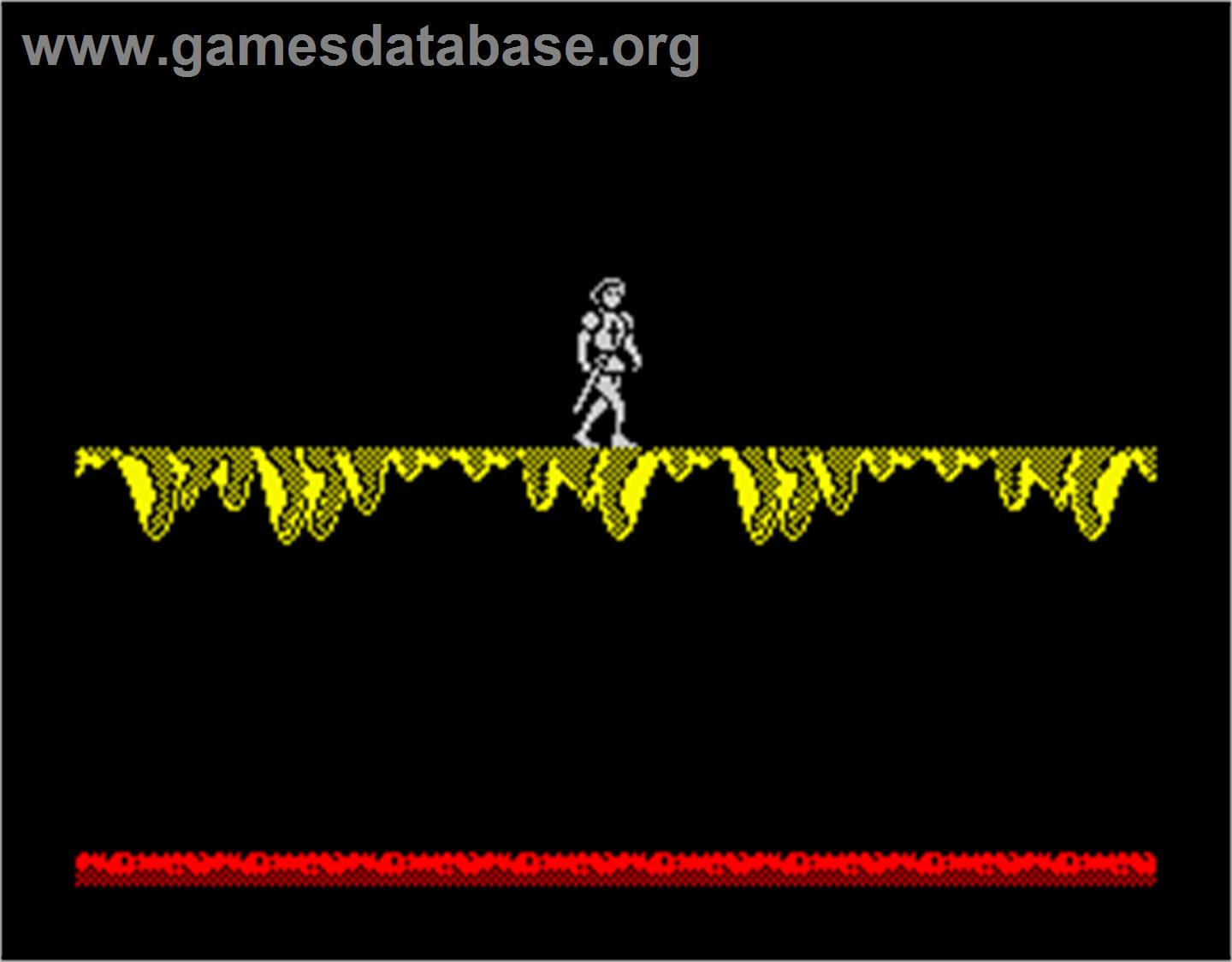
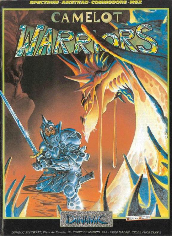
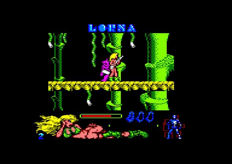
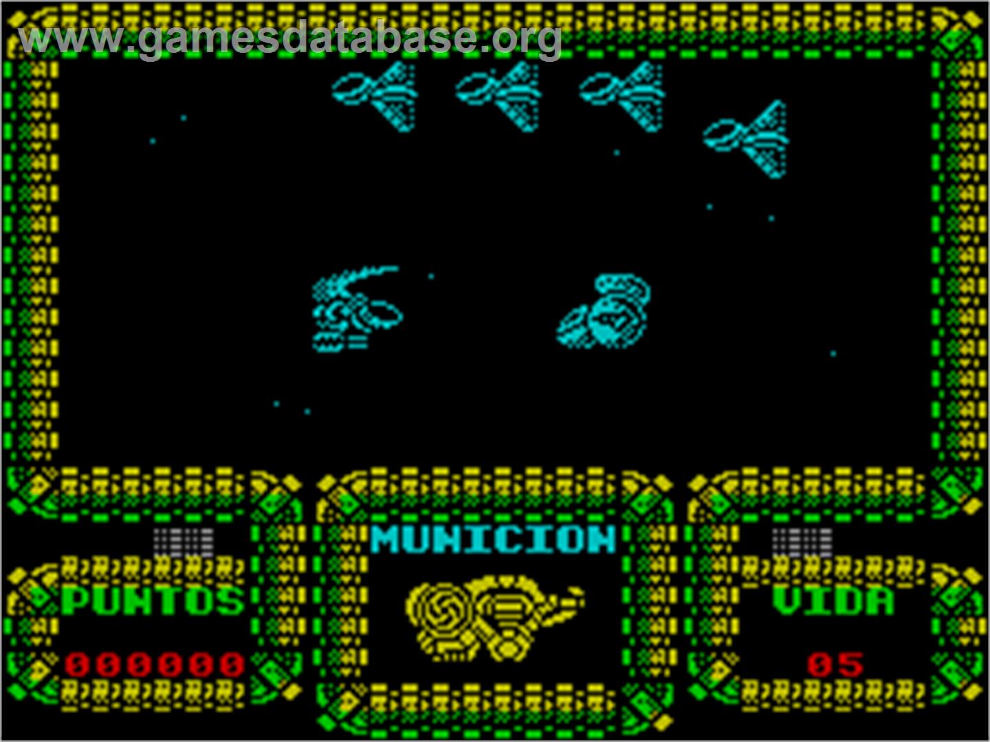
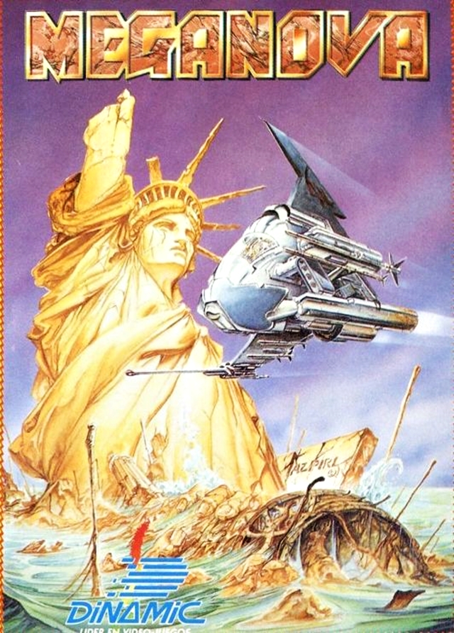
Some examples of games with amazing covers from an artist of my country, whose name is Azpiri (now he is retired), compared to the actual game.

With the cover you went from this:

maxresdefault.jpg


To this:
viaje-al-centro-de-la-tierra-erbe-01-poster.jpg

More:

Camelot_Warriors_-_1985_-_Dinamic_Software.jpg


alfonso-azpiri-camelot-warriors.jpg


723-222-303.jpg


lorna-1990-amstrad_yncg.jpg


Meganova_-_1988_-_Dinamic_Software.jpg


meganova-azpiri.jpg
 
Back
Top