You are using an out of date browser. It may not display this or other websites correctly.
You should upgrade or use an alternative browser.
You should upgrade or use an alternative browser.
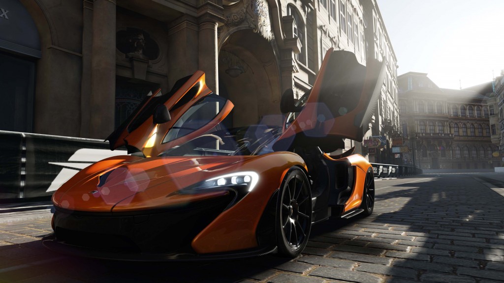
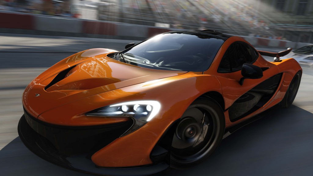
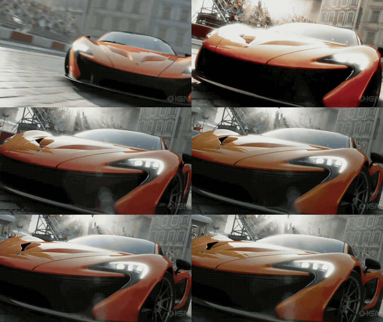
Forza 5 [XO] *large pics inside*
- Thread starter Xenio
- Start date
I'd love to see the.. game.
the e3 are for this, I just loved to see the engine in realtime
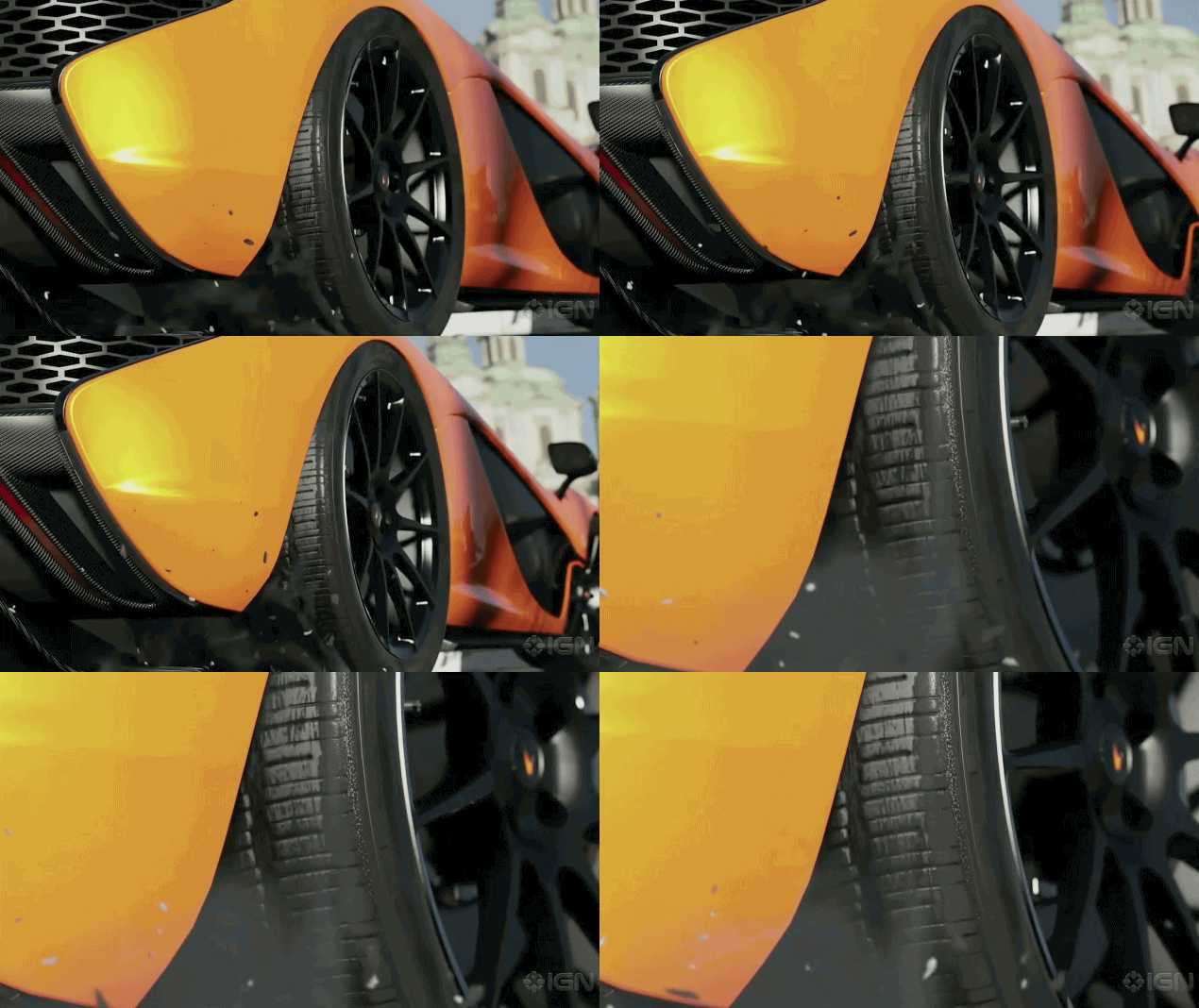
But these images are supposed to be using the actual in game engine and effects right?
But don't they always add stuff and effects into replay footage?
After playing Project Cars again it looks like it's still going to be a few years before there's a console game that looks as real...
I'd love to see the.. game.
They're just following what the competition does and gets away with it. Can't blame em...
Anyway, Day 1 purchase along with CoD. Been a while since I've played CoD.
djskribbles
Legend
But there has been gameplay footage of the competition's upcoming title, albeit, very little and off-screen. They might be waiting for E3 to show in-game footage.
(((interference)))
Veteran
But these images are supposed to be using the actual in game engine and effects right?
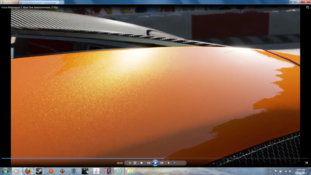
No, probably the equivalent of Autovista or replay mode in Forza 4.
The paint shaders and lighting in Autovista always look vastly better than gameplay in Forza.
No, probably the equivalent of Autovista or replay mode in Forza 4.
The paint shaders and lighting in Autovista always look vastly better than gameplay in Forza.
I don't think we should be making definitive statements yet. This is a new generation, it remains to be seen what these new machines are really capable of.
Anyway I personally like the stylised look it has. I feel like that look, in conjunction with the increased fidelity, is visually appealing. It is actually possible that they are not going for that extreme photorealistic look.
I think so. With 8GB of RAM that's what I would expect in a next generation game, the textures are really improved.But these images are supposed to be using the actual in game engine and effects right?
It looks very lush and beautiful to me too -if only a bit too good sometimes though-.
(((interference)))
Veteran
I've been playing Forza since the Xbox days and never liked the overly saturated look which persisted in 2 and 3 (and looks like 4 too, though I never got it).
It was grating that GT4 on PS2 had more realistic looking vehicles, despite Xbox being more powerful - it's like if Killzone 1 looked better than Halo!).
It's a driving sim for god's sake, no point having realistic handling if the graphics are toony.
But you're right we shall see whether gameplay looks like that.
No, probably the equivalent of Autovista or replay mode in Forza 4.
The paint shaders and lighting in Autovista always look vastly better than gameplay in Forza.
gameplay assets... they confirmed
(((interference)))
Veteran
gameplay assets... they confirmed
But gameplay rendering too? Or replay mode with better lighting, shaders and effects?
I'm guessing the latter.
(((interference)))
Veteran
Personally I don't get all the "toony" comments. Looks quite un-toony me. Just something to complain about?
Tommy McClain
No it's a real thing, even DF mention it in their analyses
http://www.eurogamer.net/articles/digitalfoundry-forza3-evolution-article?page=3
http://www.eurogamer.net/articles/digitalfoundry-tech-analysis-forza-motorsport-4?page=2
The Maple Valley track is our next destination and this is a pretty decent example of how the artists' sometimes-wacky lighting schemes have been dialled back significantly in the sequel. It's most noticeable on the car itself where a bright reflection/bloom combo has been removed. High-frequency aliasing on the engine grills above the engine is lessened, and there's a more pleasing-looking shader in effect for the rear cover lights.
Forza 1 and Forza 2 exhibited it best with their lighting and artstyle improving since F3.Another circuit that the Forza games have in common is the New York track, also found in the most recent Gran Turismo titles. Lighting has been adjusted dramatically to produce an overall more pleasing look. Once again, some of the oddly bizarre artistic decisions here have been adjusted to look closer to reality: for example, the reflection on the car in Forza 3 is no longer brighter than the sky it is supposed to be reflecting (!) and the definition of the reflections themselves is also much improved.
While the system [Image Based Lighting] is clearly a major upgrade from Forza 3 - which often looks rather flat in comparison - there are some drawbacks. Firstly, Turn 10 does not appear to have implemented a filmic tone-map, which limits the dynamic range of the lighting and can lead to both black and white crush.
The shot from FM3 illustrates what I mean:

Or this one from FM4 (the image exhibits both black and white crush... simultaneously).

Last edited by a moderator:
Similar threads
- Replies
- 28
- Views
- 2K
- Replies
- 2
- Views
- 2K
- Replies
- 21
- Views
- 10K
- Replies
- 90
- Views
- 17K

