Install the app
How to install the app on iOS
Follow along with the video below to see how to install our site as a web app on your home screen.
Note: This feature may not be available in some browsers.
You are using an out of date browser. It may not display this or other websites correctly.
You should upgrade or use an alternative browser.
You should upgrade or use an alternative browser.
Final Fantasy XV [XO, PS4, PC]
- Thread starter Bagel seed
- Start date
-
- Tags
- tig:ffxv
50 minutes of gameplay
So from multi previews it looks like it's more " new players " oriented and appealing to newcomvers. I am excited and afraid at the same time...
That opening though..not really fan of it but well. it's breaking with the old FFs. FFVII intro is still my favorite.
Can't wait to get my hands on it next november. please SE make a Neo mode for this game.
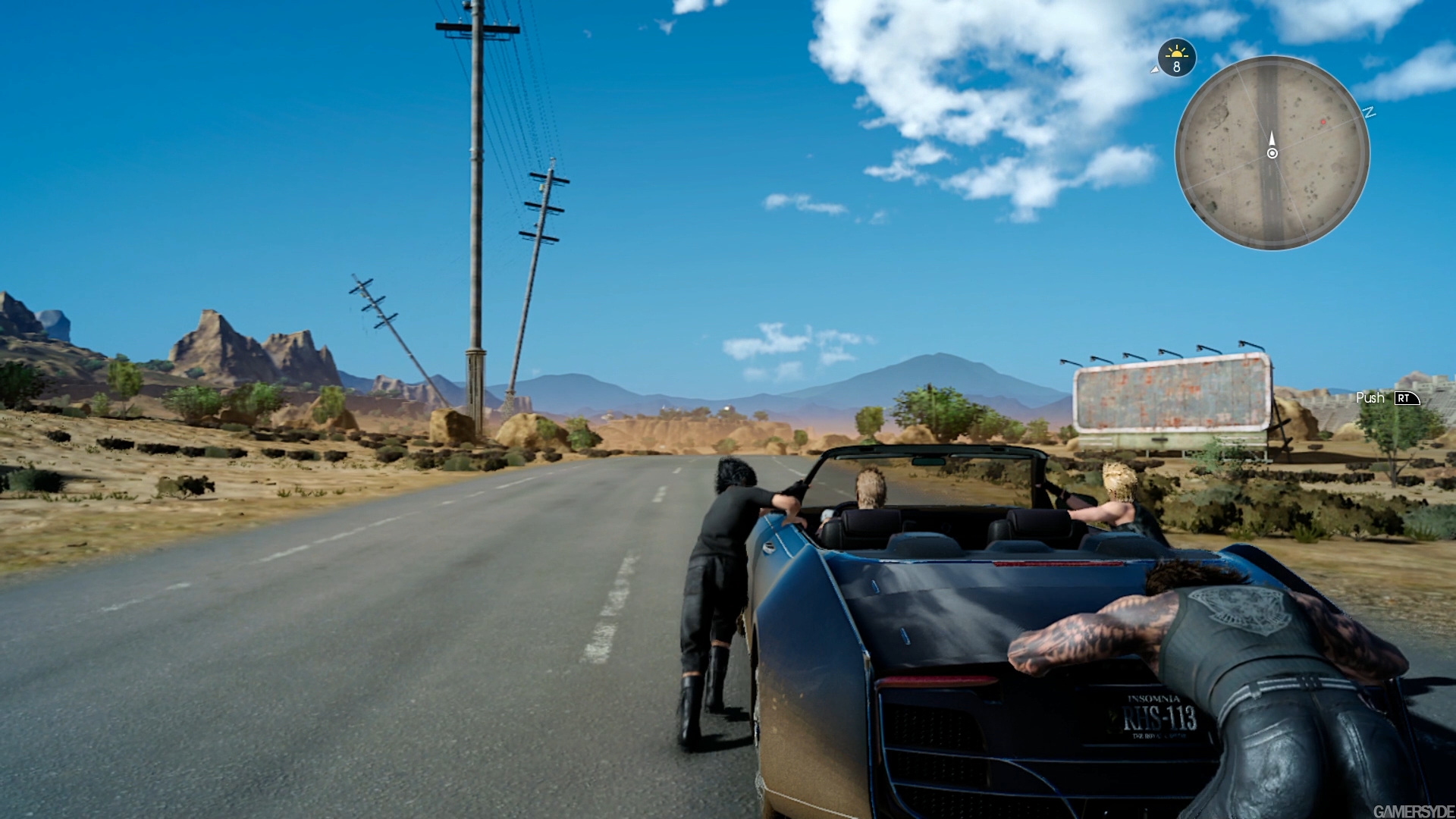
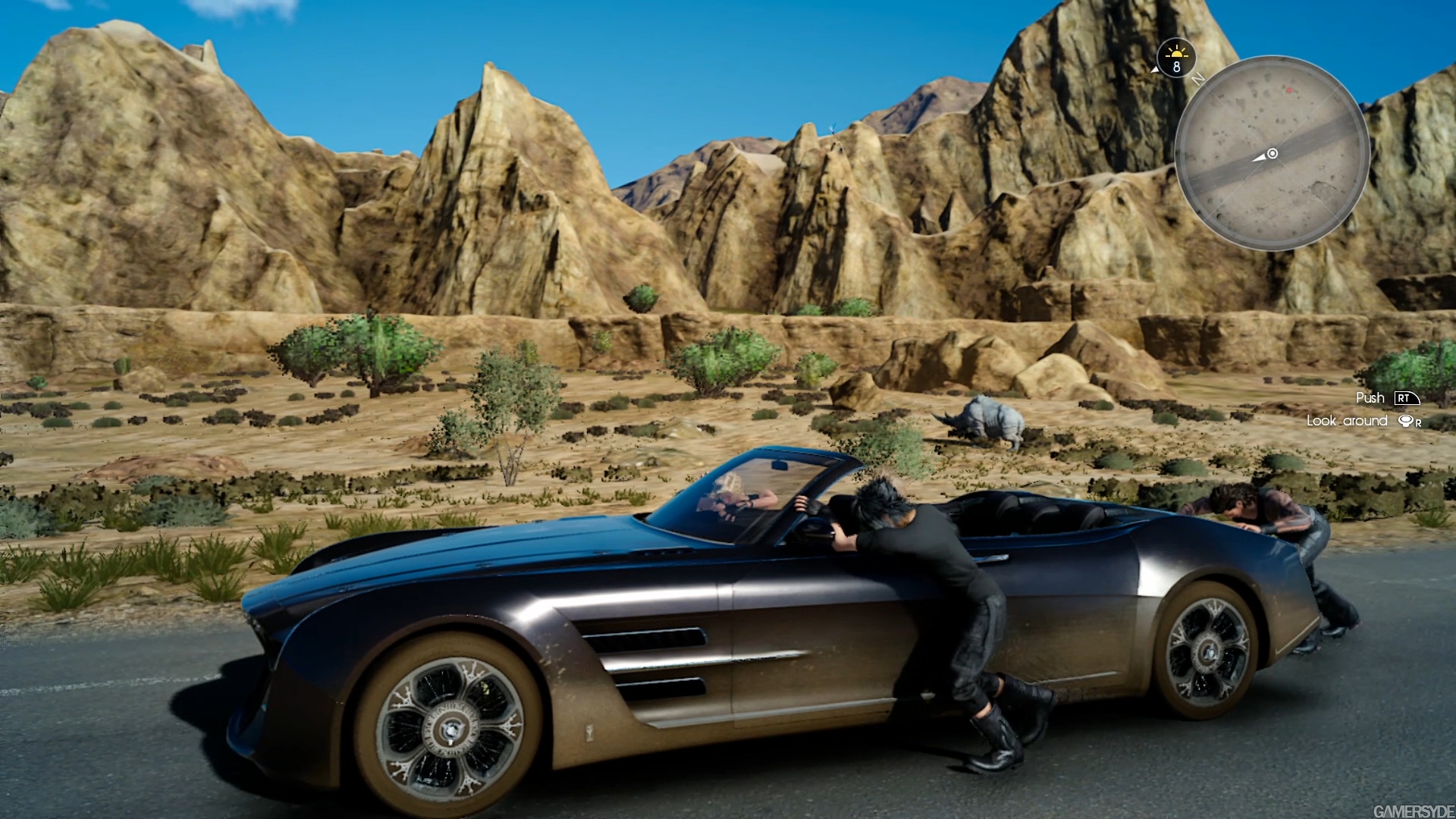
I' m kidna disapointed with the few settings we' ve seen though. No desert, no ice coldy places, only plains and moutains and forests and swamps so far.
..
holy shit that is one boring first hour of gameplay!
heck! they even changed the environment of cidney's gas station into barren desert!!
what the hell is going in their minds....
heck! they even changed the environment of cidney's gas station into barren desert!!
what the hell is going in their minds....
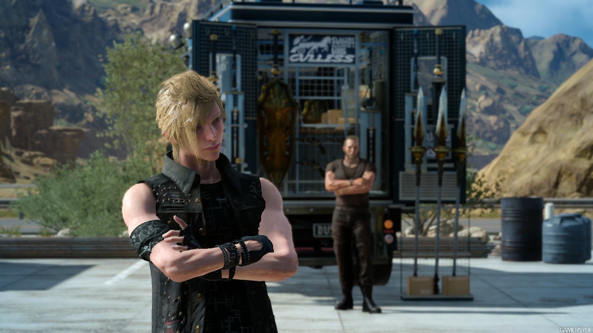
those hair!
this game really needs a PC version where we can AA the shit out of it.
this game really needs a PC version where we can AA the shit out of it.
So they still haven't fixed it. Slightly worried.
http://www.gamersyde.com/news_gc_ffxv_50_minutes_gameplay_video-18239_en.html
Gamersyde version 8gb only torrent
Gamersyde version 8gb only torrent
I' m glad they pushed the release date. not sure what they can do to optimize thigns. Lots of popups and ugly flat textures in those videos.
Looks like they' ve toned down charac models a bit too. Battle system look a bit ckumsy but itneresting....Just wished they d stick to something closer to duscae demo than platinum demo.
Looks like they' ve toned down charac models a bit too. Battle system look a bit ckumsy but itneresting....Just wished they d stick to something closer to duscae demo than platinum demo.
First 12 minutes of the Kingsglaive movie:
The battle scene from 3:40 was our part
I wish they 'd made a DLC playabvle chapter of Kingsglave
The graphics in those screenshots are embarrassing to say the least especially comparing to TW3 and Horizon ZD, not to mention sub 1080p. I am more interested in Kingsglaive then the game now, at least the CG would have some consistency in visuals. Man hope the Neo version give it a huge make over with HDR to boot.
i wonder, What is their bottleneck?
why the IQ looks that bad.
hopefully the PC version will come ASAP. Their PC screenshot looks so nice looking! Especially the screenshots on Duscae region.
why the IQ looks that bad.
hopefully the PC version will come ASAP. Their PC screenshot looks so nice looking! Especially the screenshots on Duscae region.
First 12 minutes of the Kingsglaive movie:
The battle scene from 3:40 was our part
how many PS4s duct taped used to render it ?
Great work congratulations !
Will definitely support this when/if it comes out on Blu-ray and buy it.First 12 minutes of the Kingsglaive movie:
The battle scene from 3:40 was our part
It does put the visuals of the Warcraft film to shame IMO.
Cheers
First 12 minutes of the Kingsglaive movie:
The battle scene from 3:40 was our part
Great, I've recently watched the Spirits Within for the second time after all those years. Still looked pleasant to me, I even got used to the lack of SSS
Great, I've recently watched the Spirits Within for the second time after all those years. Still looked pleasant to me, I even got used to the lack of SSS. This will be nice to compare and see how far we've made it
.
Judging by this


I'd say pretty far. Still, animation looks a bit uncanny, even if it is obviously really good.
Judging by this
I'd say pretty far. Still, animation looks a bit uncanny, even if it is obviously really good.

Yeah, I recall Aki's hair being immune to the lack of gravity


