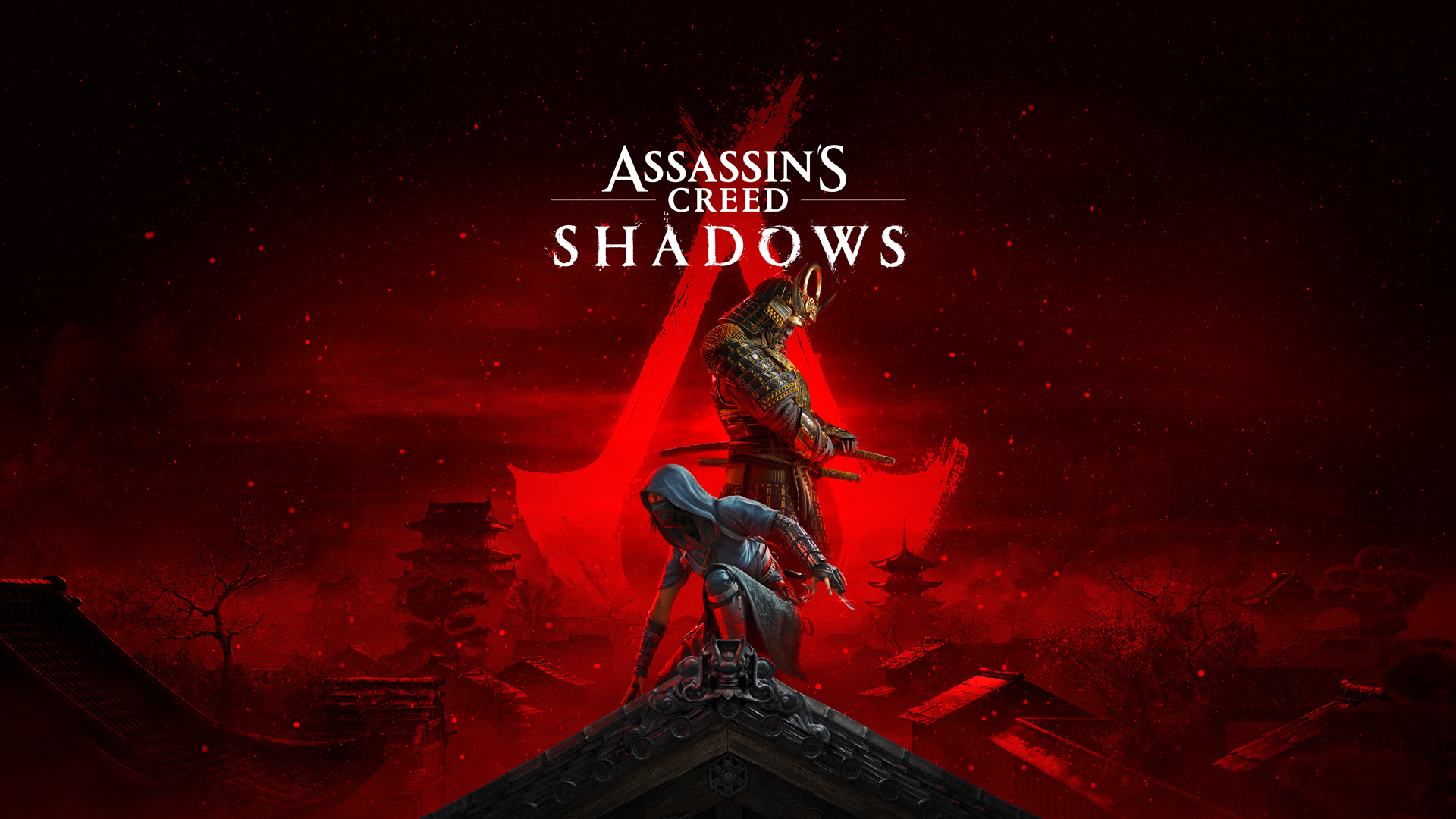
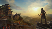
Assassins Creed Shadows

cheapchips

Veteran
aka Red, the one set in Japan. Trailer for this is dropping Wed 15th May. Release date of November this year has also leaked.

I'm well up for seeing what the first current gen only AC game looks like. Does modern game production let them be as bold on tech as both the original AC and Unity? Probably not!

Still, Odyssey is brill and anyone who says otherwise can chop of a finger, replace it with a blade and stab themselves with it. :)
 
I've really enjoyed all the open world AC games, the ability to explore everywhere (within the confines of the map) without any loading screens etc. Just amazing, Odyssey was the best, the Origins and Valhalla. I just think the settings for Valhalla was a little bland, I'm mean the UK is OK but it is very much plain white bread (until you get to Wales or Scotland that is :D )

It as understandable that people were getting exhausted with the size of the games though, modern day lifestyles are all about instant gratification and you can't get that is you have to spend anytime travelling somewhere. But I am patient and I love to explore so they were the best in my eyes!!
 

Looks good so far, and I look forward to certain people being super duper upset with an aspect of this even though it's based on an actual historical account.

That said, PSN listing seems to say it's 'Online Play Required', which I hope is just a mistake, or simply referring to a one time initial online activation or something. Cuz if it's truly just online required, I will never buy it, not even for steep discount later down the line. If I cant actually own a single player game because it'll literally become unplayable one day when servers are shut down, I've got no interest.

We just cant ever have nice things.
 
They did that back in 2022, so hopefully not!
Lol

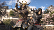
One actual screenshot though, I would hope this game is more focused than Valhalla, but it's Ubisoft these days so I'll just wish for a flying unicorn while I'm at that:

WCCFassassinscreedshadows2.jpg
 
Lol

One actual screenshot though, I would hope this game is more focused than Valhalla, but it's Ubisoft these days so I'll just wish for a flying unicorn while I'm at that:

WCCFassassinscreedshadows2.jpg
Hopefully that's a bad screen and the game actually looks substantially better than the prior titles.
 
Hey maybe the series is targeting Switch 2 as well. After all who do you want to make games for but the console that sold as much as both competitors combined last time?
 
In this interview they confirm RTGI, knocking out lights/ hiding in shadow, destruction and a systemic time of year system. Good upgrades to target over last gen.

 
I loved the stealth in Origins, but it has gone downhill from there imo. Combat in the older titles made you look and feel cool, even if there wasnt much to it. The combat in the later games have been terrible.
I like the idea of a more realistic looking historic ninja game, but I doubt they will be able to have gameplay to do it justice.
 
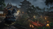
I'm completely at a loss as to what y'all dont think looks good in those screenshots. I honest to god feel like I have a completely different set of eyes to many people in this forum! lol

The lighting alone is a big step up from before. Way more natural looking. Character models also look fantastic with great material shaders on basically everything in sight.

EDIT: Good news - looks like the PSN listing saying Online Play Required was really only about initial activation:


Back on my excitement list.
 
Last edited:
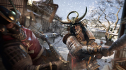
For my money, It suffers a bit in screenshots like most non-UE5 titles. It doesn't have detail that's universally 'next-gen' up close. There's a lot more stuff, a lot more complex stuff but if you crop out rocks and tree trunks they wouldn't look out of place in last gen titles. Reasonably high poly stuff with a detailed texture on it is visual language we've seen for a decade.

Hero characters aways look great, but the chap Yasuke is clobbering looks very detailed. We'll see how universal that is when in a big town?
 
I'm completely at a loss as to what y'all dont think looks good in those screenshots.

It looks good but those screens don’t look particularly current gen to me. Granted a lot of current gen stuff is hard to see in stills. The hero characters have decent geometric detail but the materials and lighting seem doable on a PS4. Hard to say anything about the environment detail since it’s in the background and a bit blurry.

Current gen to me is all about detailed environment and clutter and high precision shadows and GI. Lighting is hard to evaluate in still screenshots.
 
Back
Top