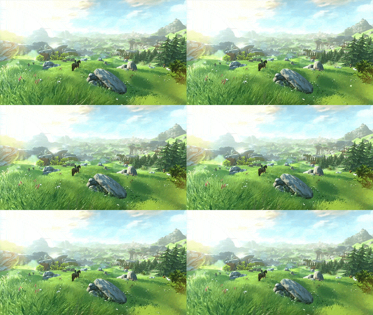
I'll be spending hours cutting that grass with the sword, must cut all the grass 
Install the app
How to install the app on iOS
Follow along with the video below to see how to install our site as a web app on your home screen.
Note: This feature may not be available in some browsers.
You are using an out of date browser. It may not display this or other websites correctly.
You should upgrade or use an alternative browser.
You should upgrade or use an alternative browser.
Zelda: Breath of the Wild [WU,NX]
- Thread starter Goodtwin
- Start date
copy-ed to here:
anybody?
Btw does all zelda game always follow the same-ey story?
i think i payed zelda something something on NDS and zelda skyward on Wii, and i felt de-ja-vu with the story. Its like Zelda and Link is trapped in a parallel universe that keeps repeating.
anybody?
Played A link to the past, Ocarina of Time, Minish Cap, and Wind Waker and they all felt quite different.
From what I've seen Majora's Mask & Twilight Princess also felt different...
If you are talking about the usual "rescue the princess and defeat the bad guy to save the world" trope, sure it's in every single of them, but the worlds are very different in my experience. (Gameplay wise, it's evolutionnary rather than revolutionnary each time, which is fine by me.)
i like the gameplay they offer. its fun and feels unique that i cant find on other games.
about the story, i think thats the "dejavu" i got. Link rescue zelda again and again and link will meet weird npc again and again.
Kid Icarus Uprising also basically the same, it just saving "princess" Palutena. But i dont feel "dejavu" and a few times entertained by the unexpected turn of events.
hmm, i guess i'll read some synopsis on wikipedia of Zelda stories
shredenvain
Regular
I'll be spending hours cutting that grass with the sword, must cut all the grass
Dude I have the same problem!!!!
I feel like if I dont I could be missing something.
D
Deleted member 11852
Guest
On the plus side, we'll all be millionairesDude I have the same problem!!!!
D
Deleted member 13524
Guest
I'm going to come in with the unpopular opinion and say I think the game looks nothing like a technical marvel, but rather an artistic and animation one just like Twilight Princess and Skyward Sword before it.
Zelda games have had this for a while. It looks like every single object in the game took dozens of hours from several developers to make sure it moves and looks right -> within the technical constraints. Everything feels organic in that world, and while this is becoming popular within indie 2D platformers nowadays, I think it should be really hard and especially time-consuming to do in 3D.
This is why I hope Nintendo never stops making games and that Miyamoto makes sure he leaves a proper legacy of apprentices to follow on his steps.
So does the game look excellent? Yes.
Does the game make it look like the gap between the Wii U and the new-gens have shortened? No.
In fact, I'll dare say the E3 2011 tech demo looked technically better. Which isn't really hard to conceive since that demo rendered a single room while the new demo shows an open world..
Last edited by a moderator:
The cel shading looks quite advanced - IMO anyway - and the lighting looks good, so they probably use modern stuff like tone mapping and so on. It's certainly well beyond wind waker's implementation. The wide open field and deep visual depth speaks of a good LoD implementation. The fire and particle effects during the fight are quite elaborate.
Within the technical constraints of the wuu itself, to me, this game looks like an eminent accomplishment, technically as well as artistically. But yeah, it may just be smoke and mirrors, heh. I really couldn't tell!
Within the technical constraints of the wuu itself, to me, this game looks like an eminent accomplishment, technically as well as artistically. But yeah, it may just be smoke and mirrors, heh. I really couldn't tell!
japan, especially Nintendo have awesome talent in using smoke and mirrors. And i have no problem with it, i even like it*
*to be played on the original console, but hate it when played on PC using emulator because the smoke and mirror become horrible.
*to be played on the original console, but hate it when played on PC using emulator because the smoke and mirror become horrible.
oh the Dynasty Zelda Warriors 
are you sure it did not support Wiimote+ ?
the game looks to be perfect for Wiimote+
are you sure it did not support Wiimote+ ?
the game looks to be perfect for Wiimote+
I just saw some gameplay that looked like a weak version of Dynasty Warriors. I am missing the wii-mote already ...
Where'd you see gameplay?
Where'd you see gameplay?
I think it was gamespot video linked on GiantBomb's website.
The first video here I think:
http://www.giantbomb.com/chat/
So to find it back, you'd probably have to look at gamespot.com
EDIT: Lol, this was probably Hyrule Warriors ...
Pixeldamage
Newcomer
That's a crazy amount of alpha cards for the grass (if that's how they're doing it). Perhaps they're grouping sections of grass, which are further from the camera, into imposters?


None of what was shown in this clip come close to the graphics from the origina unveil, so I'm marking the whole initial unveil off as motion bullshot for now. Seriously underwhelmed, TBH. Blurry textures, bland terrain, and the landscape looks very barren as far as animals and creatures are concerned. The autopilot horse is a nice touch though! (Can you autopilot through dungeons as well?  )
)
Also, he crashed one of the wild horses and made it go tumbling just by running into it. Lol.
Also, he crashed one of the wild horses and made it go tumbling just by running into it. Lol.
why it looked so bland, repetitive, vacant, and blurry?
i should blame youtube compression but it still does not explain the repetitive trees, grounds, and vacant world
i should blame youtube compression but it still does not explain the repetitive trees, grounds, and vacant world
L. Scofield
Veteran
Are you seriously judging the graphics based on off-screen, low resolution footage?None of what was shown in this clip come close to the graphics from the origina unveil, so I'm marking the whole initial unveil off as motion bullshot for now. Seriously underwhelmed, TBH. Blurry textures, bland terrain, and the landscape looks very barren as far as animals and creatures are concerned. The autopilot horse is a nice touch though! (Can you autopilot through dungeons as well?)
Also, he crashed one of the wild horses and made it go tumbling just by running into it. Lol.
Similar threads
- Replies
- 1
- Views
- 177
- Replies
- 9
- Views
- 2K
- Replies
- 37
- Views
- 3K
