Console Dashboard UIs *spawn*

  • Thread starter Deleted member 11852
  • Start date
D

Deleted member 11852

Guest
Next, the UI. I like the UI is running in 4K HDR, and the visual elements and animations are consistent, it makes the XSX's Dashboard feel unpolished and dated in comparison

Having had a Series X for a few weeks - this one really sticks out. What you really notice is because the Xbox UI is not HDR, when you're playing a HDR game and switch to the full Xbox UI there is a hitch of several seconds while the TV switches from HDR (game) to non-HDR (UI) then back to HDR (again). It really slows the transition.

And I've had to be doing this a lot because there is some weird issuing impacting Fallout 4 on Xbox (not PC, or PS4) where you cannot log into, or download, mods without frequently disconnecting and re-connecting to the network.

The Xbox UI really feels static and utilitarian next to the PS5 and both have scope for improvement in terms of usability.

BTW you can 'hide' games in the PS5 Games Library that they will not show at all, but it would be nice if you you could set the default view permanently to whatever your preferences are. I'd like to see folders return in the main UI, and the option to just show every game in and endless stream - which is what PS4 did.
Yeah I think each has its own dire need of improvement, for XSX it’s 4K HDR and visual consistency, whereas for PS5 common actions needs to be quicker to perform (e.g. trophy list in Control Centre).
 
Having had a Series X for a few weeks - this one really sticks out. What you really notice is because the Xbox UI is not HDR, when you're playing a HDR game and switch to the full Xbox UI there is a hitch of several seconds while the TV switches from HDR (game) to non-HDR (UI) then back to HDR (again). It really slows the transition.

And I've had to be doing this a lot because there is some weird issuing impacting Fallout 4 on Xbox (not PC, or PS4) where you cannot log into, or download, mods without frequently disconnecting and re-connecting to the network.

The Xbox UI really feels static and utilitarian next to the PS5 and both have scope for improvement in terms of usability.

BTW you can 'hide' games in the PS5 Games Library that they will not show at all, but it would be nice if you you could set the default view permanently to whatever your preferences are. I'd like to see folders return in the main UI, and the option to just show every game in and endless stream - which is what PS4 did.

You do actually get those annoying transitions on PS5 too if you're gaming at 120hz. Some games frustratingly have a 60hz menu and 120hz gameplay (Rainbow Six), so it constantly transitions with a screen flicker when leaving/joining a match.
 
You do actually get those annoying transitions on PS5 too if you're gaming at 120hz. Some games frustratingly have a 60hz menu and 120hz gameplay (Rainbow Six), so it constantly transitions with a screen flicker when leaving/joining a match.
Sure, all changes of video output format are going to result in a TV mode blip and if games are changing the output format between their own screens there is nothing the console can do about it.

It's really noticeable on the Xbox UI because HDR games are so common and the UI doesn't have an HDR mode and has been particularly bad because of this weird bug in the Xbox Fallout 4. Usually I'm not dipping into menus during games.
 
Yeah I think each has its own dire need of improvement, for XSX it’s 4K HDR and visual consistency, whereas for PS5 common actions needs to be quicker to perform (e.g. trophy list in Control Centre).

I don't really care if the x gets a 4k hdr menu as I spend little time in it. I rather they focus on making it more custimizable . I feel like i need to go through so many menus. As for the ps5 I only use it sparingly but I have never liked the design of the UI.

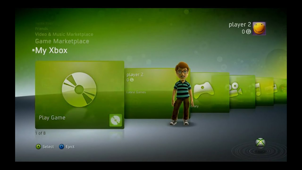
At the end of the day i wish both consoles used the xbox 360 blades
 
You mean, the very very original blades??

Launch day or bust !
xbox-360-blades-dashboard-1.jpg
 
Personally I preferred the NXE

NXE was okay

This right ?
maxresdefault.jpg


I dunno blades was just so simple


I would just modify it so I can put a few pins under each section of a few game I play often or media apps i use often.

I also bet at 4k HDR this thing would take almost no resources to run lol

To me I don't understand what people do in the dashboards so much that they have to be so complex . I just want something fast and easy to navigate that gets me to my game or app quickly
 
I don't really care if the x gets a 4k hdr menu as I spend little time in it. I rather they focus on making it more custimizable . I feel like i need to go through so many menus. As for the ps5 I only use it sparingly but I have never liked the design of the UI.

At the end of the day i wish both consoles used the xbox 360 blades
Not running in 4K HDR is not a dealbreaker for me, but when it does run in 4K, it really looks that much better for the little amount of time you spent looking at it.

I love the Guide in NXE, in my opinion it even beats all the quick menu designs that came after it:
new-xbox-experience-xbox-dashboard_9688.1024.jpg
 
Last edited:
The NXE is probably the most complete, most aesthetically pleasing, most stylish Xbox Dashboard of all the Xbox Dashboards.

IIRC its also when MS listened to the feedback i sent them (i think it was on xbox uservoice website?) about needing to support 16:10 screens. It didnt get lots of upvotes, but they added that support in NXE, and it was AMAZING because my 16:10 monitor doesnt have 1:1 mode (it stretches 16:9 vertically to 16:10).

IIRC my avatar was also still using the hidden purple hair. But when i lend my MS account to my friend, she replaced my avatar ROFL.

Btw IMO one of the sleekest and fastest dash currently is Switch. Yes some game took quite a bit of more time stuck on NINTENDO SWITCH blank screen boot screen, and some took eons to close. But the dash itself is always responsive.
 
Looks like release notes are up now.
Interesting it just says higher resolution and not 4K.
So will be interesting if it is actually 4K or not.

But they do say connected to a 4K Display. So maybe just some odd word stylings for a Monday?

The real requirement of these dashboards is to remain in the same mode as the game, so the display chain (AVR and TV or monitor) doesn't switch modes. So if the game is in HDR then the dashboard should be in HDR. If the game is in SDR then dashboard should be SDR.
 
But they do say connected to a 4K Display. So maybe just some odd word stylings for a Monday?
Was wondering if it could be 1440p or something, as it's currently 1080p so obviously will be higher.
Just thought it was weird wording all things considered.
 
I wonder when they ever add LFG back into their Xbox App. Ridiculous that they did an app refresh where they cut half of its functionality ages ago. The only really time the app was really useful.
 
Back
Top