God of War [PS4, PC]

No, it's a review copy. My colleague has already written a [glowing] review, and I finally started playing yesterday.

Just keep away from spoilers of any kind, you will be glad for doing so.

Other than the E3 demos I haven't seen much, kinda excited about this :)
 
World Serpent in final build seems to have more texture detail in the nose, glowing eyes and all the AO are still there.
E3 2017
untitledg2pd3.jpg

Final build
god-of-war-review-28i6pkg.png
 
World Serpent in final build seems to have more texture detail in the nose, glowing eyes and all the AO are still there.
E3 2017
untitledg2pd3.jpg

Final build
god-of-war-review-28i6pkg.png
The original has a more natural CG feel to it because of the lighting. It used to have more depth to it. Now it looks a little bit rough. And the subtle speculars looked more believable. The surface of the serpent's skin received a layer of mirrored noise on top of the original asymmetrical scales which ruins the skin's realism. I am certain that it is not a simple case of art direction change but the lighting and some other elements also received some downgrade.
 
The original has a more natural CG feel to it because of the lighting. It used to have more depth to it. Now it looks a little bit rough. And the subtle speculars looked more believable. The surface of the serpent's skin received a layer of mirrored noise on top of the original asymmetrical scales which ruins the skin's realism. I am certain that it is not a simple case of art direction change but the lighting and some other elements also received some downgrade.
Surprisingly enough, the base texture itself is mirrored in the middle of the nose. O_O

I understand some compromises have to be made, but that one... once you see it, you can't unsee it. It's weird. Maybe they had to tweak something and forgot to use the original texture back?
 
I agree with Nesh, the previous version of the world serpent looked much better : better shaders, textures, lighting.

Unlike with the IGN video, here we really have a like-for-like comparison.

In the video, it was difficult to decide bewteen an artistic change or a real downgrade

Now, with the world serpent comparison, my opinion comes back to my original intuition : there's mainly a downgrade in lighting throughout the game.

However, i watched some reviews and the graphics in this game are outsanding. Probably the best looking game available on the market, but it's a tough fight with the most impressive exclusives on the system.
 
While I prefer the original serpent as well, I disagree that it was a downgrade.... looks more like a change in art direction to me.
 
While I prefer the original serpent as well, I disagree that it was a downgrade.... looks more like a change in art direction to me.

jrvel4.jpg


Are you saying that is just an artistic choice? A weird one, in such case (or maybe as I said, they wanted to do a change and then forgot to readjust the definitive texture, I dunno). I mean, as I said, the game looks great and I'm very happy for the developers, but why can't we notice a small downgrade (as well as an upgrade in other aspects, as some people have spotted, too)?

I agree that some changes in the colours used or some changes in the assets are an artistic choice, but there are slight changes such as these, or in lighting and post-processing effects that don't seem just an artistic change.
 
The nose texture maybe mirrored but it's not exactly a downgrade in totality, it's a tradeoff for a sharper look or higher res than the lower res but asymmetrical scale texture if you will. They could always revert back to the original but I guess they made a call. As for lighting downgrade? I'm not sure about that either, both scene uses voxel grid volumetric for lighting and fog, it's just a color switch although the original's pinkish underlying flesh tone does lend itself to be more realistic and natural in a way? Yes I also prefer the original hue since the new one does seem too blue, but maybe they are going for this blue film filter look intentionally to suit the snowy tundra.
One more think about the skin lighting, I do wonder if the original could be using a SSS hack for the pinkish scattering, if so then the final version might be missing it?
 
jrvel4.jpg


Are you saying that is just an artistic choice? A weird one, in such case (or maybe as I said, they wanted to do a change and then forgot to readjust the definitive texture, I dunno). I mean, as I said, the game looks great and I'm very happy for the developers, but why can't we notice a small downgrade (as well as an upgrade in other aspects, as some people have spotted, too)?

I agree that some changes in the colours used or some changes in the assets are an artistic choice, but there are slight changes such as these, or in lighting and post-processing effects that don't seem just an artistic change.
I also think that there is an absense of SSS or at least it is severely paired down
 
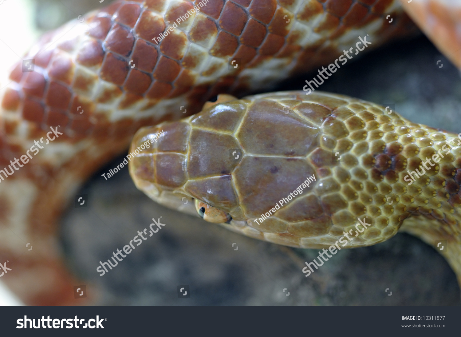
Or maybe, just maybe, it’s because actual snakes do have very symmetrical features, like the second shot and unlike that first shot. Look it up.
What we are seing on the serpent arent the large symmetrical patterns you would expect from a reptilian skin. It just plainly doesnt look correct and natural here. It is an error.
 
What we are seing on the serpent arent the large symmetrical patterns you would expect from a reptilian skin. It just plainly doesnt look correct and natural here. It is an error.

I was kinda joking, but still. Snakes are more symmetrical than not :)
 
Back
Top