steveOrino
Regular
Hollowing had no actual effect on DS3 and I really do hope it's the same on DS. I'm ok with the game being hard, but I just could not get over DS2 and the needlessly punitive hollowing that reduces your max health, who the f thought of that?? You die cause the game is hard, so we make the game even harder every time you die, so you die more, and the game gets harder the more you die? What?
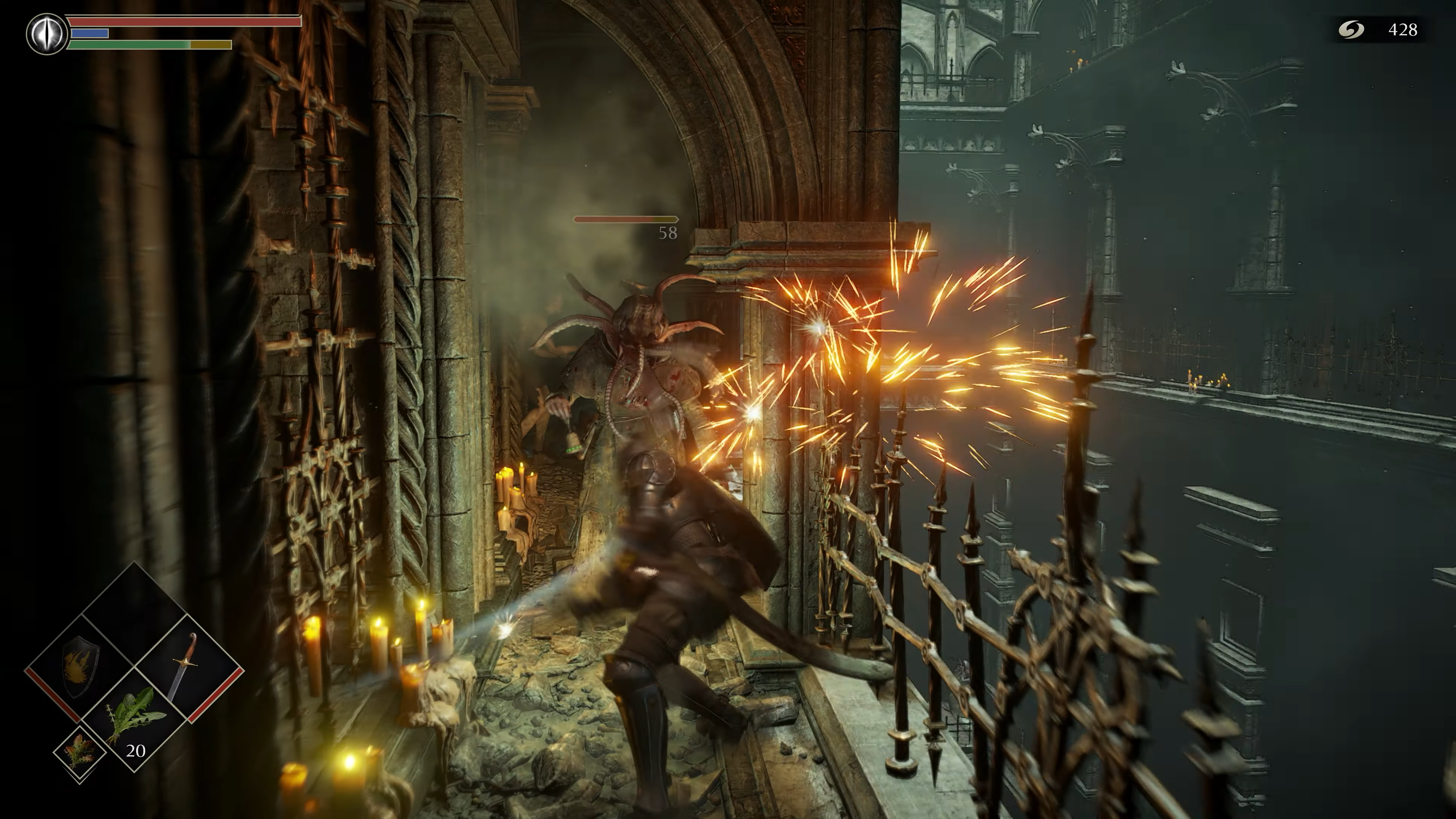
I am pretty sure they aren't changing the body and soul form system just like they aren't changing the world and character tendency system. Soul form was a lore and gameplay mechanic in that if you died in body form your soul gets bounded to the nexus. It was pretty complex but there were benefits in staying in soul form.... you could be summoned for coop, can't be invaded, your footsteps are quieter meaning you can sneak up on enemies better, don't have to worry about world tendency switches when dying and you do more damage as well if your character tendency was white.... and probably other things I'm forgetting. There are many ways to return to human form either from an item, invading another player and killing them, defeating a boss, getting summoned and defeating an invader and or defeating a boss.
Also there is a ring early on that can reduce the life penalty by 25% (so max 75% life) if you are white tendency. I never found being in soul form as more difficult but I have never played DS2 for comparison.


