Bayonetta prominent lighting artifact's name

xLothwenx

Newcomer
I've wondered about some obvious lighting artifacts in prominent games, and would like to know what this issue/effect/"feature" is called. I've never seen a single person mention it, and I've looked.

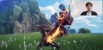
First example is Bayonetta. By developer Platinum Games, they tend to create games with this poor lighting... thing (Star Fox Wii U).

Observe the top third of the screen being almost constantly lightened compared to the rest of the scene; see screenshots here for examples:


Note it's not just in outside areas, but also during complete-black background sections where you learn moves. There the top third of the screen is red... Presumably to look angsty/blood-like.

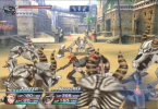
Second example is more top-of-screen lighting "bleed" in Rogue Galaxy.


If that's "depth of field fog", that looks pretty shitty. The areas without it look much clearer and better.

1. What is this artifact/intended effect called? Give me something to Google.
2. Who in their right mind thinks this looks better than simply not doing it? Why would anyone choose to smudge the lens?
 
1. What is this artefact/intended effect called? Give me something to Google.

It's called on of the following..

1. Performance savings
2. Poor implementations
3. Art direction

2. Who in their right mind thinks this looks better than simply not doing it? Why would anyone choose to smudge the lens?

That question needs to be aimed at the developers and not at people in a forum that had nothing to do with the games development or art direction choices.
 
First example is Bayonetta. By developer Platinum Games, they tend to create games with this poor lighting... thing (Star Fox Wii U).

Observe the top third of the screen being almost constantly lightened compared to the rest of the scene; see screenshots here for examples:


For Bayonetta it's all about art direction, it's to impart an otherworldly/dreamlike (in this case a Heaven and Hell setting which potentially bleeds into "real" world scenes) feel to a scene, you'll see this done in some movies that use it for a similar effect.

Regards,
SB
 
That question needs to be aimed at the developers and not at people in a forum that had nothing to do with the games development or art direction choices.
Aren't you a sassy one. This is a forum related to graphics, so I'll engage randos like you however I see fit. As if I could have gotten some Japanese salaryman to answer my question (about an obvious graphical artifact) from an old, highly popular game(s).

Hopefully there are a few graphics programming veterans here.

For Bayonetta it's all about art direction, it's to impart an otherworldly/dreamlike (in this case a Heaven and Hell setting which potentially bleeds into "real" world scenes) feel to a scene, you'll see this done in some movies that use it for a similar effect.
Nice theory. Yeah, possibly. Bad taste, though. Looks like shit and reduces color information.

I have a feeling it's incompetence, though. Unless someone can put a name to the intended lighting/filmography technique, I wouldn't put it past these developers to flub some lighting coordinate calculation at the top of the screen. "Looks good enough."

I'll try to post examples from other games.

You can look here for very basic forms of lighting used in films and from which game artists take inspiration (except for RT lighting which so far has ignored all of this and thus why RT lighting sometimes doesn't look as good in games). Also, some astute people will note that "hero" lighting like we get in some games is actually adapted from basic film lighting. :p


However, the actual filmic look also requires either different exposure for different parts of the film or altering how each frame of the film is developed to give it a lighter more exposed look for key parts of the frame. Generally combined with soft lighting and high key lighting if not using film development tricks to give it an ethereal, dreamlike or "heavenly" look. For example, a dying person dreaming they are walking to heaven might have such an effect as the light coming from above implies a heavenly/good end for that character.

You'll see things like that used more often in art films and indie films, but it still gets used by some directors in big budget films as well. For example, when filming a scene involving seeing a dying person's memories, a director might opt for this type of effect.

Of course, nowadays with digital editing, you don't have to rely on some of the tedious and error prone film/movie tricks of the past (for example, lightening parts of each frame when developing the film in a dark room).

Regards,
SB
 
Aren't you a sassy one. This is a forum related to graphics, so I'll engage randos like you however I see fit. As if I could have gotten some Japanese salaryman to answer my question (about an obvious graphical artifact) from an old, highly popular game(s).
This is a forum related to graphics yes, but not a forum that knows how and why developers made certain art style choices.

Only the developers know that.
 
I've wondered about some obvious lighting artifacts in prominent games, and would like to know what this issue/effect/"feature" is called. I've never seen a single person mention it, and I've looked.
It's deliberate post-processing for artistic reasons. Think of it like a gradient lens filter on a camera. Or these days colour gradient applied in post on digital footage.

Second example is more top-of-screen lighting "bleed" in Rogue Galaxy.


If that's "depth of field fog", that looks pretty shitty.
You could do with pointing out specifically, but if you mean this one

1682075328472.png
It'd be simulated HDR haze off the bright sky
 
1. What is this artifact/intended effect called? Give me something to Google.
Bloom.

At least i think that's what you don't like. Basically it tries to simulate how light from very bright surfaces diffuse through the lens or eye.
It came up with HDR rendering, since this allows to store color values 'brighter than one'. But unlike haze it's not depending on distance, just brightness.
 
I wouldn't count these uses as bloom. Bayonetta is a colour grading. Rogue Galaxy isn't a spread of bright light but just an area effect. In motion it's more of a honking lens flare!


Meh, can be argued that's clumsy sky bloom. Bloom is more characteristically around light-sources though, so searching for Bloom shouldn't reveal much to match these. eg. https://www.resetera.com/threads/a-look-back-at-the-fuckload-of-bloom-era.28756

Edit: to identify the technical difference, bloom takes the existing render and adds it back on top, adjust for contrast. It's a screen-space effect. RG is using a sprite to fade out the top of the screen like a lens-flare. As a technique that wouldn't come under bloom, but artistically could be considered an attempt to reproduce a light bloom visual effect.
 
Last edited:
Deliberate post processing effect to tint the final image with a gradient across the screen. A flawed (or stylized) lighting calculation wouldn’t vary with a uniform pattern across the screen — it would vary either per object or per pixel depth.
 
Thank you for the responses. Gives me some stuff to research!

Mostly I'm interested in what it would take to hack ("mod" as the cool kids like to say) games with these poor artistic choices.

Yes I don't like bloom (join the club). But this is more obnoxious than general bloom, since it's non-uniform. Also probably more difficult to correct.

Top contenders for identifying this artifact:

(fake) HDR gaze
gradient lens filter
scatterbrained lens flare glare hair
 
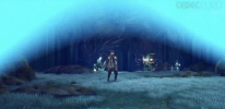
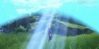
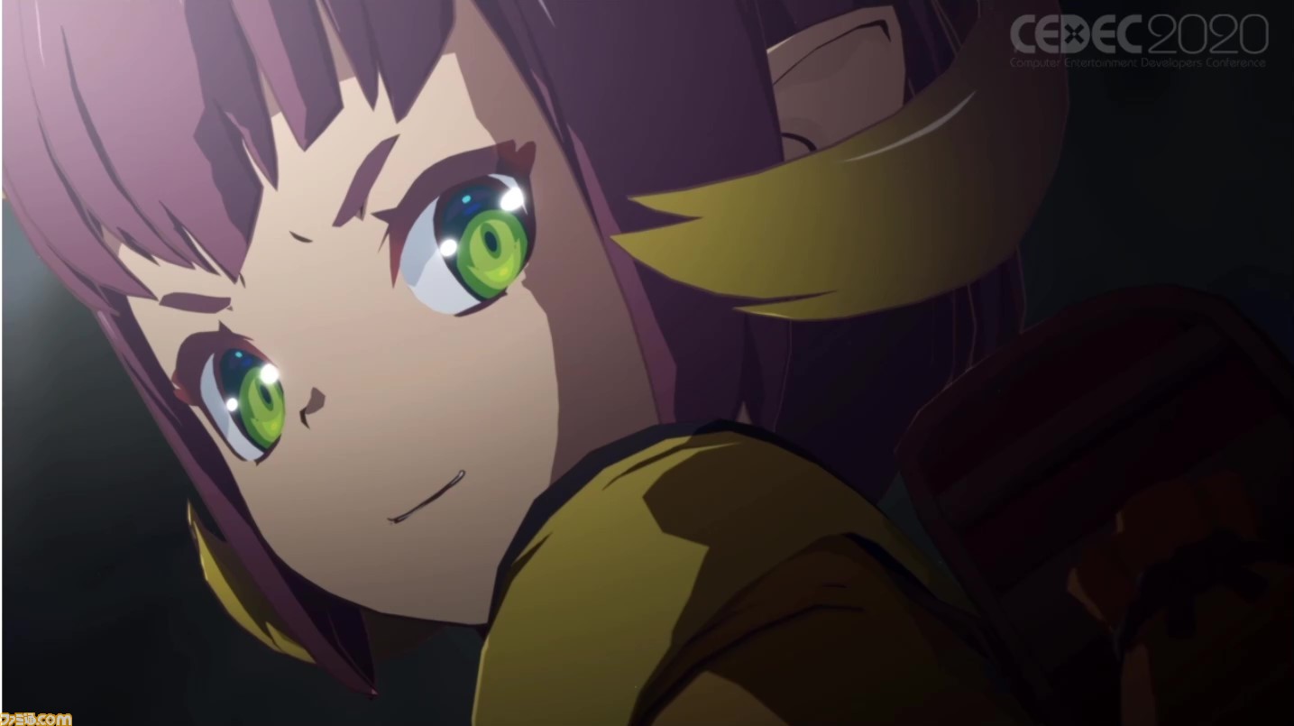
I personally think this is more like a anime-inspired post effect. This is a process commonly used by Japanese animes to simulate the overbright sunshine (i would say more like simulating the artifact of a camera len). In CEDEC 2020, Blue Protocol gave a tech talk about their anime render pipeline in UE4, and this is something they addressed to recreate the actual anime feeling. They call it パラ (Para)

Here's a screenshot of it in effect:
QQ20230421-233504@2x.png

This is implemented by a simple screen space mask and the tint is adjusted based on sun direction (projected on the screen). The following images show the mask and sun dir:
QQ20230421-233516@2x.png
QQ20230421-233526@2x.png
 
To add on top of the above post, for some reason they also add this effect even the environment is dark and the lighting doesn't match (I guess in this case it plays more like a hero-ic light thing to address the face of the character)

QQ20230421-234753@2x.png
 
Aha, that's sounds like a winning explanation. I miss the days when developers didn't have the ability of controlling every aspect of post processing with their grubby fingers. If I watched anime, I wouldn't like it there either.
 
Aha, that's sounds like a winning explanation. I miss the days when developers didn't have the ability of controlling every aspect of post processing with their grubby fingers. If I watched anime, I wouldn't like it there either.
adding a toggle solves all the problem ;)
 
In CEDEC 2020, Blue Protocol gave a tech talk about their anime render pipeline in UE4, and this is something they addressed to recreate the actual anime feeling. They call it パラ (Para)
Here's the article for reference:


Now I'm trying to corroborate this developer's term "Para" with the actual Anime effect seen all over. If it's such a well understood style, why did they have to invent their own vocabulary?

I can only assume "Para" is referencing the way the mask resembles a "parachute" shape. Pretty sure the masks in Bayonetta and Rogue Galaxy are straight horizontal, but I haven't played either game recently.

Good luck me finding anime style guides inside the Nippon.
 
Back
Top