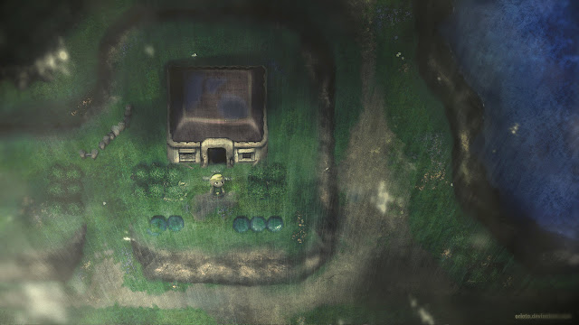
Why Can't 2D HD Games Look Like This?

gary

Banned
http://www.cracktwo.com/2010/02/videogame-remakes.html

Perhaps my greatest disappointment as consoles have progressed is the inability to expand on the potential of 2D graphics. I wish a major dev would make a 2D title with some real chops (deep action/rpg, 5-star platformer etc), art like something in one of these photos, like something out of a parallel dimension where 3D never became a medium for videogaming, and all the years since the early 90's had been devoted to polishing and innovating on 2D immersion and visuals.
 
It'd be great if they could look this good. In essence you could decompose the game into sprites of exceptional artistic quality and build a 2D game. I guess that's not generally considered because 2D is out of fashion (though coming back!). However, creating the assets and effects needed to compose those pieces together could be time consuming and problematic. Alternatively you need to create a 3D engine and apply effects to create the non-photorealistc renderer, but we're well short on IQ and resources to pull that off with the clarity needed. I started a thread in 2006 about stylized renderers, but we didn't get very far! Current gen should be able to do cel-shading to a convincingly anime quality (Valkyria Chronicles would have nailed it had they sufficient IQ), but your examples are perhaps a bit far-reaching. I guess the sonic and Marios could be made, just like the original 2D games only with HD 32bit colour alpha-blended sprites. Given pecious few animations are drawn to this level though, I'm guessing the artistic demands to make frames that look good are too much. Then again, 3D models could produce template animation frames to be drawn digitally. That could work.
 
Braid looks pretty darn good. Not quite at the level of those pics. I imagine braid is rendering sprites as textures on flat polygonal shapes, and isn't a traditional 2D renderer.
 
What I'd give for a Metroid game that looked like those paintings, omfg.......... *mumble grumble*

The atmosphere is just amazing, I get kind of po'd actually that the OP even made this thread, since now I have to think of all the awesome games that could have existed, but don't. :(
 
Donkey Kong (SNES), Yoshi's Story (SNES), Paper Mario, Four Swords (GCN) and the new Mario game on Wii did look like those, pretty much.
 
Donkey Kong (SNES), Yoshi's Story (SNES), Paper Mario, Four Swords (GCN) and the new Mario game on Wii did look like those, pretty much.

Maybe under the influence of some seriously heavy stuff, cause those games look nothing like the pictures on the original post.
 
I don't think sprites would be the way to achieve this level of quality. Not in motion anyway. You're looking at complex lighting models, subsurface scattering, various "fog" volume excercises with irradiance transfer, camera effects, heat blur etc etc. You don't want to stick your perfect directional highlight on a sprite only to watch it fall apart as the objects move but your lights don't follow.

This is all work for a 3D graphics engine, just with gameplay and camera restricted to their respective planes.
 
Maybe under the influence of some seriously heavy stuff, cause those games look nothing like the pictures on the original post.

I disagree. While they don't look exactly like his art (which is impossible anyway), the games I mentioned looked pretty close in their style. Four Swords in particular.

32.jpg


legend-of-zelda-four-swords-adventures-image1.jpg
 
I don't think sprites would be the way to achieve this level of quality.
Not sprites, of course not. But 3D games with fixed 2D cameras could possibly look like this. Not on today's console hardware most likely, but on some imaginary future system... :)
 
I disagree. While they don't look exactly like his art (which is impossible anyway), the games I mentioned looked pretty close in their style. Four Swords in particular.

Obviously the style is going ot be similar, after all they were paying tribute to the original games and showing what they wish the games would look like today.

But even you have to admit they look absolutely nothing alike other than really REALLY broad stylistic cues.

Regards,
SB
 
Limbo's already been linked to in this thread. I dare say the lack of labelling by LightHeaven made it all to easy to miss the existing suggestion. I can see how a dozen letters less typing is worth all the confusion...

As for Limbo, it looks beautifully atmospheric, although the monochromatic silhouette style isn't really matching the artwork of the OP's example artworks. Same with Insanely Twisted Shadow Planet. The simplistic art of these titles is ideally suited for low-dubget Indie titles offering a strong style and saving a truckload of artwork. Sadly, it's the soft edging and subtle colour effects of the 'natural media' (may be simulated in digital art software) that makes the OP's target so attractive and diffiicult to accomplish. Silhouetting is actually directly opposite to that when you think about it!
 
Back
Top