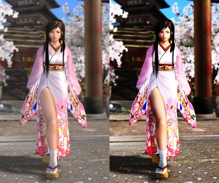
Ran Across An Interesting Comparision: DOA4 with and without Self-shadowing

Hardknock

Veteran
doa4vsDOA4ps.jpg


What do you think? Does it still uphold Team Ninja's style? A better lighting engine would make this game look so unbelievable...


Edit: This doesn't really show of self-shadowing, but just a better lighting model in general...

Here's Self-shadowing!

http://xs38.xs.to/pics/05296/dead-or-alive-4-shelf.jpg
 
Last edited by a moderator:
No, it shows the same picture with increased contrast, bringing out some detail but also destroying some in the darker regions of her hair.

This is however the lowest quality thread I've seen in a while ;P
 
Hardknock said:
Edit: This doesn't really show of self-shadowing, but just a better lighting model in general...

:LOL:

I came in here expecting to see DOA4 with actual Self Shadowing.
 
Saved on corner!!

That's a better comparison, though the whole game could look much better than it does. Then again we'll have VF5 on X360 soon enough (hopefully), which i am looking forward to more than any DOA game.
 
Even with Self Shadowing you can still see the models as kinda plasticy (stated as a design choice). Design choice or not, this game would benefit from more realistic models.
 
BlueTsunami said:
Even with Self Shadowing you can still see the models as kinda plasticy (stated as a design choice). Design choice or not, this game would benefit from more realistic models.

I don't know if it's so much "models" or textures that is the problem. The skin is what really irks me the most, there is no detail at all and the whole thing is just so dull. I guess that's why I liked the first pic so much, because the contrast brings out more detail and color in the screen.
 
Last edited by a moderator:
Hardknock said:
I don't know if it's so much "models" or textures that is the problem. The skin is what really irks me the most, there is no detail at all and the whole thing is just so dull. I guess that's why I liked the first pic so much, because the contrast brings out more detail and color in the screen.

The first pic you posted looked pretty good though, I agree. The dark to light contrast gave the skin texture? a much more eye popping look. The way it is now honestly look kinda bland. I hope Team Ninja really exploites the 360 with their next installment in this series.
 
On the first picture I actually prefer the version with lower contrast. Neither look "real" but the latter looks particularly false and harsh. In a brightly lit scene, and especially dealing with something semi-translucent like skin, you shouldn't see anything that's very dark, and especially not when there seems to be some kind of giant floodlight just off-camera to the right.

On the second picture I'm not sure what the point is - it looks like someone painted on some dodgy shadows in Photoshop - they don't seem correct to me.

Assuming it's actually just been faked to illustrate a point, then yes, some soft self-shadowing would generally help with realism. On the other hand if it's overdone or looks obviously wrong I might find it a bit counter productive.

I think if I was going to criticise DOA I wouldn't start with the shading :)
 
The left picture shows a low-contrast GI illumination. There's little direct light and lots of diffuse light creating little difference between lights and darks. Similar in effect to a bright but overcast sky. This is clear in the clothing and leg shading, but the face shading has a higher contrast, and the lighting of the scene and strong shadow looks out of place. All in all the lighting model isn't uniform across the scene, and it's lighting first and foremost that creates realism and solidity. the ringside shot shows a much better model, and now the object looks believable we're drawn primarily to the plasticine body. Too much cosmetic surgery I think...
 
Pointless thread.
Of course a game X would look better with better lighting model and self shadowing.
PGR3 would look better with better lighting.
PDZ would look better with better lighting.
Kameo would look better with better lighting...
These all would also look better with better polygoncount, better textures, better particle effects, better art....

Of course everything would look better if it had "better anything".
Why are things lacking all this "betterization" then... lack of power, skills, time, money, motivation...
 
rabidrabbit said:
Pointless thread.
Of course a game X would look better with better lighting model and self shadowing.
PGR3 would look better with better lighting.
PDZ would look better with better lighting.
Kameo would look better with better lighting...
These all would also look better with better polygoncount, better textures, better particle effects, better art....

Of course everything would look better if it had "better anything".
Why are things lacking all this "betterization" then... lack of power, skills, time, money, motivation...

You somehow went into my head and stated what I wanted to state but for some reason didn't. Good post!
 
You could produce the second image from the first by simply applying a 'level' correction function in photoshop.
(This is probably what have been done)..
 
Excuse the scepticism, but i not only agree with Rabid, but am i the only one questioning the shots?

Where do they come from?

Unless they're straight from Tecmo, they're probably just photoshopped images of what the game would look like with more shadows. Wouldn't take long...
 
rabidrabbit said:
Pointless thread.
Of course a game X would look better with better lighting model and self shadowing.

Hmmm, I don't think I follow you. I understand your point that anything can be improved. But the main complaint with DOA4 is that it needs a better lighting and shading engine(the current one in use is practically non-existent!).

The game gets mistaken for an Xbox game on frequent occasions, the lighting is the main culprit IMO. This thread is showing how much better lighting could have improved the graphics if there had been time to implement.
 
Hardknock said:
But the main complaint with DOA4 is that it needs a better lighting and shading engine(the current one in use is practically non-existent!)

no. The Real problem is that DOA lokks like that by design ,not for whatever technical limitation.
 
_phil_ said:
no. The Real problem is that DOA lokks like that by design ,not for whatever technical limitation.

Yep. Self shadowing will only make the Barbies look like... Barbies with shadows on them....
 
Hardknock said:
Hmmm, I don't think I follow you. I understand your point that anything can be improved. But the main complaint with DOA4 is that it needs a better lighting and shading engine(the current one in use is practically non-existent!).

The game gets mistaken for an Xbox game on frequent occasions, the lighting is the main culprit IMO. This thread is showing how much better lighting could have improved the graphics if there had been time to implement.

My main complaint with DOA is that it's the same game they've been churning out for generations but with slightly bouncier boobs. IMO they've never been known for technical achivement or realism. If they've ever gone on record with that as an aim then certainly I'd agree that they are failing.

The pictures given here don't show better lighting. One shows a really nasty contrast effect and one shows some strangely applied shadows. I agree the lighting could be better - this could be said for pretty much any game on any platform - but it has not been terribly well illustrated in this thread thus far.

I think they achieve precisely the effect the artists/designers were after - a slightly cartoony look with scantily clad cartoon women in amusing costumes jiggling up and down.

Teenage boys will buy it in their droves along with the strange women-of-DOA "pillows" that are available. So I doubt Tecmo care much about giving their characters a few moles, freckles or acne.
 
MrWibble said:
My main complaint with DOA is that it's the same game they've been churning out for generations but with slightly bouncier boobs. IMO they've never been known for technical achivement or realism. If they've ever gone on record with that as an aim then certainly I'd agree that they are failing.

If you want technical achivement you should try the Saturn version of DoA, or maybe the Naomi version of DoA2. The Saturn version has 60fps, high-res and good lighting, and the Naomi game was on of the first games that really pushed Dreamcast.
 
True, but the first pic illustrates that the game could actually benefit from some kind of post-filtering on the final render output. Similar to the way AOEIII only really begins to look breathtaking once the post-processing shaders kick in at the highest quality settings. Of course that pic is way over the top, but a more subtle HRD/Bllom/Contrast/Sharpening filter could do wonders to improve or change the look (stuff like this could easily be added late in the development process too, they could even make it an unblockable or a user option if they don't want it in the default game, kinda like in Farcry)...
 
Back
Top