New Forum Skin: Introducing 'vB3D' Edit: And vB3D-LC

Farid

Artist formely known as Vysez
Veteran
Supporter
As some folks may know by now, we're actively working on the site and the forums. The forum part was bestowed upon me by Rys, with the clear order from him to "do it well, to do it great and to do it now!"

That was a few months ago, fast forward to today, here we are with an operational new web site, still being updated -code wise- regularily, and, now, with a new forum skin.

I hope most of you folks will like this new skin, and those who don't at first, will at least give it a try for a few days, it might grow into them.


Update: introducing vB3D-LC:

http://forum.beyond3d.com/index.php?styleid=3

It also includes a different "new forum post" icon, now instead of being of made of a darker blue, it's colored in gold, which allows you to tell the forum with new posts in them from a mile away.

LC stands for lower contrast, by the way. It could have been named DC too.


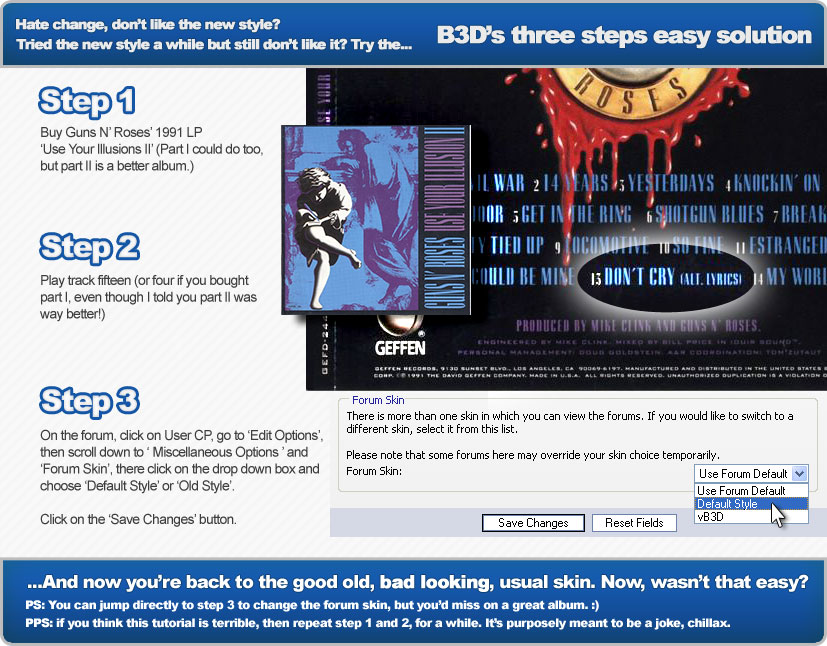
In any cases, if you dislike the new styles, for any reason, feel free to follow this simple three step tutorial:


new-skin-solution.jpg


:p
 
I was going to revert back to the old skin, but I figure I'll do as you ask and give it a try for a few days. :cool:

Nite_Hawk
 
Those of us (well, okay, me :D ) who've been using it for the last few days really like it.

Major props to Farid for what was a whole lot of work over the last month to make this new skin happen. . .
 
I like the basic "idea" behind the design, but there are a couple of drawbacks of the new skin:
- the logo at the top is too big. If you use less than about 1200 pixels width for the page display, it will go above the ad, wasting a lot of space (the same goes for the main page, by the way).
- The background is too bright, especially in the forum overview. It's just less ergonomic than the old color scheme.
- The edges of the boxes are a bit too blurry.

My biggest gripe, though, and I won't use the new skin because of it: It changes the message edit box to use a fixed width font. Seriously, WTF?


Farid,
with all the smooth font and even an antialiased mouse pointer in that picture, how could you not use font AA for the screenshot part? ;)
 
As far as looks go, I think this is groovy and I just wanted to post this opinion quickly. Yet to check out all the other more important stuff though, later.
[edit]Quick feedback : With a 1024x768 desktop, having a horizontal scroll bar is not groovy.
 
I was all looking at the forums, turned around to do some work. Turned back around and was like :oops:. I though tI went to the wrong site for a second...

I like the feel... All Mac like (bubbly) :cool:
 
Oh, come on! Now you're just doing this to spite me!

Windows XP candy-theme-loving weirdos. *waves his fist and goes back to browsing gopher with lynx*
 
[edit]Quick feedback : With a 1024x768 desktop, having a horizontal scroll bar is not groovy.
There's a 800x600 picture posted in this particular thread, this is the cause of that horizontal scroll bar.
 
My biggest gripe, though, and I won't use the new skin because of it: It changes the message edit box to use a fixed width font. Seriously, WTF?
That should be fixed now, it wasn't intentional.
 
I'll suggest a slight modification to the tutorial: Rather than Guns'N Roses with "Don't Cry", use the song "The Future's So Bright I Gotta Wear Shades" by Timbuk 3.

I.e., I find it to have too much contrast in some places (and not enough in others). Hard on the eyes (not as in it looks 'bad' - I like the general look, but actually *hard* on the eyes).
 
The brightness of the forum has made me go back to the original format. I usually keep my home office dark as in no lights and that makes the contrast way too much for the eyes.

Format is good otherwise.
 
Thanks guys.
This is a really good skin, it feels very clean and definitely nice on the eyes(colours).

Dare I ask how long Rys + party have been designing it?
 
nice job Guys , first time i saw the new forum i was shocked.Brilliant indeed and to the guys they didn't like the new one i happy to say it's your problem coz i realy see it the best skin i ever saw by now :devilish:
 
The beautiful thing about having choice is that folks who have a definite preference for one over the other are free to do so. . .
 
although i hate change, i must say i love the new forum skin.
nice job Guys , first time i saw the new forum i was shocked.Brilliant indeed and to the guys they didn't like the new one i happy to say it's your problem coz i realy see it the best skin i ever saw by now :devilish:
:smile2:

Yep, I like it but I have to echo Xmas - the logo at the top is waaay to big.
Your screen is way too small, don't try to reverse the situation on us.

We might use a smaller logo later on, to test things out (we already did, though). But note that the logo wrapping on top of the ad when displayed on smaller viewport is not an error, it's by design. And in any cases, to read the forum you scroll vertically a lot already (multiple thousands px in height), so if your viewport is smaller than 1200px width, scrolling down 85px more should not exactly be a deal breaker in the end. With that said, I take note of your suggestions, and as I said, we'll experiment with other methods to display ads and the logo on the forums in the future.
 
I don't think the logo is too big, I am running 1024x768.

I am going to give it a fair chance, as requested - at least in daylight.

Thanks for the update.
 
Back
Top