Mintmaster
Veteran
This is what that image would look like without any loss in vertical resolution.
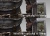
Getting 2x supersampling makes a huge difference too.I think he is. I tried scaling the 1920x1080 picture to 960x1080, then back up, and the difference in vertical resolution/detail compared to his 960x1080 image is huge.
When scaling to 960x1080, do it using point sampling (i.e. nearest neighbour). You can do it using MS Paint, actually. Then upscale it however you've been doing it. The only difference I see between this and macabre's pic is artificial texture detail from the higher mipmap selection of 1920x1080 vs. 960x1080. I can see aliasing within the texture - the kind that would shimmer in motion.
macabre, I think the best thing you can do is post the natively rendered 960x1080 and 1280x720 pics to prove the skeptics wrong.


") ). It's exactly what you'd see with a negative LOD bias.
). It's exactly what you'd see with a negative LOD bias.